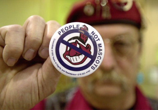
Halloween provides an annual opportunity to remind folks that their "Sexy Squaw" costume is racist. But this year's #NotYourCostume campaign was joined by the year-round #NotYourMascot movement, when a years-old Blackhawks logo replacement by Toronto-based Ojibway graphic designer Mike Ivall went viral.
Late in the evening on Oct. 29, longtime Winnipeg radio hosts Tom and Larry posted the logo image below, and by Monday morning it had over 15,000 likes, nearly 12,000 shares and, they said, had reached over two million people and counting.
Ivall, a First Nations artist who says he now designs hockey jerseys and hockey logos for a living thanks to the success of this image that he first created in 2007, appeared on their radio show Monday morning.
"At the time I was just learning how to use Illustrator and I know how some natives are a little against the native imagery and stuff like that, so I thought, 'Let's just try something out and be literal about it,'" Ivall said. He added he personally was less concerned about sports teams and cultural appropriation.
"It wasn't that I was saying I really think they should change it. I'd rather us put all the effort into trying to figure how to fix our communities. People are boiling water on reserves and you want to worry about an image of a logo?"
"The costume thing is a little bit different for me, it's a bad taste for me," Ivall added when asked about how Halloween may have played into the post going viral.
Ivall first posted the concept art to Icethetics in 2008 and has since sold the design to Ottawa-based AAA Maplesoft Hawks.
Regardless of his personal motivation, the reason it caught fire over the weekend is because of the ongoing controversy.
While most of the focus has been on the Washington Redskins due to their racist name, there remains plenty of North American sports teams, from amateur to pro, that also make use of indigenous imagery. The stats site FiveThirtyEight.com found 2,128 "Native American mascots," with 92 per cent at the high school level, while the National Congress of American Indians said there were now fewer than 1,000, a number that had shrunk by two-thirds.
"People are definitely awakening to to the idea of how wrong it is. Slowly but surely the tide seem to have turned within the last three years," A Tribe Called Red's Ian Campeau told HuffPost Canada last April in an an interview about his successful campaign to get Nepean Redskins youth league in Ottawa to change their name.
"We're seen as cartoon characters. So until we're taken seriously and seen as human beings and not these ancient relics or ridiculous stereotypes, we won't be taken seriously for these quote-unquote more important issues. But to me this is of the most utmost importance."
So Ivall may not have really intended his logo to address such concerns, but as Tom and Larry also pointed out, "the thing that resonated with people was the fact that it looks so cool." Indeed, that's why it so perfectly points toward a solution to problematic native team logos and mascots.
Just make new ones that are better and more badass than the old ones.
Also on HuffPost
