The sky may not be falling on Canada's housing market, but as house prices continue to rise there is no reason to compare its housing bears to Chicken Little.
The problem the housing bears have had is they are reading the same fairy tales about Canada's housing market that the housing bulls continue to suggest all Canadians keep reading. It's time to stop turning the pages and start reading what the words are really saying.
Housing bubbles in Canada and the rest of the world are measured through changes to selling prices of homes. While you can debate which house price measure to use, the most commonly used is average selling price, which in Canada happens to be the most-discussed headline in the news each month. So let's use average selling prices to explain why housing bears are not Chicken Littles.
In 2013 Calgary was the being called the "hottest" market in the nation, replaced by Toronto in 2014 and then in 2015 through today by Vancouver. In each instance, the home being described each month as Canada's average home sold changed so much that someone new to Canada, seeing what the average looked like in 2013, would not even recognize it in 2016 as being the same.
This is the nature of average selling prices and, through the monthly cumulative inflationary nature of its collection methodology alone, is the reason house price bubbles even appear in the first place.
The real story is Canada has had three major bear markets and one minor one since 2006, but Canadians have simply never read about them.
Unfortunately even the combined minds of the OECD in its recent (2013) tome on how to create a real property price index simply proposed methodologies that continue support further bubble's forming.
It is impossible for any housing market in the world to even maintain the value of its current housing stock on an inflation-adjusted basis without new entrants coming into the market and stepping up to buy their first home, let alone for house prices to rise and fall over and over again.
It only makes common sense that if fewer lower-priced homes (like those in the price categories first-time buyers acquire) are part of the sales mix, that is used to create an average price that the average will rise.
The opposite of course also makes common sense in that when more sales of lower-priced homes are added to the mix, average prices will fall.
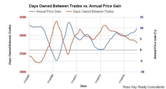
It's time for the fairy tale of monthly house price gains to end and for fiction to be replaced by fact. (See the chart below.)
If one month 10 homeowners who have lived in their homes for 10 years traded their existing home for another, the average number of days they each would have owned their existing home before "moving on" would equal 3650 days.
If the next month only one first-time buyer and another 10 owners of 10 years moved, the average days owned between moves would drop to 3318. This nine per cent drop in Days Owned Between Trades will cause a decrease in the average selling prices being reported.
This is why measuring the Days Owned Between Trades (DOBT) accurately is one of the most valuable tools in the housing analysts toolbox.

The chart measures the Canadian market and it tracks Canada's Trading Cycles demonstrating how those bears were right more than they were wrong over the last 110 months.
The chart demonstrates what happens when first-time buyers are getting into the market (DOBT increasing) or running from it (DOBT decreasing).
The quicker the percentage of first-time buyers increases, the smaller and smaller price gains will take place -- and if they continue to increase in share, negative gains will be recorded.
The quicker first-time buyer's share of sales decreases, the higher gains in prices will be recorded. DOBT and selling prices have an negative correlation as a result.
Knowing the number of Days Owned Between Trades is the best measure on the percentage of first-time buyers included in the current sales mix. It is only natural for average prices to change relative to the percentage shift.
Since the percentage of first time buyers in the national sales mix shifts coincident with provincial, municipal and even neighbourhood shifts, the change is always reflected in the average sales price being reported.
Now when this story is read and fully understood, many of the fairy tales currently believed to be true are proven otherwise. The real story is Canada has had three major bear markets and one minor one since 2006, but Canadians have simply never read about them.
That's the real story that needs to be told.
Follow HuffPost Canada Blogs on Facebook
MORE ON HUFFPOST:
