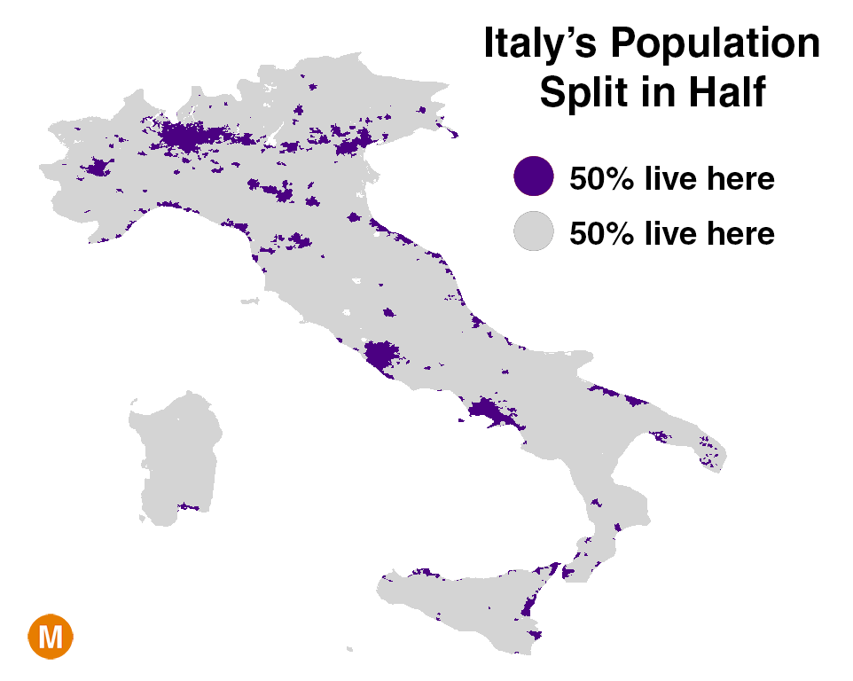
Based on data from NASA / SEDAC, this map shows how Italy's population is distributed -- half lives in the densely-packed purple areas (8% of the land), half lives in the sparse grey areas (92% of the land).
The map is the latest addition to a long-running string of population maps tweeted out by Conrad Hackett, a Pew Research demographer with a very interesting and very popular Twitter feed. The maps show how and where people are concentrated in different regions of world, including contributions from some great data visualizers as well as a few of my own.
It's no surprise that people are not evenly spread out across the Earth. But seeing the population concentrations mapped out visually can be quite striking.
The World
On a global level,
.
The map below shows the world's population density from another perspective. Only 5% of the world lives in the entire blue area. For comparison, the same number of people live in the small red area (bonus points if you can name the two countries it covers).
Australia
Australia may be the country with the most extreme population concentration in the world. Physically, it is about the same size as the United States. But as this map by reddit user
shows, half of Australia's 23 million people live in just a few densely packed specs.
United States
This map of the United States was made by
of
, a site that put out some great data visualizations before being acquired by
late last year.
Of the United States' 3,142 counties, just 144 account for half of the population.
Spain
As you can see in the
, Western Europe's population is distributed relatively evenly compared to the rest of the world. But
is a bit of an
. 14% of Spaniards live in Greater Madrid, smack dab in the center of the country.
France
This map of France comes by way of
of
. It shows not only the 50% / 50% population split, but the full range of possible breakdowns.
North Africa
Unsurprisingly, the Sahara Desert has one of the lowest population densities on the planet. Nearly
lives along the banks of the Nile River.
Turkey
This map by
, shows the population concentration of Turkey. 50% of the population lives in the black regions, 50% lives in the yellow regions.
Canada
The 49th parallel is traditionally thought of as the border between the U.S. and Canada. Oddly, most Canadians live far below it.
lives in this red area, which is at about the same latitude as Oregon.
You can find these and many other population density maps on Conrad's Twitter feed, many connected to the tweet below. If you have any suggestions for other parts of the world whose population would be interesting to see visualized like the maps above, feel free to share your thoughts.
The post originally appeared on Metrocosm
Support HuffPost
Our 2024 Coverage Needs You
Your Loyalty Means The World To Us
At HuffPost, we believe that everyone needs high-quality journalism, but we understand that not everyone can afford to pay for expensive news subscriptions. That is why we are committed to providing deeply reported, carefully fact-checked news that is freely accessible to everyone.
Whether you come to HuffPost for updates on the 2024 presidential race, hard-hitting investigations into critical issues facing our country today, or trending stories that make you laugh, we appreciate you. The truth is, news costs money to produce, and we are proud that we have never put our stories behind an expensive paywall.
Would you join us to help keep our stories free for all? Your contribution of as little as $2 will go a long way.
Can't afford to donate? Support HuffPost by creating a free account and log in while you read.
As Americans head to the polls in 2024, the very future of our country is at stake. At HuffPost, we believe that a free press is critical to creating well-informed voters. That's why our journalism is free for everyone, even though other newsrooms retreat behind expensive paywalls.
Our journalists will continue to cover the twists and turns during this historic presidential election. With your help, we'll bring you hard-hitting investigations, well-researched analysis and timely takes you can't find elsewhere. Reporting in this current political climate is a responsibility we do not take lightly, and we thank you for your support.
Contribute as little as $2 to keep our news free for all.
Can't afford to donate? Support HuffPost by creating a free account and log in while you read.
Dear HuffPost Reader
Thank you for your past contribution to HuffPost. We are sincerely grateful for readers like you who help us ensure that we can keep our journalism free for everyone.
The stakes are high this year, and our 2024 coverage could use continued support. Would you consider becoming a regular HuffPost contributor?
Dear HuffPost Reader
Thank you for your past contribution to HuffPost. We are sincerely grateful for readers like you who help us ensure that we can keep our journalism free for everyone.
The stakes are high this year, and our 2024 coverage could use continued support. If circumstances have changed since you last contributed, we hope you’ll consider contributing to HuffPost once more.
Already contributed? Log in to hide these messages.