
WASHINGTON -- Multiple new polls shows a continuing bounce for President Barack Obama that translates into a significant Electoral College lead. With more than seven weeks remaining before Election Day, however, the crush of daily polling has just begun.
To help readers make sense of the many polls we're likely to see each day -- Thursday alone featured 23 new releases from 17 different pollsters -- HuffPost Pollster is announcing a new poll tracking model that is fully incorporated into the maps and charts of the HuffPost Election Dashboard.
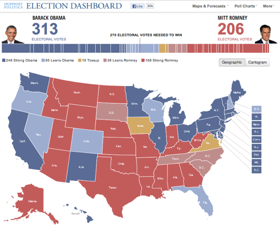
The new model currently gives Obama a big Electoral College lead -- 313 to 206 electoral votes if the ballots were counted today, with 19 electoral votes too close to call -- reflecting the president's recent bounce in the polls. How we get to that snapshot requires some explanation.
The influx of new poll data released each day can tell us a great deal about the race for president, but it also brings many challenges. The methodologies used by individual surveys vary widely, with some pollsters producing results that tilt consistently toward one candidate or another. Pollsters also use different sample sizes, interview over different dates, sometimes report on different populations (registered vs. likely voters), and often fail to disclose the methods used to identify likely voters.
Our new poll tracking model, designed and created by Stanford political science professor Simon Jackman, works by pooling all of the available data, both national and statewide, to produce state-level estimates of voter preferences.
The goal, as Jackman explains in a blog post published Friday morning, is to use all of the available data "to form today's best estimate of the national and state-by-state levels of support for Obama and Romney."
HuffPost's presidential poll tracking model has five important features:
1. The model combines national and state-level polling data to estimate current vote preferences in each state. Jackman has analyzed historical election returns to find patterns in the way voters in the different states shift their support from election to election. "Some states follow other states more closely than others," Jackman writes," and "some states follow the national trend more closely than others."
2. The model allows for continuous updates on all states, even states that have had few or no recent polls. As Jackman explains, "even though we may not have polls in every state on every day, we've got a plausible (if imprecise) model of movement in one state that might be related to movements in another state, and a model that links up state and national level changes in the vote."
This feature largely eliminates the problem of state-level polling averages that appeared to lag behind the national data in our classic poll charts.
3. The model corrects for consistent pollster "house effects." This procedure will limit distortions caused by organizations that produce large numbers of polls and whose results typically skew to one candidate or another. The corrections are vital, Jackman explains, because they prevent the polling data from being "overwhelmed by any bias contained in the estimates" produced by the more prolific pollsters.
4. In addition to the house-effects correction, Jackman writes, the model "aggressively down-weights" statistical outliers, those that are "radically at odds with the rest of the polls for a given state," and "one-off" polls, from pollsters that appear just once in the HuffPost Pollster database. This procedure helps prevent one odd poll from throwing off the overall estimate.
5. Finally, the model calculates the statistical confidence for each state's estimate, so we can report the probability that Obama or Romney is really ahead in the current polling.
So what does all this statistical firepower tell us about where the race for president now stands?
At the national level, the model captures the bump in support for President Obama since the Democratic convention. Obama currently leads Romney by roughly 4 percentage points, whereas his lead had typically varied between 1 and 2 points since April.
The model also generates estimates of the polling trends in each state, again combining state and national data, that we incorporate into the HuffPost Pollster charts.
Consider Florida, a state whose 29 electoral votes are widely considered "must win" for the Romney campaign. The model currently gives Obama a lead of just under 2 points (47.7 percent to 46.0 percent, as of this writing). The trend lines produced by the model indicate both that Romney had narrowed Obama's lead during the Republican convention and that the gap widened again after the Democratic convention.
Although Obama's Florida margin is narrow, the current estimate is based in part on 52 Florida polls, including six conducted in early September. Based on all of the available data, the model reports 81 percent certainty that Obama's lead there is real. We classify that certainty as "leans Obama."
Parallel estimates across the 50 states allow for a far more precise snapshot of the Electoral College standings. The model now shows Obama leading in 24 states plus the District of Columbia, representing a combined 313 electoral votes, 43 more than the 270 needed to win. Romney is leading in 24 states, accounting for 206 electoral votes. We currently classify two states -- Iowa and Virginia -- as "tossups" based on the latest data. Estimates from the new model now drive the classifications in the HuffPost Election Dashboard map.
A state is classified as a tossup (yellow in the map above) if the model indicates less than 65 percent certainty that the leading candidate is really ahead. A state "leans" to a candidate (light red or blue) if the statistical certainty ranges between 65 and 95 percent and is "strong" for a candidate (dark red or blue) if the certainty exceeds 95 percent. The model will update several times a day as new polls become available.
We encourage readers to explore the newly upgraded Election Dashboard and HuffPost Pollster presidential charts. The map now displays the current estimate for each state, as well as the statistical confidence of an Obama or Romney lead in each state.
The trend lines produced by the new model appear by default in each state chart. However, the classic, customizable Pollster trend lines are still available. Just click the "create your own" tab at the top of the chart, and use the appropriate tools (that also appear at the top) to filter out polls, change the sensitivity and alter the date range.
More upgrades to the Election Dashboard will roll out over the next few days to provide additional tools to make sense of the coming flood of polling data. Stay tuned.
Before You Go
