
Last year around this time I posted my ten favorite graphs from my prolific colleagues at the Center on Budget and Policy Priorities. It's tough to make the cut. If I may be permitted -- and I'm bragging on my friends, not me -- we at CBPP make a lot of revealing graphs. But I've chosen the ones that I think shine the brightest light on the path back to smart fiscal and economic policy. I've added short annotations but follow the links for more info.
1. 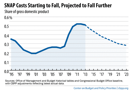
(Source)
The SNAP roles did what they were supposed to do: they ramped up in the Great Recession to meet the nutritional needs of low-income families. As the economy slowly recovers--especially slowly from the perspective of the poor--they're ramping back down again. It's called countercyclical safety net policy, and conservatives gunning for the program--the House Republicans want to administer huge cuts that would throw almost four million off the rolls in in 2014 and an average of 3 million people each year over the next decade--are willfully ignoring the program's effectiveness.
2.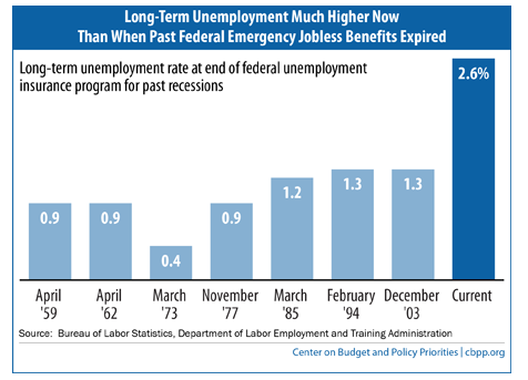
(Source)
Here's another graph that should impart great urgency regarding very near term policy. The little budget deal that Sen. Murray and Rep. Ryan put together left out a much needed extension of unemployment insurance benefits. As you can see, historically, when Congress allowed such an expiration to occur, the share of the long-term unemployed was half what it is today.
3.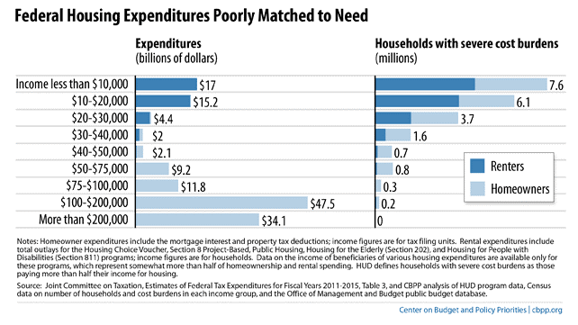
(Source)
No one can say when, but tax reform is out there somewhere, and so I've included a number of figures that I would love to see emblazoned in the minds of policy makers when they undertake that effort. This figure shows that while some of our federal spending on housing helps those who really need the help, most of it doesn't.
4.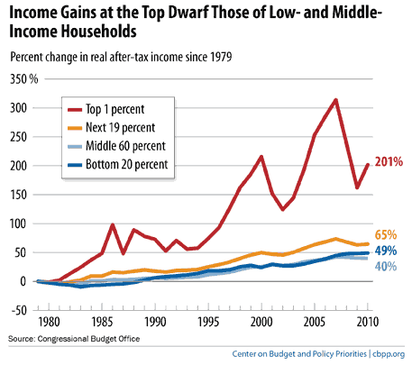
(Source)
The President just gave a big speech on the inequality story, referencing important connections between the large increases in income dispersion you see above, and immobility and even macroeconomic growth. The figure, which includes the impact of taxes and transfers (the argument that these offset inequality is belied by the relative growth of the top 1%) as well as capital gains and losses, shows how financial bubbles and busts add a large cyclical component to the movements for the wealthiest households. But note how at the end of the graph they've started to bounce back while the other income classes remain flat.
5.
(Source)
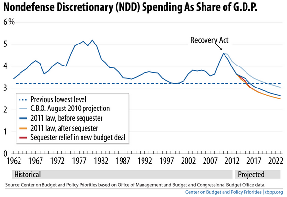
The little end of the year budget deal mentioned above replaced some of the sequester cuts. But as far as nondefense discretionary spending is concerned, the add-backs in 2014 and 15 are barely perceptible. This spending, which pays for many critical human services of low-income households, including college assistance, preschool, and housing support, is headed for historic lows and the "new deal" doesn't change that one whit.
6.
(Source)
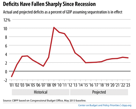
Yes, the economy's been on the mend, but do you want to know why it's been such a slog? Just eyeball the figure above: we've cut our deficits too quickly, generating fiscal headwinds estimated to have cut real GDP growth by 1.5 percentage points this year alone. The six percentage points of GDP decline in the deficit/GDP ratio, from 10% in 2009 to 4% this year, is the largest four-year decline since 1950. That would be good news is it coincided with a robust recovery--that's the time to be a deficit hawk. Not when we're still trying to crawl off of the mat.
7.
(Source)
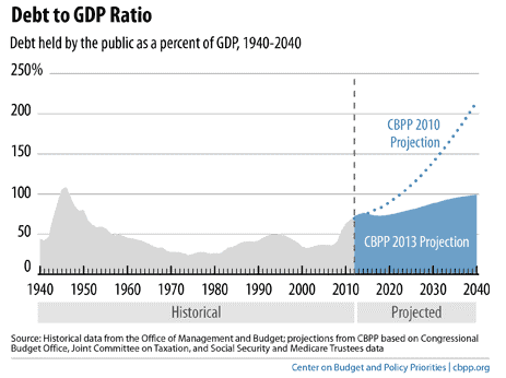
Speaking of stomping out the "hair-on-fire-stop-the-debt-before-it-kills-us-all" mentality that has given us economy-slowing austerity and legitimized the debt-ceiling-as-hostage strategy, this figure from our updated long-term budget projections contains two important messages. First, compared to our last projection, the trajectory of the debt is hugely improved. Second, that doesn't mean we can ignore future fiscal imbalances. The biggest factor driving the slope that starts climbing around 2020 is health care spending, and other research shows that changes introduced with the ACA may be helping on that front.
8.
(Source)
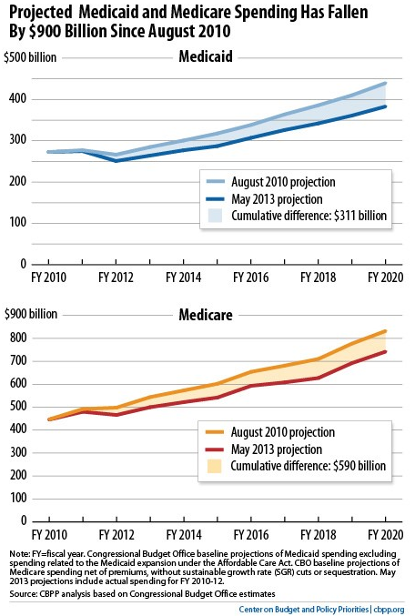
What's that? You'd like to see such research? OK -- we've got that too. This figure compares two different CBO spending projections for Medicaid and Medicare, one made in 2010 and the other three years later (earlier this year). Once the budget office incorporated savings due to slower health care cost growth, the combined forecasts fell by $900 billion. That's a) a lot more fiscal oxygen, and b) as we wrote at the time, a reminder that while we'll need to do more to ensure a sustainable, long-run fiscal path, there's "no need for sweeping and misguided changes, such as establishing a per capita cap in Medicaid or raising the age of eligibility for Medicare."
9.
(Source)
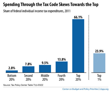
Back to tax reform. When someone says "tax expenditures" you should hear "spending through the tax code." The reason this is important is that conservatives run around saying "I'll always cut spending; I'll never raise tax revenue." Well, here's a way to do both: end some of the regressive tax expenditures-sorry, "spending through the tax code"-that deliver two-thirds of their goodies to the top fifth of the income scale and you'll raise some serious revenue.
10.
(Source)
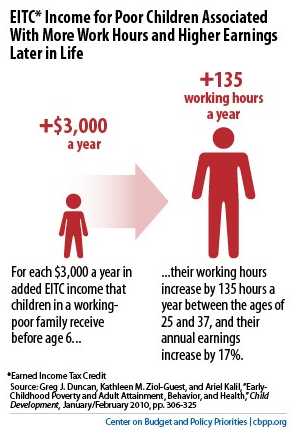
We spend a fair bit of time defending the safety net at CBPP on behalf of poor households who have both deep economic needs and little political voice. But with longitudinal data sets that can now follow kids who began life in poor families all the way through to adulthood, evidence is beginning to surface showing that safety net support not only boosts consumption helping disadvantage families today. It serves as an investment that pays returns down the road. This shows the benefits from the EITC, a pro-work wage subsidy, but food stamps (now SNAP) have also been shown to yield long-term benefits.
This post originally appeared at Jared Bernstein's On The Economy blog.