
The U.S. federal government released its third National Climate Assessment on Tuesday, emphasizing that climate change is not only an issue for the distant future. It is already "triggering wide-ranging impacts in every region of our country and throughout our economy," they write.
The Huffington Post's Kate Sheppard explains:
The full report, at more than 800 pages, is the most comprehensive look at the effects of climate change in the U.S. to date, according to its authors. (Even the "highlights" document provided to reporters the day before the release weighed in at 137 pages). The report includes regional and sectoral breakdowns of current and anticipated impacts, which have implications for infrastructure, agriculture, human health, and access to water.
Among the report's findings in the highlights document are these five eye-opening charts which reveal how much things have changed in recent decades and what we might expect later this century.
1. We're Seeing More Heavy Precipitation Than We Used To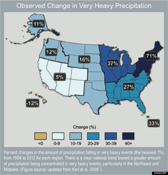
2. It's Gotten Warmer Almost Everywhere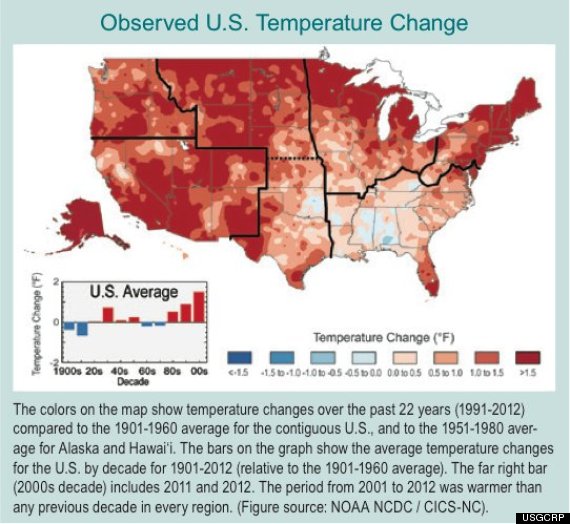
3. We're Seeing A Lot Of 100-Degree Days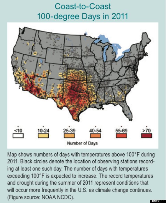
4. Drought Is Becoming A Major Problem For Much Of The Country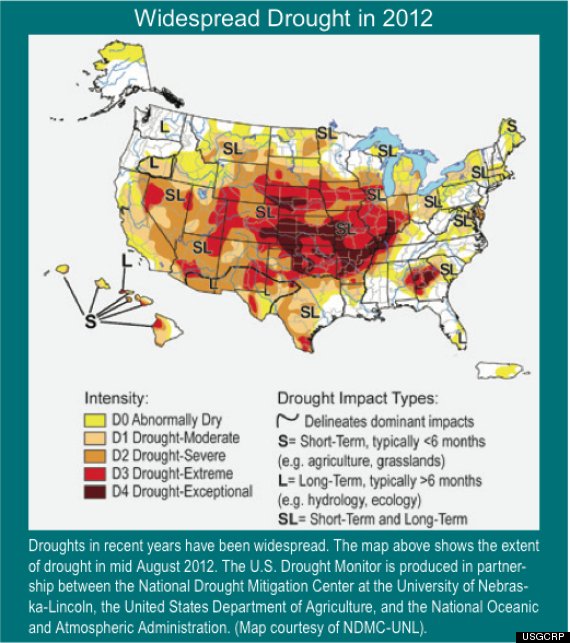
5. Business As Usual = More Temperature Rise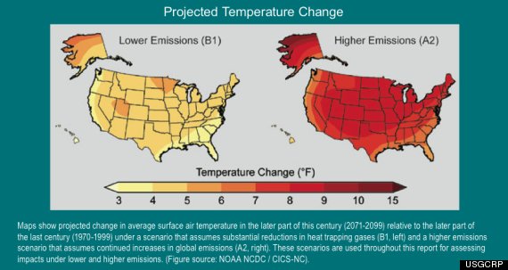
Related
Before You Go
