Did you know that mobile commerce now accounts for 30% of all US ecommerce sales? That should make it easy to understand why your mobile site isn't just a smaller version of your website. It also makes it clear why you need to take mobile optimization seriously.
The key is to successfully optimizing your mobile site is to remain 100% focused on converting visitors to buyers through a simple conversion process. If you implement even one of these seven tactics, you'll see a lift in your store conversion rate.
1. Cater to Your Customers
Customers usually come to your mobile website to do one of two things: buy a product or browse around. (source)
Since you will never know which one of those two motivations your website visitor has, your online store must cater to both needs. A layout like Nemo Equipment's mobile site, which features a prominent search function as well as product images is ideal. It satisfies both the browser and the visitor with the intent to purchase.
2. Keep Your Navigation Smooth
Keeping your navigation simple and straightforward will go a long way to getting customers to stay on your site.
Including your logo, a hamburger menu (that 3-line navigation icon), a text search option, and displaying your value proposition (or featured product) on your homepage, just like Nau does, is a great place to start.
3. Bigger is Always Better...
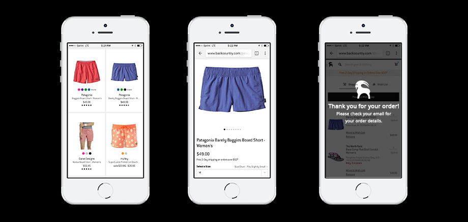
In the case of mobile ecommerce sites, bigger is most definitely better. Mobile screens are usually quite small, so making text and images bigger and easy to click are key to ensuring your visitors have a friendly experience.
To make it easier for the consumer to take action, I recommend including only 1 call to action per page. For instance, on your product detail page, the most appropriate call to action is the "add to cart" button, while on your homepage it could be a link to a featured collection.
4. ...But Keep Your Site Fast
We humans -- nowadays -- have a very short attention span, so it is crucial that your site loads fast to capture any of your website visitors' attention. Having lots of high-res interactive images on your mobile site is great, but be sure to compress the files to maintain good site speed.
Having larger images and text should never detract from a speedy website browsing experience, given the short attention spans consumers have. Using a site like TinyPNG, you can have high quality images and a reasonable load time.
5. Prioritize Your Search Results
Since consumers usually use mobile devices to make purchases while on the go, it's extremely important to prioritize search results as accurately as possible.
The key to successful prioritization is to keep on top of keyword trends and organize content accordingly. By knowing which product categories are in demand, it's possible to tailor your search results to those specific keywords.
Another easy way to prioritize your search results is to use Semantic Search, which gives your search function the ability to put searches into context. By attempting to understand intent through understanding how keywords relate to the user, they reduce cart abandonment rates to as low as 2% (compared to 40% on websites with no Semantic Search functionality). (source)
Learn more about how optimizing your search function can be one thing that separates you from your competition in this article.
6. Don't Ask For Irrelevant Information At Checkout
No one likes a long checkout process, especially on a small screen, so keep yours minimal. Allowing users to log in to make a purchase using cross platform log-ins through Facebook or LinkedIn is a great way to cut down on unnecessary steps.
You can also leverage UI design elements (like the quantity selector) to speed up the checkout process. But whatever you do, do not add content unrelated to the purchase at checkout. It's important to keep the focus entirely on the purchase, especially when the consumer is in the frame of mind to buy.
7. Create Mobile Landing Pages
A lot of ecommerce stores don't realize that 67.2% of their consumers are using mobile to check their email, and make the mistake of not designing mobile-friendly versions of their landing pages.
- A minimalistic design
- A really brief heading
- No navigation bar
- A clear, immediate, and clickable call to action
- An appealing and relevant image
- Compatibility with landscape and portrait viewing
More than 20% of all mobile sales are initiated by email marketing, so you're losing a good portion of your potential revenue if you don't optimize your email campaigns and landing pages for mobile.
Get to Optimizing
Creating a customized, minimal, and comprehensive shopping experience especially for mobile users is not a waste of time or resources. It's small, experiential details like these on mobile platforms that can make all the difference in converting more of your mobile visitors into customers.
Want to Learn How to Double Your Conversions?
Top brands like The North Face & Patagonia use a "secret sauce" to convert their website visitors to paying customers. Get your own hands on the exact tools list here.