Tuesday is Election Day in the United States. If history is any guide, we can expect to see a whole lot of maps on Wednesday that look something like what’s displayed on the left-hand side of Figure 1. But it’s important to keep in mind that we live in a country that looks a lot more like the map on the right-hand side. In this post, we’re going to talk about some of the problems with the map on the left and how we can move to widespread use of something more like what is on the right.
Before we dive in, it is important to note that in the maps that follow, red means Republican and blue means Democrat. (Though this hasn’t always been the case.)
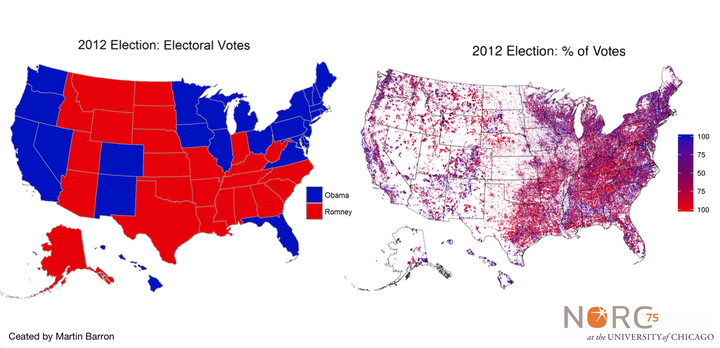
Figure 1
The map shown on the left in Figure 1 and in greater detail in Figure 2 ― technically referred to as a choropleth map ― is great if all you want is to quickly convey how a state’s Electoral College votes were assigned. They are awful, however, for conveying how the U.S. population actually voted. Anyone unfamiliar with the outcome of the 2012 election could be forgiven if the casual viewer came away with the impression that Mitt Romney won that election. After all, something approaching 63 percent of the map is red, but Barack Obama actually won 51 percent of the popular vote and 62 percent of the Electoral College. Yet, because (most) states’ electoral votes are assigned “winner take all” and because states vary in geographic size and population, these maps actively mislead viewers to think that more of the country voted Republican. Take Montana, for example. It has only one-third of the electoral votes of Maryland but represents 12 times as much space on the map.
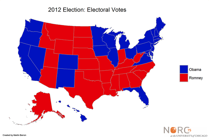
Figure 2
This problem could be corrected by using a stylized map that makes each state the same size (such as the one in Figure 3, based on a frequently used National Public Radio design). But while this corrects for the geographic size differences between states, it’s not a huge improvement over the original map. The map below still leaves viewers with the incorrect impression that our nation is isolated by political affiliation. That is simply not an accurate image of the United States. And we can prove it with better maps.
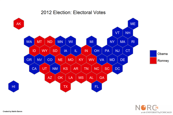
Figure 3
Instead of focusing on electoral votes, let’s instead focus on how people actually vote. With that goal, we can do a lot better than the above maps by altering three elements: color, geographic aggregation, and population.
Color
Virtually every election map shows Republican-voting states as red and Democratic-voting states as blue. This is fine, if everyone in each state voted for the same candidate. But, of course, that is never the case. In 2012, only the District of Columbia had more than 90 percent of the population voting for one candidate. Every other state had 75 percent or less of the population voting for the winning candidate. Most states, in fact, had between 50 percent and 60 percent of their population voting for the winning candidate. None of that differentiation is captured in typical electoral maps.
The most obvious way to fix that is to alter the shading to reflect the proportion of each state voting for a candidate. The map below keeps the same shade of red to indicate 100 percent of votes were cast for the Republican candidate and the same shade of blue to indicate 100 percent of votes cast for the Democratic candidate. But it adds a third color—purple—to represent where an even 50 percent of voters selected each candidate, and then uses a gradient of purple to represent any percentages above 50 percent—adding more red or blue as appropriate. Contrast this result (Figure 4) to the electoral map (Figure 2). It’s the same map, produced with the same data and program—just with different shading.
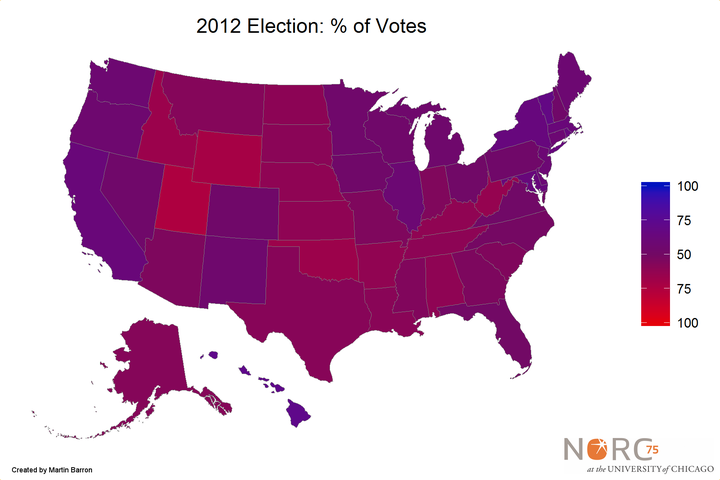
Figure 4
The message conveyed by Figures 2 and 4 couldn’t be more different. Figures 2 and 3 suggest a deeply divided country with huge swaths of the country either entirely Republican or entirely Democrat. Figure 4 suggests something very different: a country where party state in every state is nearly identical. While some states may lean slightly toward the red (Utah) or the blue (California), the overall message of the map is that all states are some shade of purple.
Geographic Aggregation
Should the goal be to illustrate voting patterns instead of Electoral College patterns, then the maps must be based on something other than states. States are, of course, very big—causing a significant amount of variation to be hidden away. Is northern Illinois (which includes the city of Chicago) really the same as southern Illinois? How about upstate New York versus the New York City region?
So another improvement to make is to reduce the level of geographic aggregation. Ideally, the map would use the smallest level of aggregation possible: the voting precinct. Unfortunately, while these data are available, it’s actually hard to obtain, aggregate, and map. Instead, the maps below use the smallest level of geographic precision that is easily obtained: county level data.
Figures 5 and 6 map counties rather than states. Figure 5 shows two colors (as in Figure 2). Figure 6 shows a continuous scale (analogous to Figure 4).
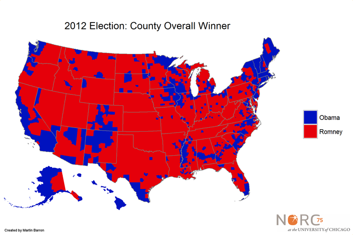
Figure 5
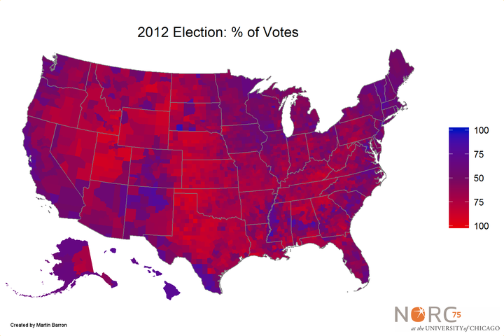
Figure 6
Here again we see that the country is not blue or red, though more gradations now appear. Unlike Figure 5, we can now see areas that are clearly more red or blue than purple. We can also begin to see blue clusters in traditionally red states (Texas) and vice versa (California).
Population
The last oversimplification in the traditional electoral maps is that they fail to account for the uneven distribution of the U.S. population. Simply put, huge swaths of the United States just don’t have many (or any) people living in them. More than 50 percent of the U.S. population lives in states along the two coasts. And just 25 percent of U.S. counties hold 90 percent of the population. Mapping at the state or county level thus gives disproportionate weight to sections of the country where there are not a lot of people.
One approach that others have taken to correcting for this is to create a cartogram. A cartogram scales each geographic area to a size proportional to some other variable (for example, population size). In the process, it attempts to maintain the general shape of the map, but distortions are inevitable (see, for example, this approach).
But if a more realistic representation of the United States is desired, another approach is needed. One alternative would be to manipulate the opacity. That is, a map could maintain the same shading but reduce the transparency of counties with low populations. Unfortunately, in trials of this approach (not shown), the resulting maps are difficult to read.
Instead the map below uses alternative approach. Figure 7 maintains the same shading shown in Figure 6 but removes all census blocks that have zero population (that is, all areas where no people live are colored a neutral white). While this doesn’t completely correct for population discrepancies (after all, an area with one person is displayed with the same vibrancy as an area with 10,000 people), it does correct some of the significant misrepresentations of Figure 6, where largely uninhabited areas (such as large portions of Utah) are shown as deeply red.
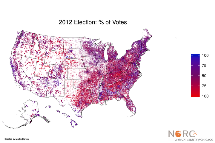
Figure 7
Conclusion
If all you want to know is which direction a state’s electoral votes were assigned, the typical election night map is all you need. But if you really want to study geographic patterns of voting, a more accurate and nuanced map can be developed and presented. What do you think is the most effective way to represent the voting patterns in the upcoming presidential election?
About the Data and Maps
State election data is from the Federal Election Commission and can be found here. County data is adapted from data stored here. All maps were created using the R programming language using geographic data from the U.S. Census Bureau. This work was conducted at NORC at the University of Chicago and originally published on their Sparks Blog.