Since 1920, a total of 79 million people from around the world have emigrated to the United States and become lawful permanent residents. The animated map below displays them all. The brightness of a country corresponds to its total migration to the U.S. during the time period shown.
Two Centuries of U.S. Immigration (1 dot = 10,000 people)
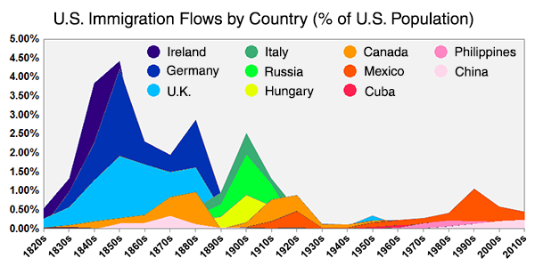
Through time, the largest source of immigration follows a clear trend through the world. Initially, the bulk of immigration comes from Western Europe (Ireland, Germany, and the U.K.). The next wave, starting around 1880, comes from further east in Europe (Italy, Russia, and Hungary). Through the 20th Century, most of the Immigration arrives from the Americas (Canada and Mexico). And finally, the last few decades have seen a rise in immigration from Asia (China and the Philippines). The same trend is clear looking at the history of New York City's foreign born population.
Though total migration to the U.S. has peaked over the last few decades, the picture looks very different when viewed in proportion to the U.S. population.
In 1820, the year the animated map begins, the U.S. population was less than 10 million. It goes to show, we are all immigrants.
- Immigration data: Department of Homeland Security's Office of Immigration Statistics (download: full report, data in Excel format). The data used for the map is "persons obtaining lawful permanent resident status," which does not include illegal immigration.
- World borders: Natural Earth
This post originally appeared on Metrocosm.