Like most things, website design comes under the influence of trends. A new shiny feature comes along and suddenly everyone wants to implement it on their website. The problem is that sometimes the shiny newness of a feature gets in the way of our ability to judge whether or not that feature is actually improving user experience on our website.
Newness isn’t always the culprit behind website elements that are actually hurting user experience. Sometimes old standby features or design norms are at fault. That’s because it can be easy to fall into the trap of assuming that if something has always been done a certain way, that’s necessarily the best way to do it, when in fact, doing it the old way is hurting your website’s performance.
In this article we’re taking a look at seven common website design elements and determining whether they’re helping or hurting conversions on your website.
1. Generic or Confusing CTAs: Hurting
Nothing kills conversions like an ambiguous call-to-action, or one that doesn’t align properly with the action users expect to take next. Worst of all is a hidden or absent call-to-action.
If you want users to complete an action on your site, it’s up to you to guide them there. Along with strong messaging, clear CTAs are a critical component of the customer journey. Indeed, they’re one of the most important usability features of your website. There shouldn’t be any doubt in the user’s mind about what will happen once they click on one of your CTAs. Uncertainty causes apprehension, and apprehension causes users to abandon.
The solution is to write CTAs that are specific to the action being taken and that make sense in the context of the content they are driving towards. If appropriate, use supporting messaging to further clarify. In the example below, Blue Fountain Media makes it clear to the user what they can expect when they click on the “work with us” call-to-action on their homepage.

2. Site Search: Helping
The main goal of your site is to provide users with the content, information, or products they’re interested in. Site search helps users who know exactly what they want to find that thing quickly and without having to go through a process of category narrowing to get there. Site search also acts a safety net that can be a last resort for users who try to find something by browsing and aren’t successful.

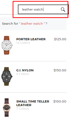
In the example above on the Nixon website, the brand has an incredibly user-friendly search bar that auto-generates responses based on the user’s input. Nearly 63% of digital shoppers surveyed indicate that they use site search while shopping online, so this is one design element you probably can’t afford to skip.
3. Image Zoom: Helping
As internet users have become more comfortable than ever shopping and buying products online, they’ve also come to expect certain features as part of that shopping experience.
Image zoom is a key feature of the ecommerce experience. Users want to be able to see the weave of the fabric of a jacket, or the detailing on a pair of sneakers. Absent the ability to see a product in person, image zoom is the thing that comes closest to allowing users to experience products close-up. What’s more, survey data suggests that roughly 70% of digital shoppers use image zoom when shopping online.
4. Vanity Features: Hurting
Loading up your website with extra features that none of your users actually need is not a good idea. We sometimes think of these as “vanity features” because they’re often developed and implemented for the sole reason that they look cool or because they employ some shiny new technology. The problem is that shiny, impressive features implemented for their own sake probably aren’t going to be beneficial for your website, especially if there’s no real need for them.
If a feature doesn’t serve a clear and meaningful purpose, then it’s basically just a distraction from the main action you want users to take on your website. Not to mention, building a lot of vanity features is costly and diverts money away from more meaningful website improvements and maintenance.
Instead of building another vanity feature that will end up as visual clutter on your website, think about investing in improving the things that users really care about, like site speed, mobile usability, and site navigation.
5. Prominent Contact Info: Helping
Customers need to know how to get in touch with you. If they have problems, prominently displayed contact information increases the likelihood that they will get in touch with a customer service rep who can resolve the issue for them. If they have an issue and can’t find your contact info? That’s a recipe for a lost sale or lead.

Displaying contact information prominently on your site promotes credibility and trust. Missing or difficult to find contact information may also result in a loss of trust among users. They may be forced to wonder about your credibility. Why doesn’t this business have a phone number? Maybe they don’t have an office or a real person manning the phones. How come I can’t find this company’s email address? Maybe they’re not actually a real company.
6. Stock Photography: Hurting
In the early days of the internet, having a website that looked professional and was functional was enough to impress most users. In an effort to appear professional, many brands employed stock photography and visuals in their website designs. Nowadays users are seeking more than just a professional and functional brand site -- they’re searching for brands that are both of those things in addition to being highly authentic.
Stock photography is the epitome of inauthentic. It’s usually stiff, formal, generic, or all of the above and can be a huge turnoff to users. Companies need to invest in photography that is generated specifically for their brand and that depicts either real people or models in situations that are aligned with brand aesthetics and personality.
7. Content blocks: Hurting
At this point we all know that featuring thoughtful, well-written, useful content on your website is a wise thing to do. The last thing you want is for users to come to your site looking for information about a product or service and not be able to find what they need. Having the right content available at the right moment is a critical component in the customer journey.
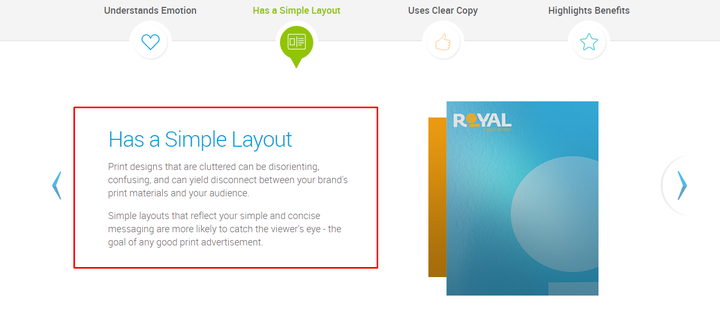
The problem is that you don’t want to overwhelm users with content. This is precisely what happens when content is presented in big chunks and long paragraphs. Attention spans on the web are limited and users tend to scan content rather than spend time reading it in depth.
Make sure content is divided into digestible chunks. Use bullet points, paragraph breaks, and numbered sections to help users consume and interpret content.

Effective Website Design
These basic dos and don’ts of web design should give you ideas for a few ways to improve your website, but don’t forget that web design is an ongoing, iterative process. Your website is never really “finished” so to speak. There will always be improvements to be made and new trends and technologies to adapt to. They key is to avoid adopting a design trend simply because it’s trendy. Always keep the needs of your brand’s specific users in mind and consider which design elements will help them accomplish their tasks and goals.
To learn more about how to improve conversion rate from website design, visit Blue Fountain Media online.