
For anyone who uses a word processor ― so, over a billion people, Microsoft estimates on its site ― a favorite font can be an identity marker as salient as an outfit or a hairstyle.
It can communicate formality or a more laid-back mood. Beyond that, it can illustrate the nuances of the user’s personality. For the twee, there’s Futura; for the old-fashioned, Times New Roman. And, for the history-loving, there’s Baskerville, a font that was created in the 18th century, and is still widely used today.
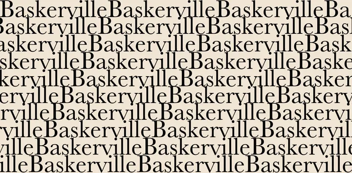
You might’ve seen a variation on the typeface adorning your favorite book or filling the pages of a poetry collection. Or, more likely, you’ve seen it as an option in the dropdown menu in Word, sandwiched between the sleek Arial and the goofy Comic Sans, the butt of typographical jokes.
With more elaborate finishing strokes (aka serifs) than Times New Roman, it’s readable but ornate, and therefore a popular option that designers use for mid-length texts, such as sections of poetry, book titles, old-fashioned-looking company logos and, occasionally, the interiors of the books themselves.
Baskerville appears in a popular, classic edition of Ulysses, and the 1965 back cover of In Cold Blood. Today, due in part to the prevalence of handwritten fonts on book covers, it’s more likely to be found on the back cover or inside jacket of a new title, such as Nate Silver’s The Signal and the Noise. It can be found on movie posters, like the one for last year’s “Hidden Figures.” It’s the font used for Jeb Bush’s 2016 presidential campaign and the wordmark (in modified form) for the Canadian government.
That’s a lot of visibility considering the range of fonts available today, but its widespread use is even more remarkable when you consider Baskerville’s long history, which began centuries before its birth.
The font dates back to the 1730s, when an English businessman named John Baskerville first began working on engravings for tombstones using a style of writing that would later resemble the lettering of his eponymous typeface. In the 1750s, Baskerville set out to design a thinner version of Caslon, the de facto typeface at the time. By 1757, he settled on a design he used to print an edition of Virgil’s work, and Baskerville was born.
At first, the font’s success overshadowed the use of Caslon, causing a rift between the two designs ― the practical stalwart and the elegant alternative.
“Many people don’t realize that the typeface generated a very mixed reaction when it first appeared,” designer and author of Let’s Talk Type: An Essential Lexicon of Type Terms Tony Seddon told The Huffington Post.
“In England [Baskerville] was vilified by many of his fellow printers,” he added. “It’s likely that this was largely down to professional jealousy as Baskerville was achieving a quality that others couldn’t recreate, but his printed work was also criticized at the time as too thin and narrow and hurtful to the eye.”
In the United States, however, Baskerville and his design had some notable admirers, namely Benjamin Franklin, who wrote a letter to the typeface’s creator himself. Franklin recounts a conversation he had with a so-called typeface “connoisseur,” who believed, as Seddon noted, that Baskerville was too difficult to read.
“I endeavored to support your character against the charge,” Franklin wrote to Baskerville before launching into an anecdote about a prank that he pulled on the gentleman in question. Franklin presented the man with text written in that earlier, thicker font, Caslon, but lied and said it was written in Baskerville, and asked the man to point out his precise criticism. The man complied, proving to Franklin that anti-Baskerville sentiments were hogwash.
Still, Seddon says Baskerville fell out of favor for decades before regaining popularity again around 1917, when a designer and eventual printing adviser to Cambridge University Press and Harvard University Press bought Baskerville’s old typeface molds and used them to distribute printed materials in America.
Today, Baskerville is available on both PCs and Macs, solidifying it as a popular font. Just as different letterpresses offered slightly tweaked variations of the original font, there are several digital varieties of the font, too; some are crisper, with thinner downstrokes, while others are heftier, and easier to read for several pages.
“I think its enduring appeal with professional designers is largely down to the fact that it’s got a certain flair and a handmade character,” Seddon said. “It was designed as a book face and it still excels at that today ― at least in the right kind of book anyway. Otherwise it’s good for invoking an historical feel to text without coming across as too stuffy.”
Designer and co-founder of Emigre Fonts Zuzana Licko agrees about the typeface’s versatility. In fact, she has such an affection for Baskerville that she designed her own typeface riffing on its curves and general look.
“Baskerville was one of my go-to typefaces in the early ‘80s when I used to order photo typesetting, which seems like another lifetime by now,” Licko told HuffPost. “I was intrigued by the variety of different Baskerville versions offered by the various type manufacturers, and less than two decades later, designing my own interpretation became possible with the personal computer.”
Struck by the warmth and humanity of the early versions of the typeface, Licko wanted to combine the look of various letterpress versions of Baskerville with her own impressions and feelings upon first seeing the typeface.
The result was Mrs. Eaves, a font that she named after Sarah Eaves, a woman who worked closely with Baskerville back in the 1700s. Married with five children, Eaves worked as Baskerville’s housekeeper and, after her husband left her, his lover. The two were married after Eaves’ husband’s death and worked together on typesetting before that.

“I thought it would be misleading to call my design Baskerville, as it had gotten too far away from what a user might expect from a font named Baskerville. So, instead, I sought to find a name that would make reference to Baskerville, and in reading about his life, I came across Sarah Eaves, aka Mrs. Eaves, and thought that was a lovely sounding name,” Licko said.
She describes her font as full and able to occupy space, but in a delicate way.
“This gives the reader some room to rest and contemplate, making Mrs. Eaves ideal for short texts, including poetry,” Licko said. “Mrs. Eaves loves to adorn book covers and relishes short blurbs on the flaps and backs of dust covers. Trips to bookstores are always a treat for me as I find Mrs. Eaves staring out at me from dozens of book covers in the most elegant compositions, each time surprising me with her many talents.”
Salman Rushdie’s Haroun and the Sea of Stories may be among the most popular titles expressed by Mrs. Eaves, which also appears on a Radiohead album cover and the original logo for music streaming provider Pandora.
So, when you next notice a typeface gracing the cover of your favorite book or album, you might consider that the fonts tell stories themselves. That the thin lines might’ve been praised by a Founding Father, and the rounded lettering might’ve been the handiwork of a later memorialized mistress.
Related
Before You Go
