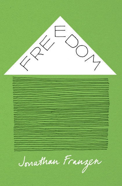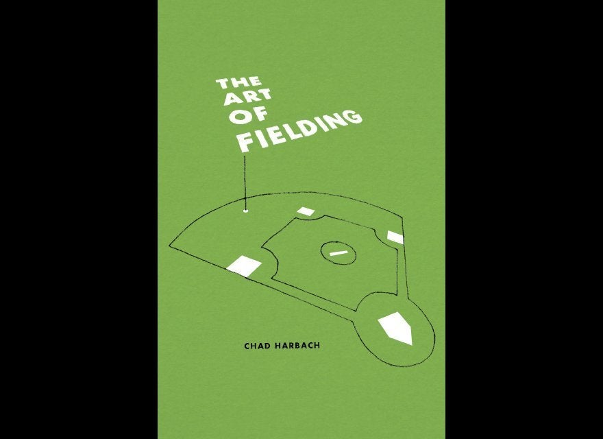
From Cover to Cover is a personal project of mine -- I read a book, then design a cover for it.
I started this project because when I am 90 (if I live that long), I want to have a library in my house (if there are still books) where every book jacket is designed by me. That is my long-term plan.
I've also wanted a project of my own, separate from client work, where I could have the freedom to do whatever I wanted without worrying about feedback and revisions. As a graphic designer, I work best when there is a visual problem that requires a solution: It's difficult for me to create my own content. Books provide the perfect "problem," since so much content has to be condensed into a single image. The cover has to relate to what's in the book, but also not give too much away. And to me, a good cover is just an image when you pick up the book, but is filled with meaning when you're done reading.
For the first five or six cover designs, I gave myself no constraints, but found I was spending lots of time searching for the perfect image on Google and Flickr. This made the covers seem less like a personal project, and added more hours to already lengthy computer sessions. So I decided to make the process a bit more challenging by creating all of the imagery - whether it was drawing, painting, cutting or scanning.
It also felt like the first group of covers didn't look enough like a series, and my library wasn't going to have the cohesive look I envisioned. I gave myself further restrictions; a color palette (green, white, black) and limited type choices (Futura, typewriter, hand drawn/handmade). I always prefer working with a set of limitations, so this made the project both more challenging and more fun.
The History of Love is a favorite on my reading list this year. It's a kind of book within a book and story within a story, where all the characters are inter-related without knowing it. For example, The History of Love is a physical book in The History of Love" and a lot of the story follows characters who are looking for its true origins. It turns out that the original The History of Love was destroyed in a flood and its authorship was later faked. For the design, I made the cover look like the title page of the original handwritten manuscript, with the crossed out author name alluding to the forgery.
The City and the City is a detective mystery and sci-fi mashup novel. My favorite part of the book is the underlying premise of the environment where the characters live. It's a city that occupies the same space as another city, in certain areas you're in both cities at once. Residents of the two cities can make out the buildings and people of the other city, but consciously seeing them is a crime. People of both cities have to learn how to "unsee" the other side. The cover and typography mimic this idea of being in two places at once.
Dune is a 60s science fiction novel set in the very distant future, about a desert planet called Arrakis where very little can survive. A lot of the book, aside from some infighting between Dukes, Lords and Emperors, focuses on the difficulties of surviving in the hostile desert environment. Right away I wanted to do something with sand, but I didn't want to make it too literal like a depiction of an actual dune.
So I got a bunch of sand from my backyard, plastic-wrapped the scanner, spilled a lot of sand on the scanner bed, and wrote Dune in the sand with my finger. It seemed the Fremen (the native inhabitants who thrived in Arrakis) would approve.
A great thing about personal projects, with rules that you create for yourself, is that you get to break the rules when it's appropriate.
One of my favorite rule breakers is the cover for Lolita. John Bertram asked me to be part of a project where book designers re-design the cover for Nabokov's Lolita. It's one of my favorite books, but not so much for the story, as for the language. You have to read each sentence two or three times to fully understand the double meanings and the word play. It's like drinking the thickest milkshake.
I designed the cover using my favorite sentence in the novel -- where Humbert Humbert goes through the list of names he has for Lolita. Since the book is primarily about his obsession with her, it felt like an appropriate sentence to explain the plot and alludes to the importance of language in the book. I tried making the cover green, then white, then black, but in the end it just had to be a rule-breaking red.
I am currently only two covers behind, I just finished reading The Big Sleep by Raymond Chandler and Outliers by Malcolm Gladwell. And, if anyone has any book recommendations, I am always looking to add to my library.
See some of my book covers below:
