Rejected Covers is part of an ongoing series on rejected book cover designs, in which we invite cover artists to reveal some of the rejected ideas and inspirations behind a particular project.
Jarrod Taylor, the designer of "Yok" by Tim Davys [Harper, $22.99]:
In your own words, what is this book about?
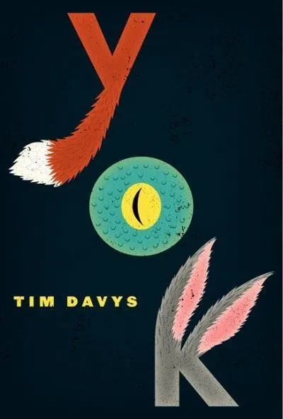
Yok is the conclusion of a four-book series about a city populated by stuffed animals who get involved in some pretty shady stuff. Each book is named after a neighborhood in the city, Yok is the bad neighborhood from what I can remember.
What was the mood, theme or specific moment from the text you depicted with this cover?
This one is more of a collection of stories rather than a novel like the others. So firstly, I had to convey that this was about stuffed animals, which the previous three all did in different ways. But I also wanted to get the idea across that instead of one protaganist there were multiple, in this case a fox, a gecko, and a rabbit. I think there’s also a monkey in there, but since there were only three letters in the title, the monkey didn't make it on the cover.
What inspires your design?
I think like most designers, I try to get inspiration from sources everywhere: TV, conversation, ping pong, beer, day dreams, etc.
What is your previous design experience, with books and otherwise?
I worked in Seattle for about 5 years, after going to school there. Mostly I worked at branding and advertising agencies. Then I got kind of burnt out and decided to finish school in New York. When I was done with school I decided to pursue book cover design, I got a job at a University Press for a couple months and then went to Harper Collins.
What was the biggest challenge in designing this cover?
The biggest challenge was probably trying not to get too cute with it, to keep it slightly dirty and dark. Hopefully it was successful at that, I’m not sure.
Did you consider different ideas or directions for this cover? Why were these rejected? Do you have a favorite amongst them? Are you happy with the final decisions as it ran?
The process for this one was pretty unique in that there weren’t really a lot of rejected ideas, or multiple rounds of revisions. I could name dozens of other titles that I’ve worked which have multiple rejects, but this one was fairly smooth. Everyone was pretty happy with it from the start. I think there were maybe a couple other ideas I showed, and some layout variations on the final but in this case I definitely think the strongest one survived.
What is the most important element of a successful book cover?
If you’re able to condense all of the ideas coming from a complex story into a simple and arresting image, I think you have yourself a successful book cover.
What are some of your favorite book covers?
"The Unbearable Lightness of Being" (Roberto De Vicq De Cumptich), "Labyrinths" (Rodrigo Corral), "This Book Will Save Your Life" (Paul Buckley)
Do you judge books by their covers?
Yeah, of course. Many of the books on my shelf were bought because of their covers, and I think I only regret a few of them.
Here are some of the rejected cover images for "Yok" by Tim Davys. The last image is the final book cover design.
