Rejected Covers is an ongoing series for which artists reveal their inspirations and unused design ideas for popular titles.
Below, Little, Brown Art Director Julianna Lee discusses her creative process for Edan Lepucki's debut novel, California. The book is a Hachette title, and has been buzzed about since Stephen Colbert promoted it on his show. It's a fresh take on the dystopian genre, as it focuses more closely on the travails of a married couple in post-apocalyptic America.
The cover for California did not go through my usual process of designing book jackets. The usual process involves presenting at least four to five concepts at a jacket meeting attended by the publisher, editor, and sales. Honestly, this design started as a reject of another title I was working on. Sometimes I love a design that is not selected, and I save it, hoping that it may fit with another project. However this was the first time when everyone at the meeting wanted me to use this cover for California instead.
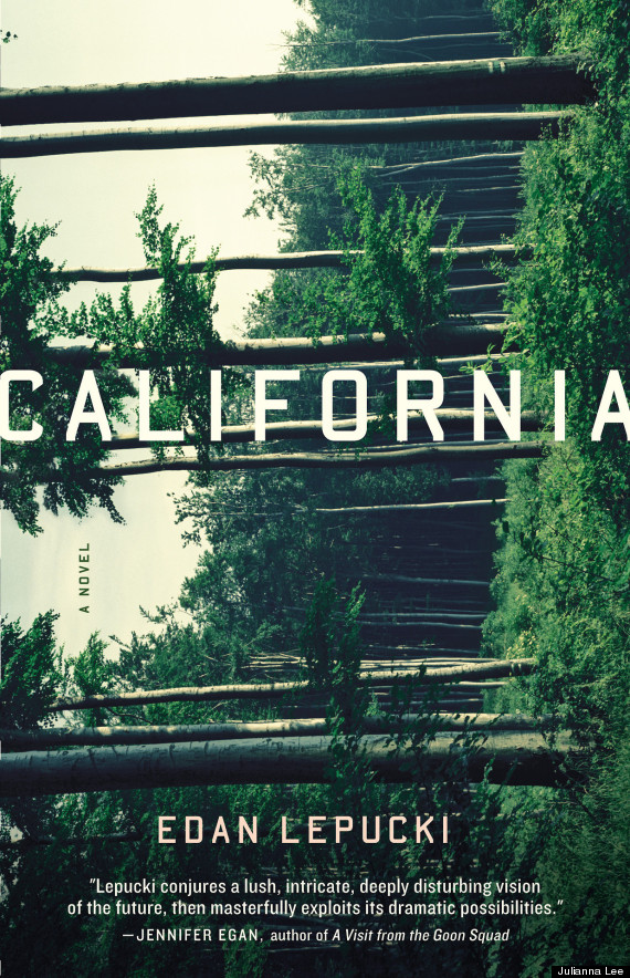
The story takes place in a post-apocalyptic future where civilization is devolving and California is in shambles. A married couple flees to the wilderness and learns to move forward in this dystopia. I wanted the mood to be disturbing and a bit chaotic. The beautiful, lush landscape of trees unexpectedly turned on its side shows that the world is not how it should be.
When flipped like this, the tree trunks create horizontal patterns of light and dark shadows. I placed the title and author’s name on the tree trunks, to emphasize the art and create a sense of movement. I chose a distressed typeface to mimic the state of decay in the story. And, to further play with the idea of disorder, I put the author’s name upside down. However the author was against the distressed font as well as the placement on the trees. She thought it too playful. Her friends and family hated that her name was upside down. Even though I preferred the surprise of an upside down author name, I could see that it may not be the best marketing move. She is a first-time author with an uncommon name, and we did not want to alienate shoppers.
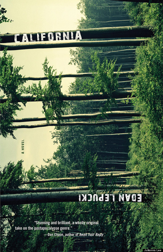
So I ended up going the direct route by centering type and making it much larger. The focal point moved away from the art and more towards the title. Now looking at the finished product, I think it is more effective this way because it has a “bigger book’ look. I chose a typeface called Carplates, which is a nod to California car culture. It also reminded me of vintage, metal signage at a junkyard, but in a subtle way.
I did want to try another solution just in case. I found a photograph by Swedish artist duo, Inka Lindergård and Niclas Holmström, that had these eerie, pink clouds over a horizon. I love that the clouds reminded me of LA smog, and the pink color made it look so strange and alien. I chose a rounded typeface that would evoke a once bubbly, sunshine state in contrast to this altered landscape. The mood is less chaotic and dreamier.
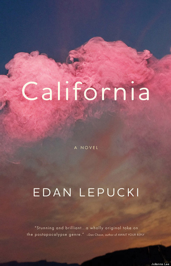
Although the editor liked this option too, she went with the original. So I kind of feel like I cheated in some way, however this is how the creative process goes, and sometimes rejected covers get a new life.
Below is the final cover for California: