Here's How One Photographer, And Her Nifty Handmade Machine, Can Photograph Your Aura

This Artist, And Her Nifty Handmade Machine, Will Photograph Your Aura

Photographs shed light on many aspects of our external appearance -- weird shadows, stray hairs, awkward smiles, lingering food particles between your front teeth. And, in very particular cases, they can illuminate something more. Something suspended between the internal and external, the visible and the invisible, the hippie-dippie and the profoundly mystical. Yes, we're talking about auras.

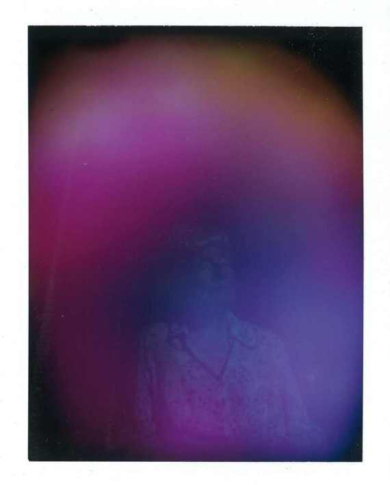
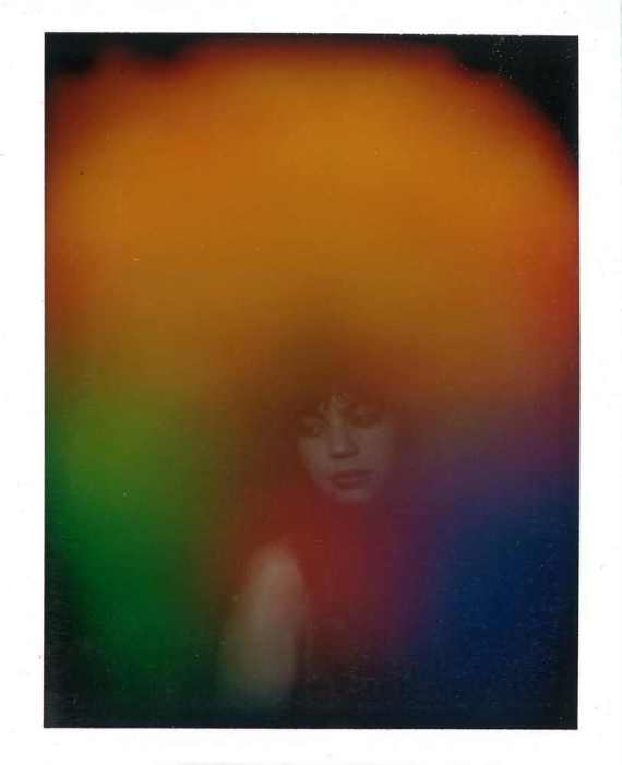
Photographer Christina Lonsdale, also known as Radiant Human, captures auras on camera in all their hazy, multicolored glory. "An aura is technically an electromagnetic field that surrounds the body," she explained to The Huffington Post. This field appears, in photographic form, like a glowing cloud, a lo-fi rainbow, an Instagram filter catered directly to your innermost essence.

aura

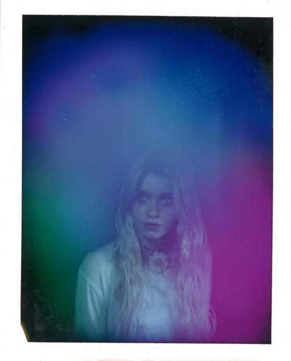
Lonsdale captures her subjects' auras via a hand-built device from the 1970s, originally invented by a man named Guy Coggins. The Aura Camera allegedly uses electromagnetic hand sensors that translate your vibrational frequency (or bio feedback) into a color, and then, with a second exposure, displays that color on an instant polaroid photo.

"I really want to create a platform for people to experience themselves in a new way," Lonsdale proclaimed. "It kind of reminded me of space exploration in the '70s."

Lonsdale purchased the camera from Coggins, who told her there are only 100 in existence. The machine lives inside a collapsable black dome, ready for travel. "I have my safe space with me wherever I go," she explains.

Lonsdale's primary sanctuary, where she conducts aura readings for clients, is speckled with rainbow books dating back to the 19th century, filled with clairvoyant artworks, paths to immortality and color decoders for aura reading. Although Lonsdale's craft fits right in at trendy "lifestyle celebrations" like Topanga Canyon's Mercado Sagrado, Lonsdale's stuff goes way back.

But how does one get into the business of aura photography, you ask? For Lonsdale, the unusual path seemed to be in her blood. "My mom is a visual painter who paints auras and spirits and goddesses she sees in her meditation. And my father founded two communes back in the '60s. It's been a part of my culture for a while, bringing me to this point where I want to do this stuff in a creative way and provide people an atmosphere to see what they're putting out into the world."

ar

Lonsdale's readings are typically five to 10 minutes long, consisting of both the snapshot itself and a condensed reading on the possible interpretations associated with your aura color.

First, the subject places her hands on a silver sensor, which is connected through cables to the camera. The model sits still for 10 seconds as the camera snaps two shots. You can only hope that if you happen to blink, it's while your ambience is being photographed. Then, she tells you what it all means.

"That's where it gets into an interesting avenue," she explains. "We're dealing with colors here. If you want to derive meaning from color, you're opening a pretty interesting box. I've used color theory in my readings. Usually what I do is share all the research I've done for each particular color. It's really up to each subject and what she wants to take from it. I provide a kind of color decoder; a boiled down, abbreviated version of what a typical reading is."

The color hovering on top of your image, Lonsdale explains, signifies your consciousness. The lower left portion indicates your inner qualities and the right side, what you portray to the outside world. Lonsdale hands out a handy color decoder that spells out some of the characteristics -- purple is equated with playfulness and magic while yellow denotes relaxation, optimism and intellectualism. Orange and tan represent logical and entrepreneurial tendencies while white hints at spiritual clarity.

aura

As further example, Lonsdale delved into the implications of a reddish aura to The Chalkboard Mag:

"When some people get red auras they get worried like they did something wrong, like they’re not a good person unless they get this perfect violet white. But let me tell you something: color is a frequency, its like a musical note. Just because one note is on the 'bottom' of a keyboard doesn’t make it less valuable. The cool thing about red is that it's always strong no matter what. It’s an access point to what drives us physically. Red was the first color we defined in our linguistic history and also the first color we painted with in the caves so long ago. Because of this, red can be considered a birth color; new beginnings. With new change comes strength and courage, and not without some challenge, as all you mothers well know. There is passion and desire to see you through, standing on a foundation of practicality and logic. This is a physical and energetic color that is full of powerful sensations, and when you have low muddy red, that just means you probably have a hangover."

Lonsdale explained that the constancy of an aura ranges from person to person -- some people are more fluid and dynamic depending on their surroundings, while others remain relatively stagnant. She noted that earlier in the day a mother and her young daughter both emitted the same aura, which is also very constant between married couples. Either that, or they're each other's complete opposite.

Yes, Lonsdale's artistic investigation is not for skeptics, but for those willing to indulge in a little new age mysticism, it offers the opportunity to know yourself in a whole new way. The experience, somewhere between a psychic reading and a portrait sitting, allows you to examine yourself as not just a tired person with a bad hair day, but a truly radiant human.

Do you want to visualize your vibes in a chromatic wash of hazy shades? See Lonsdale's upcoming tour dates here and, in the meantime, see some of Lonsdale's dreamy portraits below.

Before You Go

Lead White
Finlay uses the story of 18th century London "It Girl" Maria Gunning to illuminate the mysteries of lead white. Gunning was famous for her makeup, consisting of a cream made from lead white that gave a woman a "waiflike" appearance. It was extremely toxic, and eventually led to intense mental and physical ailments followed by Gunning's actual death. The process of making lead white is equally disturbing: workers would stack pots containing vinegar and lead one on top of the other, heaping manure over the tops for months. This method would transform lead acetate into basic lead carbonate, and, over time, create flakes of lead white. The color can be seen in many Dutch portraits from the 17th century -- a pigment that gave faces a sense of light and ethereal glow.(After Ann-Louis Girodet de Roucy-Trioson (French, 1767–1824). Burial of Atala, after 1808. Oil on canvas, 19 7/8 x 24 3/8 in. Los Angeles, J. Paul Getty Museum. 83.PA.335.)
Chrome Yellow
Chrome colors, created when chromium interacts with acid and alkali, were used in the 20th century to adorn school buses and road signs. Like urban planners and transportation administrators, Vincent Van Gogh was a fan of chrome colors too. And he used the acid-inducing yellow paint and alkali-inducing oranges to contrast his epic "Irises." Fun, albeit horrifying, fact: During one of Van Gogh's psychotic episodes, he was found to have a tube of chrome yellow paint in his mouth. (Chrome yellow is full of lead and, as Finlay points out, could not have helped his mental health state.)(Vincent van Gogh (Dutch, 1853–1890), Irises, 1889. Oil on canvas, 29 ¼ x 37 1/8 inches. Los Angeles, J. Paul Getty Museum. JPGM 90.PA.20)
Patent Blue
French Lumiere brothers Auguste and Louis are to blame for patent blue. Using potato starch granules, they created some of the first color filters used in Autochrome cameras in the late 19th century. They needed to be extremely saturated so they wouldn't fade during exposure, and the results were patent blue (used in Blue Curacao), tartrazine (yellow) and rose bengal (pink).(Sergey Prokudin-Gorsky (Russian, 1863–1844), Emir of Bukhara, 1911. Library of Congress LC-DIG-prokc-21886.)
Tyrian Purple
When the Romans conquered the Greeks, they imported tons of pigments and dyes to Rome. Their favorite? A hue made from macerated enzymes of small shellfish -- purpura -- that became a high fashion and art staple. For a time, this version of purple was reserved only for Roman rulers and the upper class. Fun fact: the making of purpura involved a hideously fishy smell so foul the vats used to prepare the pigments were housed outside the city walls. Tyrion comes from the Roman city of Tyre, located in today's Lebanon.(Engraved portrait of Aurelain, Roman, 260–280. Amethyst, ¾ x 9/16 x ¼ inches. Los Angeles, J. Paul Getty Museum. 84.AN.856.)
Cinnabar, Vermilion and Minium
Cinnabar is a "bright, shiny, orangey-red mineral" extracted from a mercury mine in central Spain that, when made synthetically, amounted to Vermilion, also called "dragon's blood." The ancient Chinese and Romans were drawn to the color, along with minium, an even more vivid orange color that can be seen in the painting of Saint Luke above. Fun fact: Indian and Mughal paintings involving this orange were called "miniatures" not because they were small, but because of the minium!(Saint Luke, from a gospel book, Ethiopian, about 1504–5. Tempera on parchment. 13 9/16 x 10 7/16 in. Los Angeles, J. Paul Getty Museum. 2008.15.143v.)
Rose
This particular rose color has origins that date back to the Saxons, and a time period marked by Europe's desire to copy the "white gold" porcelain of China that was so expensive to buy and transport across nations. "Meissenware" eventually saved the day, imitating Chinese porcelain so effectively it became a favorite of King Louis XV's mistress, Madame de Pompadour. She especially liked a rich bright pink introduced in 1757 that later became known as "rose Pompadour" or "Pompadour pink." It was produced by mixing gold, glass and nitrohydrochloric acid.(Ewer, French (Sèvres Manufactory), 1757. Soft-paste porcelain, pink ground color, polychrome enamel decoration, and gilding, 7 9/16 x 5 3.8 x 3 3/16 inches. Los Angeles, J. Paul Getty Museum. 84.DE.88.1.)
Madder Red
Madder red can be seen in early Jehan Gobelin tapestries made for King Louis XIV in the 17th century. This red (and some hot pinks and oranges) were made from a blend of cochineal and a Middle Eastern pink shrub root called "madder." One of the keys to translating this blend into pigment was adding stale ox blood or cow manure to steeping threads. Fun fact: in the 19th century, the Royal Tapestry Factory in Paris thought the madder red tapestries were fading, but the illusion of color loss was simply a result of artists not understanding the color wheel. The tapestry makers of yesteryear were not matching complimentary colors and thus the patterns seemed dull when they lost their novelty. (Color wheel, plate 3 from Des couleurs et de leurs applications aux arts industriels á l’aide des cercles chromatiques, by Michel Eugène Chevreul (French, 1786–1889) and René Digeon, 1864. Los Angeles, Getty Research Insitute. GRI 90-B8575)
Indian Yellow
Joseph Mallord William Turner was a proponent of "pan paints," which were -- essentially -- paints that didn't dry out, incorporating pigment, gum arabic and glycerin. One of his go-to pan paints was Indian yellow, a hue made from the urine of cows or buffalo fed with mango leaves. Their pee was harvest in buckets, added to clay and clumped into color balls. It amounted to the transparent kind of yellow you can see lingering in Turner's canvases.(Joseph Mallord William Turner (British, 1775–1851), Modern Rome—Campo Vaccino, 1839. Oil on canvas, 36 1/8 x 48 ¼ in. Los Angeles, J. Paul Getty Museum. 2011.6.)
Sepia
Before color photography made it big, photographers immersed in the world of black-and-white imagery turned to sepia to capture a more gray-toned picture. Sepia is an ink made from cuttlefish. Another alternative to monochromatic portraiture was hand-painting photographs, which was an arduous task.(Antoine Claudet (French, 1797–1867), Portrait of a Girl in Blue Dress, about 1854. Daguerreotype, hand colored, 2 ½ x 2 1/16 in. Los Angeles, J. Paul Getty Museum.)
Mauve
We have chemist William Henry Perkins to thank for the color mauve. During experiments pertaining to a possible malaria cure extracted from tar, he noticed a "strangely beautiful color" tinting the residue of his flasks. That color was a soft version of violet, which Perkins originally named "Tyrian Purple," after the Roman favorite we discussed earlier. He soon changed it to mauve or mauveine. His discover led to a pigment frenzy, in which chemists literally mined coal to see what colors were hiding inside. (Mauve sample from The American Practical Dyer’s Companion by F. J. Bird, 1882. Los Angeles, Getty Research Institute 84-B25071.)
Close

What's Hot