Fashion Week came and went in New York, but we're still thinking about some of our favorite looks from the runway. For example, this stylish ensemble by Nanette Lepore, which mixes tawny yellow, pink, baby blue, and a deep, almost black, turquoise. There's not doubt that bursts of pink, green and blue can really stand out against neutral hues, but we're pleasantly surprised to find that they are just as vibrant when combined with a bright yellow. The combination is fun but there's also a touch of the unexpected.
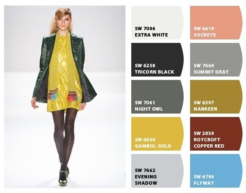
Nanette Lepore 2012 look, photo from Gorunway. Color palette created using Chip It! by Sherwin-Williams.
To get the paint swatches for our homes, we used 'Chip It', Sherwin-Williams' color palette generator tool. This palette inspired us to do a quick search to see how these colors can be used to stunning effect in different rooms, from a living room that features bright bursts of yellow and pink to an orangey-yellow dining room that's decorated with a pale blue antique-style console cabinet. We also came across this soothing bedroom that is outfitted with a great upholstered yellow headboard with with a green trim, which really helps brighten up the space.
Want more color ideas? Flip through the slideshow below other designer collections that have inspired our home color palettes.
Related
Before You Go
