
Let’s face it, Comic Sans is a bit of a joke in the font world. Its unpopularity even moved one graphic designer to fix the oft-ridiculed typeface.
Craig Rozynski developed a newer, cleaner version of the 20-year-old font. He calls the upgrade Comic Neue.
The new font does away with most of the mashed-together and cartoonish features of its predecessor in favor a more elegant design that maintains the font's casual style.
“Comic Sans wasn’t designed to be the world’s ubiquitous casual typeface,” Rozynski wrote on his website. “Comic Neue aspires to be the casual script choice for everyone including the typographically savvy.”
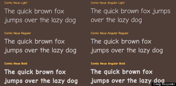
The font comes in various shapes and sizes, but each corrects Comic Sans’ less popular characteristics.
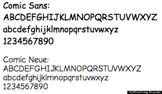
A comparison of the "regular" font version for both Comic Sans and Comic Neue.
When Microsoft released the original font back in 1994, its creator, Vincent Connare, had designed it only so that Times New Roman wouldn’t be used in a children’s program called “Microsoft Bob.”
“There was no intention to include the font in other applications other than those designed for children,” Connare wrote on his website. “The inspiration came at the shock of seeing Times New Roman used in an inappropriate way.”
According to The Washington Post, the font has inspired a global movement to ban it. In fact, if you type "most hated font" into Google, Comic Sans pops up.
“I simply set out to fix the weirdness. I still wanted it to be a casual typeface. I still wanted it to be Comic Sans, but a version you couldn't easily fault,” Rozynski told commercial arts and design magazine Creative Review.
Right now Rozynski has no immediate plans to start charging people for his font. He told Creative Review that he fears putting a price tag on the font would make people lose interest very quickly.
“What's online now for download will be free forever," he said. "If I give it a fully realized set of glyphs and fine tune it, I may offer that for sale.”
CORRECTION: An earlier version of this post displayed an incorrect version of "Conic Neue Regular." The issue has been fixed.
Related
Before You Go
