
2017 is finally here, which means that we're looking forward to a change of pace in every facet of our lives. While we love a compelling, high-contrast neutral palette, we're starting to get a bit bored with the monochromatic schemes that have dominated interior design for the past few years. In the coming months, we're going to continue spicing up our neutral palettes with pops and bursts of bold color choices. Check out the colors that we're sourcing for the upcoming year.
Muted Variations
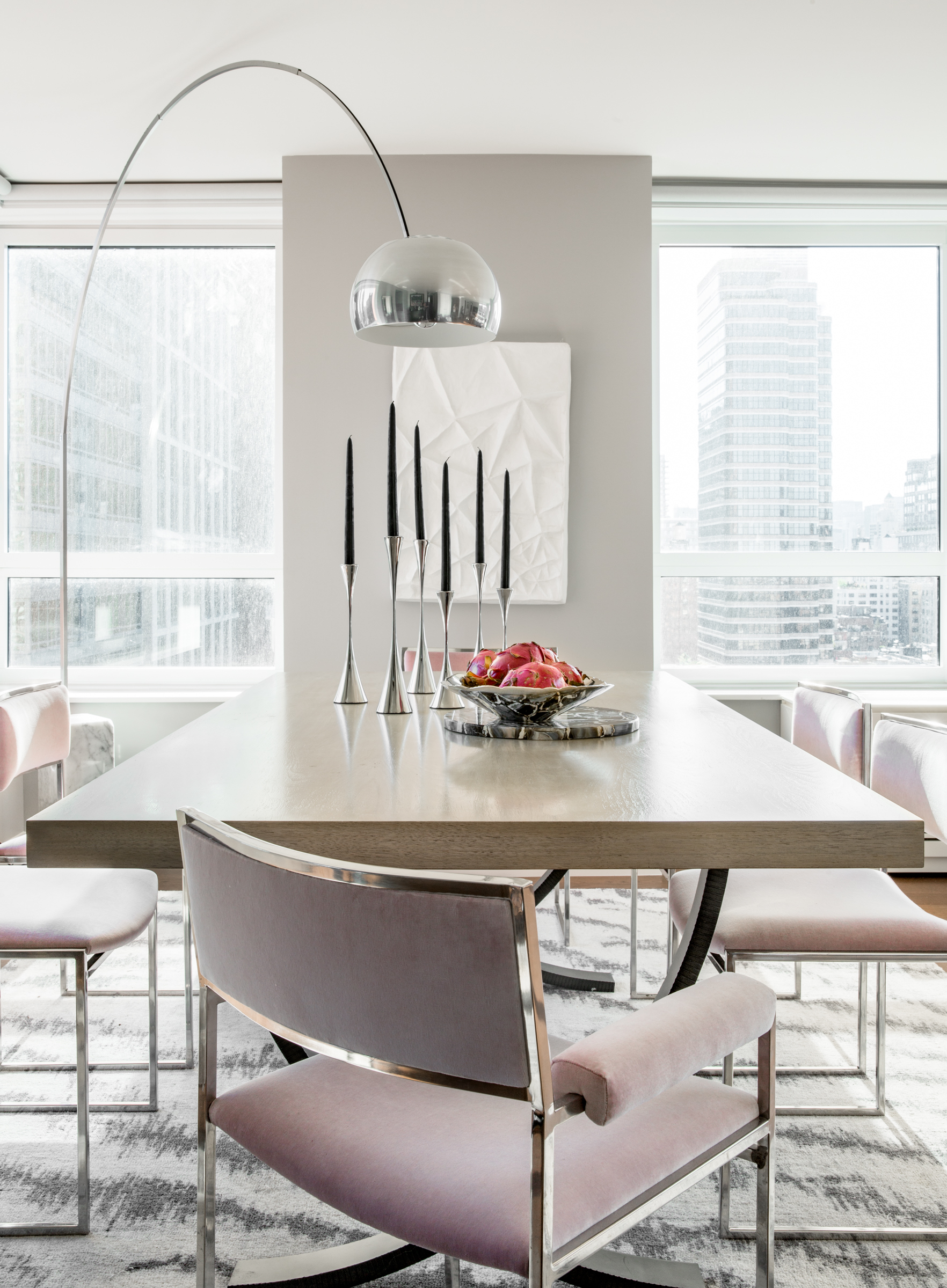
The trend towards muted variations of brighter colors is something that's had a huge influence on us for the past year, and is going to continue to be a design inspiration in the coming months. While bright colors work best in small pops and accents, a more subdued variation can be incorporated in larger swaths. Check out the vintage chrome chairs that we reupholstered with a muted pink fabric for this Upper East Side Luxury Condo redesign.
Greys With A Little Beige
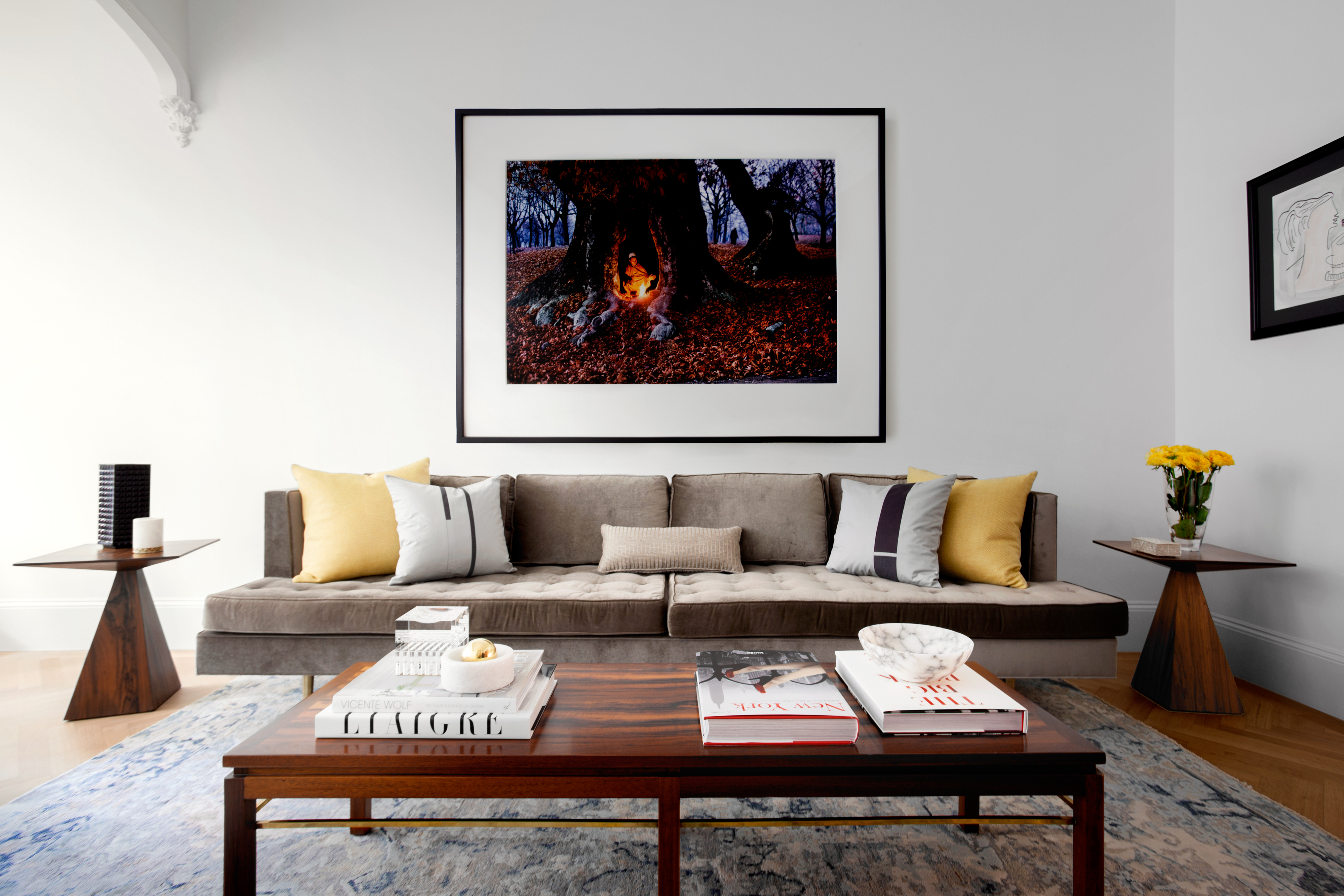
While khaki and blander beige tones are still a design faux pas, we've recently been incorporating beige pieces with grey overtones. We placed this greyed-out beige couch in the sitting room of this mid-century palace on the Upper East Side. With any bold color choice, keep proportion and shape in mind. While the fabric of this couch is a bit old-school, the angular shape and square corners tie it in with the rest of this home.
Greys With A Touch Of Color
We love a solid, angular grey couch. But if a standard grey color feels a bit impersonal, then consider opting for a grey fabric that has a bit of color mixed in. In this New York apartment makeover, we sourced a grey couch that's infused with a purplish hue, for an updated variation of the classic tufted couch.
Jewel-Tone Velvet Fabrics
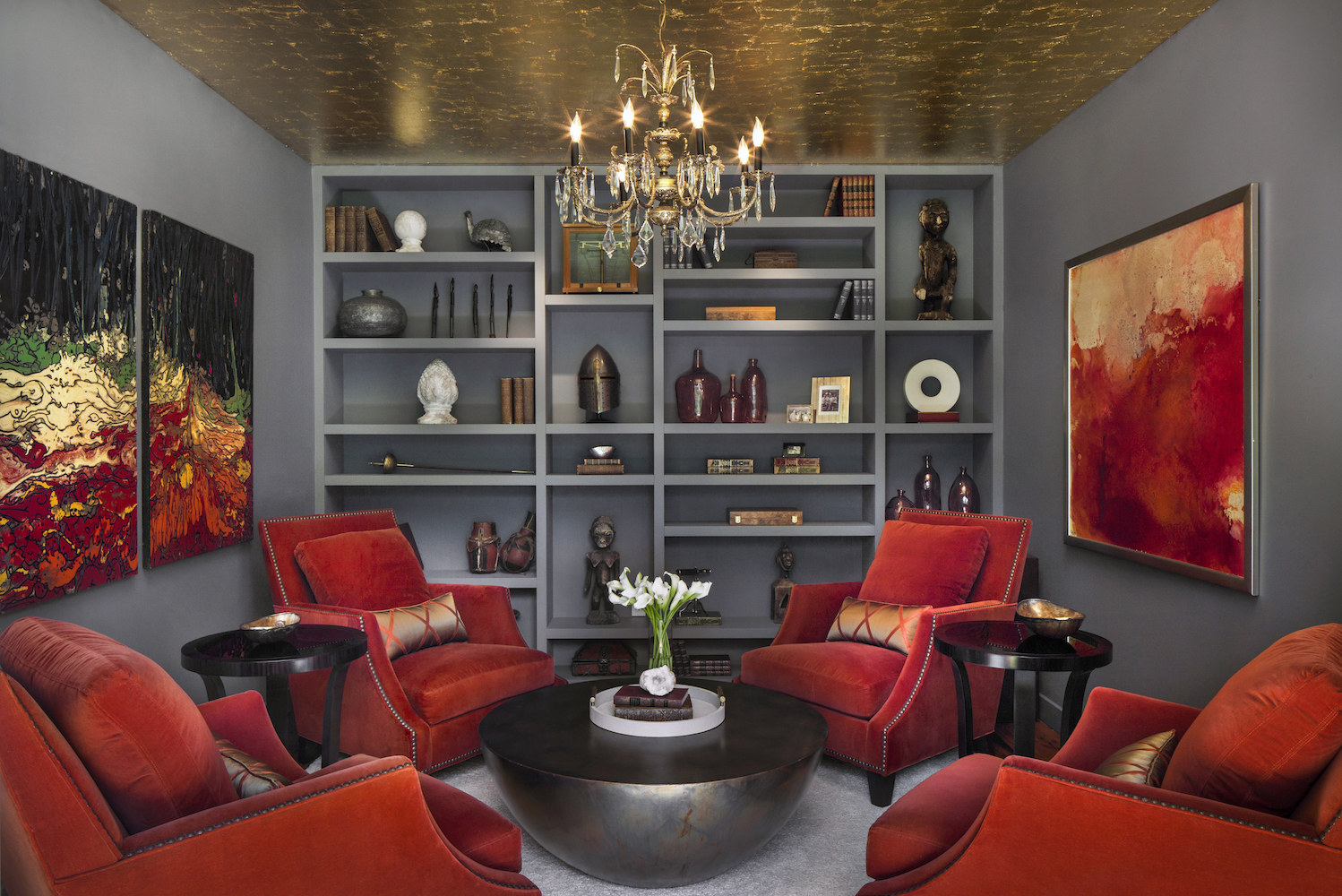
For 2017, we're going to be placing an emphasis on more natural and ephemeral color choices. We're loving jewel tones--rubies, sapphires, and emeralds--especially as choices for velvet armchairs and couches. To add a flare of color in the library of this Greenwich, Connecticut country estate, we sourced a quadruplet of ruby-red velvet chairs.
More Jewel Tones
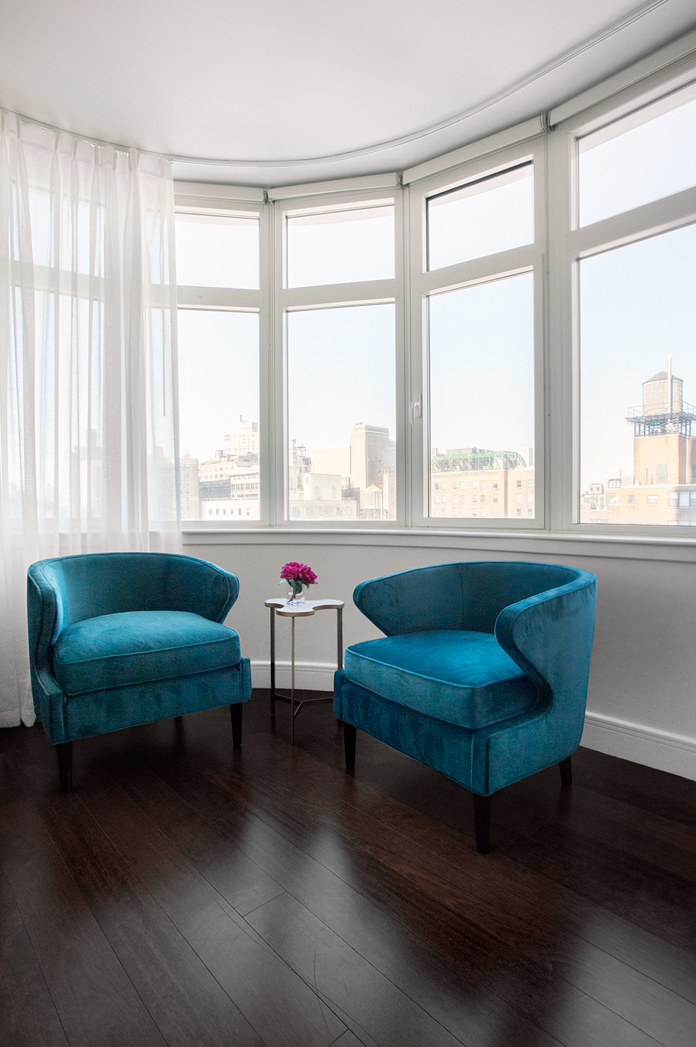
And if you're looking for another example, check out the blue velvet armchairs that we sourced for this light and airy Manhattan apartment.
Chalky Pastels

If you're looking to dramatically change your home design scheme in 2017, then consider painting your walls a new color. While you might not want to paint your entire home in a pastel or chalky tone, smaller rooms can greatly benefit from a bold, bright color, particularly if the room lacks natural light. In this New Jersey home office, we painted the walls a bright, chalky pastel blue color. It not only refreshed the space, but it dramatically brightened it as well.
Primary Colors
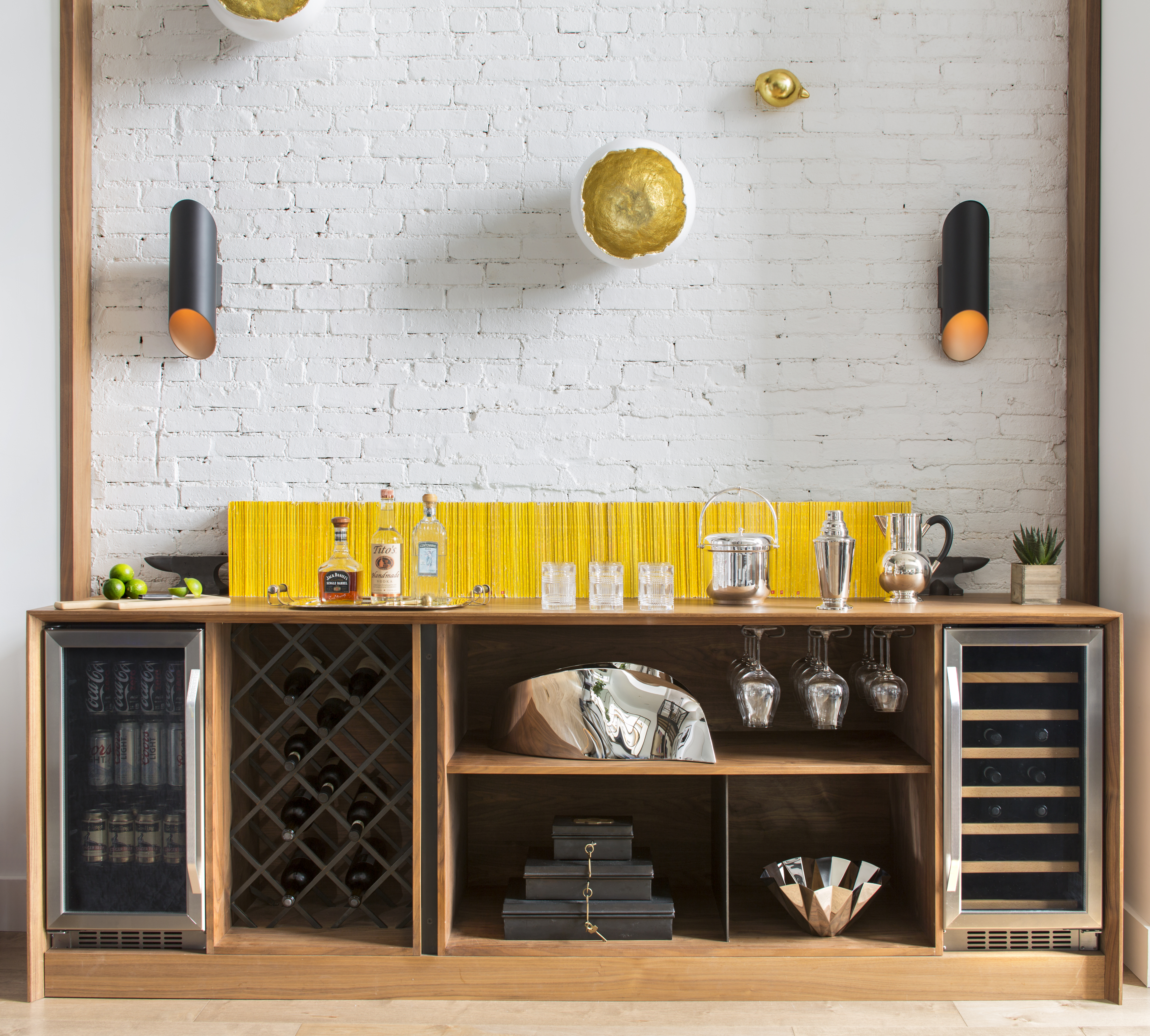
No matter the season or year, we'll always love bright pops of primary colors. In the bar of this SoHo duplex, we sourced a daisy-colored backing, for a well-placed accent.