
A catering company called Dirty Bird Fried Chicken aroused some controversy with its suggestive logo.
Some people who see the logo think it resembles a rooster. Others think it resembles a penis at the point of no return.
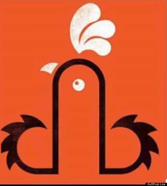
Mark James, the logo's designer insists it's supposed to be a barnyard bird.
“We were given the name Dirty Bird as the brief, and started working on ideas. We looked at the initials, DB. Then worked with the lowercase ‘db’ linking them to form the shape of a rooster. It’s a graphic representation of a rooster incorporating the initials. It depends on how you look at it," he said according to the Mirror. “I’m not sure there have been any complaints. A few comments, but it’s in the eye of the beholder, as they say.”
Company owner Neil Young insists he never intended the logo for his Cardiff, Wales food truck to appear phallic.
“We’ve never really thought about it like that. Our designer created a d and b for ‘dirty bird’ then pushed them together to make a cockerel,” he told Wales Online.
Just to be clear: Dictionary.com defines "cockerel" as "a young domestic cock, usually less than a year old." And the word "cock" in this definition means "rooster."
Young and James may be crying fowl about the reaction to the allegedly unintended innuendo, but it should be noted that the food truck does also have saucy giant posters telling customers to “Touch My Thigh” and “Touch My Breast.”
 Like Us On Facebook |
 Follow Us On Twitter |
![]() Contact The Author
Contact The Author
Related
Before You Go
