
Not too long ago, Southwest Airlines, the world's largest low-cost carrier, changed their logo. It wasn't a pointless exercise like most logo changes (see Chap Stick and Pay Pal's tepid reinventions last year) or a fiasco (like the Gap's logo refresh in 2010 which last all of one week after a public outcry, with more than 2,000 comments on Facebook). But what's in question is whether the Texan airline made the right choice for its new pictogram-- a multi-colored heart.
It was executed by Lippincott, the global brand strategy and design consultancy, so we know they had some of the world's best on the case. Here's how Lippincott described the assignment on their website:
"The task was given to distill more than 40 years of Southwest's history into one modern, impactful look, representing the exciting future of a one-of-a-kind airline." Despite the proclamation, the unavoidable question from naysayers will be: A heart? Really?
So what's the issue? Let's start with the reasoning from Lippincott: "The Heart emblazoned on the aircraft belly is symbolic of Southwest's commitment to its people and passengers, demonstrating that Southwest cares about each and every one. The Heart is the finishing touch that makes the Southwest brand unique and becomes a reminder that employees put their Hearts into every flight."
The problem of course it that it's too literal and declarative. It telegraphs its brand's emotional purpose (the thing we feel when we experience a brand) rather than allowing us to close the loop on our own. To be powerful, emotional brand benefits should reach the irrational side of our brains. That part needs clues not cue-cards.
Consider two great logos that use a similar candy-striped theme -- Apple and NBC. Both are iconic but both require us to run the last mile in the semiotic grid. We have to complete the syllogism: Apple = Newton's Apple = Adam's Apple = Knowledge/Inspiration. The same with NBC's peacock feathers which evoke a kaleidoscope of colors which we take to symbolize the kaleidoscope of experiences we see on the network. It's just abstract enough to intrigue us.
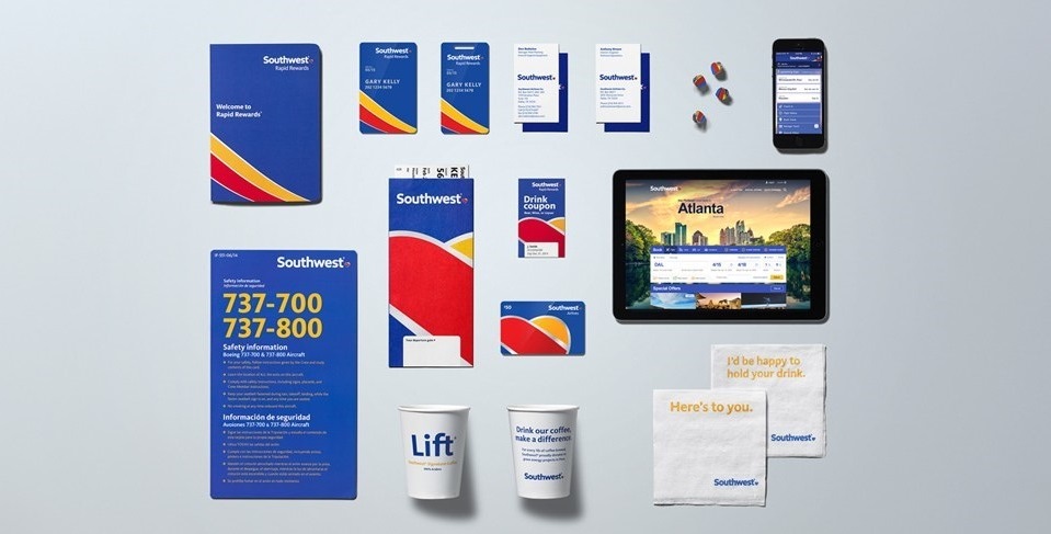
Logo design is all about semiotics or the science of signs. But, despite its name, the science is relatively simple at the outset. There are three types of signs -- icons (they look like what they refer to); indexes (they suggest or are related to what they are referring to -- footprints suggest an animal) and symbols (they require some leap of imagination, cultural agreement or education to get the reference - think of a red light or the Yin & Yang sign). Generally, icons make the worst logos because we are not asked to do any work and therefore are not engaged by them (think of the old Bell telephone logo or the current Guitar Center logo); indexes and symbols work much better but they require a tension and elusiveness to draw us in. That's why a look at the great logomarks in history show that most of them have a decided coolness and reserve. They don't hit you over the head but instead maintain a tension that compels you to draw closer. They are prompts rather than pleas. Which is why the new Southwest brand works better when the heart is obscured or cropped so it isn't as obvious. We see this in the printed touchpoints in the Southwest brandscape which work beautifully because the heart is blown up to reveal a small part of the icon at the edge of the frame allowing us to work for our supper as viewers. Similarly, their new custom font by Monotype's Dan Rhatigan and Jim Ford called Southwest Sans is stellar -- a script that subtly indexes a beating heart with its slightly irregular lines and open forms.