WASHINGTON -- A week ago, HuffPost Pollster launched a new presidential poll tracking model that is now fully incorporated into the maps and charts of the HuffPost Election Dashboard. The new model pools all available data, both national and statewide, to produce a more robust and sophisticated estimate of the current polling snapshot in each state.
But one aspect of the new system has confused many readers. The way we used colors to classify each state as a "tossup" or as "leans" or "strong" for a given candidate seemed inconsistent. For example, a 9-percentage point lead for Mitt Romney in South Carolina rendered the state light red for "lean," while a smaller 4-point lead turned Florida dark blue for "strong." How could that be?
The answer is that we initially opted to classify states based not on the size of the leading candidate's margin, but on the statistical confidence of that lead. That level of confidence depends on the number of polls driving each state's estimate and the number of interviews conducted for each poll.
The inconsistency stems from the fact that the number of polls and interviews varies greatly from state to state. For example, we have entered a dozen new polls into our database for Florida in September alone, but only one poll all year in South Carolina (and since that one poll is quite dated, the estimate for South Carolina is derived mostly from the national data and from states with similar historic voting patters). Hence the paradox: We can have more statistical confidence in the reality of small Obama leads in battleground states like Florida than in larger Romney leads in non-competitive states like South Carolina.
Over the past week, we've become convinced that this classification created two big problems. First, nearly everyone who noticed the inconsistency was confused about it, and few readers of the map were likely to follow the links to read explanations like the one in the previous paragraph.
Second, and more important, our tracking model has grown much more confident about poll averages over the past few weeks as the number of polls released has increased substantially. In the last week alone, the model's average level of confidence about Obama or Romney leads across the states has jumped from 91 to 98 percent.
That increased confidence brings us to a point that students of statistics often face: Given enough data, all differences are statistically significant, even if they are not substantively meaningful. And it became clear over the last day or two that the coloring of the map is beginning to tell as much or more about the number of polls done in each state than about the relative standings of the candidates in those states.
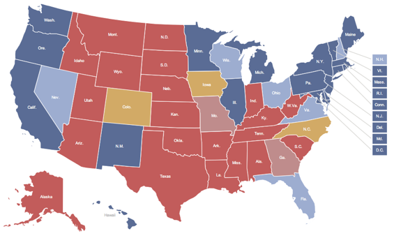
So as of Friday afternoon, the Election Dashboard has switched to a simpler classification based on the size of the leading candidate's margin: We classify as a "tossup" (yellow) any state where the margin separating the candidates is 2 percentage points or less. States where a candidate leads by 3 to 5 percentage points are classified as "lean" (light red or blue), and states where a candidate leads by 6 points or more are classified as "strong" (dark red or blue).
We want to stress that this change has no effect on any of the state-level estimates generated by the model. The map will also continue to show the level of statistical confidence for each state's estimate (which appears when you mouse over each state).
This change has produced the following shifts on the map: Colorado and Iowa moved from lean Obama to tossup; Virginia and Florida shifted from strong to lean Obama; Missouri moved from strong to lean Romney; and South Carolina, South Dakota and Tennessee all shifted from lean to strong Romney. The current electoral vote totals are 317 for Obama, 191 for Romney, with three states -- Colorado, Iowa and North Carolina -- in the tossup category. A candidate needs 270 electoral votes to win.
We apologize for any confusion caused by this change or the complexity of the original classification system. The revised Election Dashboard should be even more intuitive and user-friendly for our readers.
Before You Go