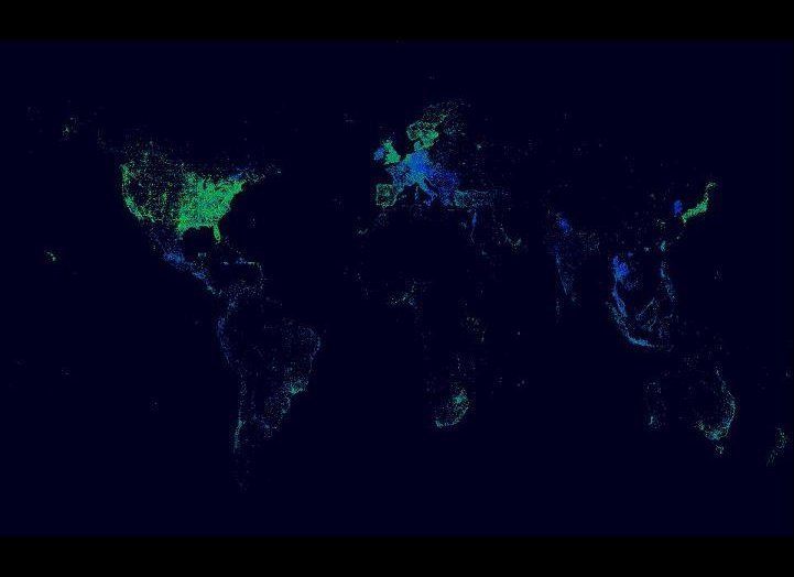
The Facebook data team has leveraged the vast quantity of personal information collected from its 900 million users to visualize how our habits, political leanings, and demographic information squares with where we are in the world.
The visualizations offer yet another reminder of just how much Facebook knows about its users and how closely it can track what's going on around the world. Thanks to the "likes," check-ins and photos we share, the social network has created detailed maps of our activity that shows nuances between different states and even disparate New York neighborhoods.
The four new maps created by the Facebook data team -- which show travel, check-ins by political affiliation, check-ins in New York City, and the age of people checking in worldwide -- were inspired by a map of Facebook friendships created by Facebook intern Paul Butler in 2010.
The latest maps were posted to the Facebook Data Team page by Justin Moore, a Facebook engineer. He wrote the following in a post explaining the visualizations:
These posts were created by processing location data using the aptly named Processing, a Java based open-source language for creating visualizations. We chose various time slices, from a single day snapshot to year-to-date images for analyzing longer-term trends.
Check out the maps in our slideshow below, including Paul Bulter's original picture from 2010. What were you most surprised to see?
