*Scroll down for picture.*
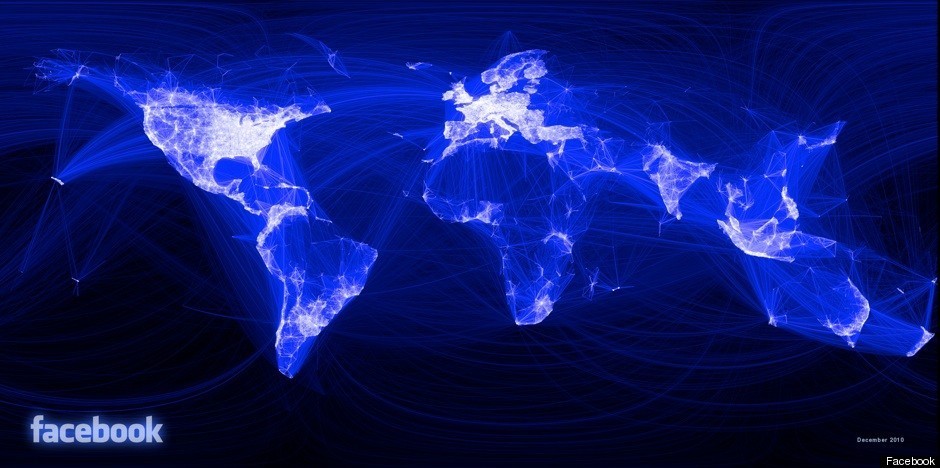
Paul Butler, an intern with the Facebook data infrastructure engineering team, has created a gorgeous map of the world that illustrates the human connections on Facebook and the distances those relationships span.
"I was interested in seeing how geography and political borders affected where people lived relative to their friends," Butler wrote in a Facebook post accompanying the map. "I wanted a visualization that would show which cities had a lot of friendships between them."
Fascinatingly, Butler did not set out to create a map of the world, although something distinctly map-like indeed materialized as a result of his work.
Using available Facebook data, Butler examined a sample of 10 million friendships, plotted the location of each person along latitude and longitude lines and drew a line to connect each pair of friends. The more friendships that existed between the same pair of cities, the brighter the line connecting them. As Butler worked, he noticed a map emerging from the data.
He wrote:
Not only were continents visible, certain international borders were apparent as well. What really struck me, though, was knowing that the lines didn't represent coasts or rivers or political borders, but real human relationships. Each line might represent a friendship made while travelling, a family member abroad, or an old college friend pulled away by the various forces of life.
Take a look at Butler's map (below), and notice the dark areas on the map that represent where Facebook use is less prevalent. Then, check out NASA's composite photograph of the earth at night (here) and note the striking similarity between the two images.
LOOK: