
There's a new food pyramid in town, and it's a plate.
The USDA's new food icon is a brightly colored graphic that breaks a healthy diet into four main sections: fruits, vegetables, grains and proteins, with a small side of dairy.
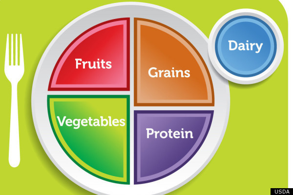
Government officials, including First Lady Michelle Obama who was on-hand for its launch this morning, hope the new graphic will serve as a simple "how-to" for making food choices by providing a clear breakdown of what our plates should look like.
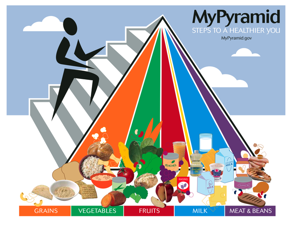
It replaces the old Food Guide Pyramid, first launched in the early 1990s, then revamped in 2005.
The revamped pyramid:
The old school pyramid:
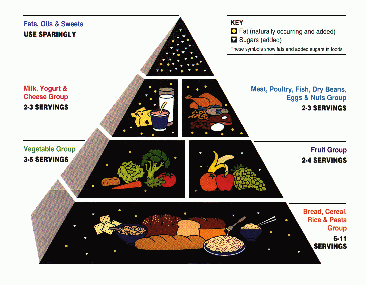
The Atlantic reports that the food industry took issue with the original food pyramid because it established food hierarchies, while many nutritionists complained that it encouraged people to eat too many grains.
The 2005 pyramid, which was meant to address those issues, also received its fair share of criticism. The Atlantic says it was just too difficult for people to understand, describing it as "hopelessly complicated" and "impossible to teach."
But thus far, the buzz for the new plate image has been far more positive.
"With the old pyramids, it was very hard to translate the recommendations into what you should eat," said Dr. Margo Wootan of the Center for Science In The Public Interest. "This is very straightforward. It takes a lot of the guesswork out."
Toby Smithson, R.D., a national spokesperson for the American Dietetic Association agrees.
"It's such a recognizable image," she said. "Everybody has seen a plate, used a plate. It's much easier to visualize when it's something we use on a daily basis."
Smithson added that the plate is an improvement because it's easy for non-readers to understand, which means young kids can learn the message early on and carry it with them throughout their lives. She also likes that the new image and accompanying Choose My Plate campaign put an emphasis on the positive.
"I like that message and that word choice," she said. "It's about choosing the right things, not so much about avoiding."
The new food plate image reflects the 2010 Dietary Guidelines for Americans, which promote measures like switching to fat-free or low-fat milk and opting for water over sugary drinks. The guidelines also recommend making sure that half your plate is filled with fruits and veggies -- a recommendation that Wootan said is one of the major points highlighted by the new graphic.
She cautioned, however, that people should be aware of the size of their plates when trying to model their meals after the image.
"You can't fill up a platter," she said. "People should be paying attention to the different food groups, but they should also be watching their serving sizes. They should eat off an eight or nine-inch plate, like people did in the old days, before we had such an obesity problem."
WATCH the evolution of the food pyramid on YouTube: