F. Scott Fitgerald's iconic classic, The Great Gatbsy, is firmly cemented in the great American literature canon. Admired for its glamorous, romantically edgy glimpse of the Roaring Twenties, the novel is a delicious ode to the excess and awe of a generation long ago.
Contemporary authors and artists alike continue to cite Mr. Fitzgerald as creative inspiration, decades after his work was first circulated. One amongst them is a Russian designer by the name of Vladimir Kuchinov, a type face enthusiast who recently embarked on an experimental art project that caught our eye. Let's just say it involves Gatsby's celebrated book, a survey of jazz music and a tricky method of crafting fonts known as generative typography.
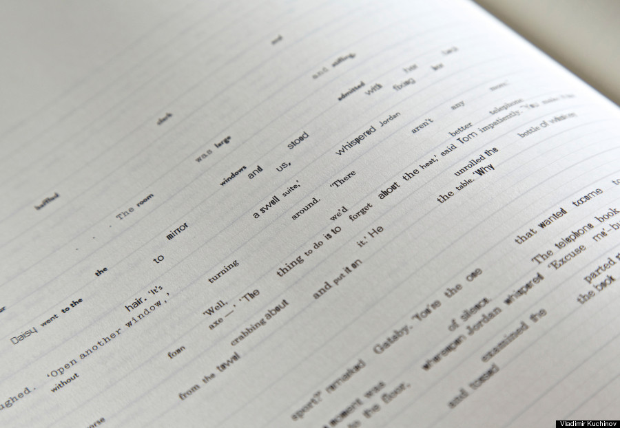
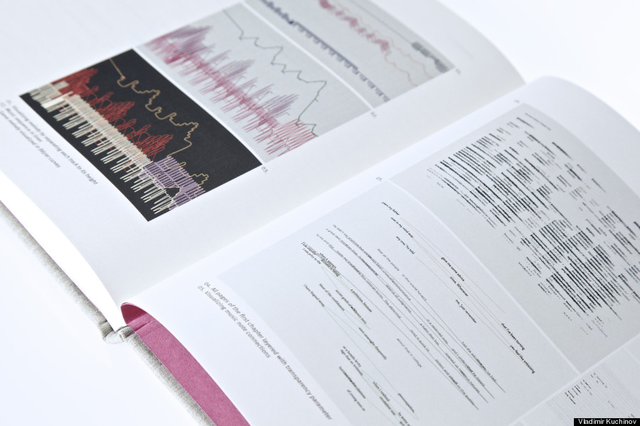
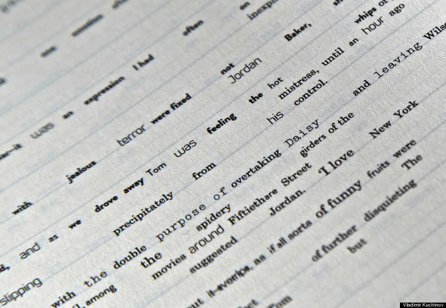
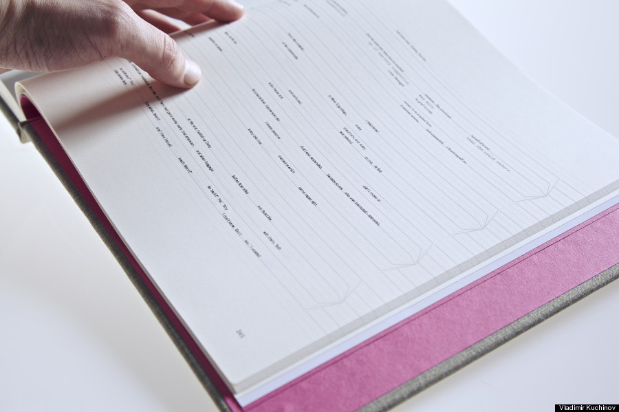
Kuchinov's project, aptly titled Generative Gatsby, takes jazz standards by Jelly Roll Morton and Count Basie and uses them to reinterpret the text of Fitzgerald's pièce de résistance. The original scores of these songs serve as templates for an algorithm-based typography, in which instruments, pitch, note length and so forth denote variable changes in the ways Gatsby's original words appear on paper.
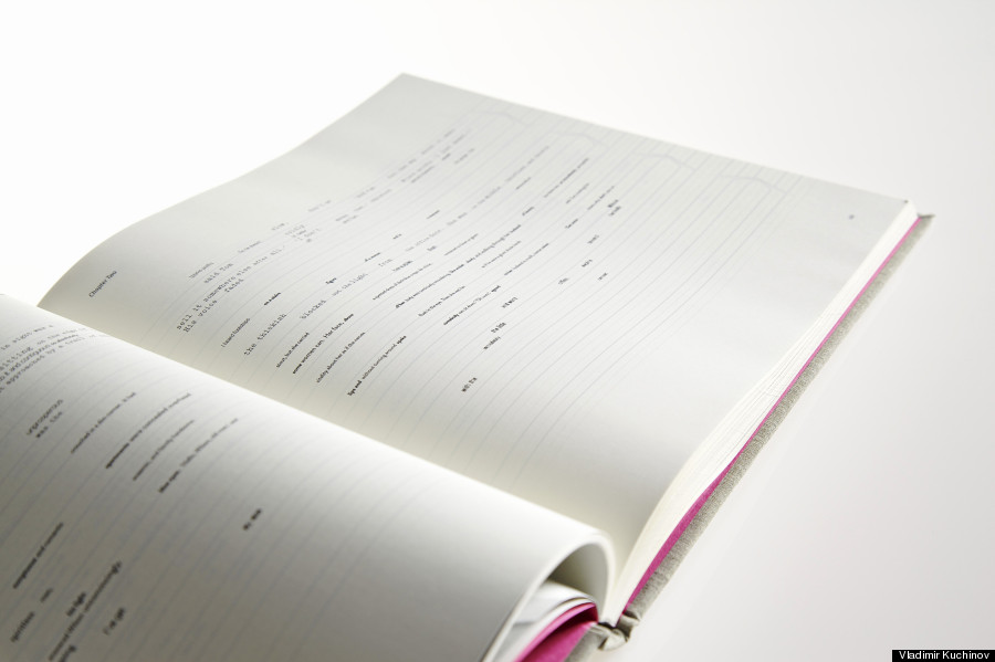
Kuchinov's wild exercise in pushing typographic boundaries resulted in an impressive object of art -- a book containing nine chapters of reimagined text, ranging in style, placement, boldness and size in a seemingly arbitrary manner that actually mimics the improvisational flair of jazz music. We interviewed Kuchinov to learn more about his dissertation project and what prompted him to delve into the world of Gatsby in the first place. Scroll down for interview.
What was it about The Great Gatsby that drew your attention in the first place?
The Great Gatsby is the most celebrated piece of art in American literature, because it captured the whole, amazingly vibrant essence of an era -- the Roaring Twenties -- along with a gorgeous and touching love story. I was going through a very similar story this spring –- the story of love and self-sacrifice –- and I had no doubts what story to take for my final degree project. It was very personal for me.
For the uninitiated, can you explain in your own words what generative typography is?
The definition of "generative typography" is quite complex. Basically, it is any text interpreted by a code-driven algorithm, which was designed by you as an author. In a classical sense, you are usually typesetting everything with your hands. In a generative method, you are creating a system, a script, which is doing everything by itself. And by controlling its structure and parameters you can have different generated variations.
In the simplest terms possible, how does one translate a jazz composition into a chapter of a book? How do visual components like font size, text placement, boldness, italics come into play? In other words, does size/style translate directly to the dynamics or components of a song?
I have used authentic scores translated into MIDI -- a well-known format of digital music notation. It is not necessary to be a musician to understand that a musical note has different parameters like its pitch, duration and velocity. I have used these values as well as its position to position text according to scores arranged for six instruments or a section of a classical big band.
And, of course, I have been carefully selected six typefaces for every single instrument. I did a very solid contextual research to fit the concept. For example, drums and percussions are represented by Remington Typewriter font, because this brand was extremely popular [in the '20s] and the rhythmic and percussive sounds of a typewriter have a very strong reference to it. For acoustic piano, it is a split version of Universe Condensed –- one light and one bold -– to recreate the sequence of white and black piano keys. I don’t want to be boring and explain every single choice of typefaces, but there are strong visual or emotive references behind each.
How did you choose the songs you used for each chapter?
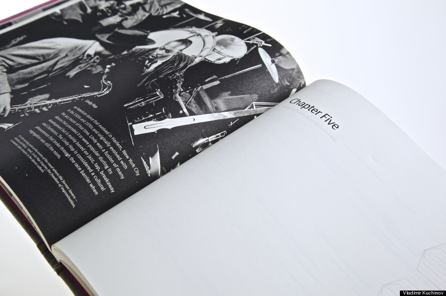
This book is like an encyclopedia of dance styles that were born in the Roaring Twenties. Each chapter has its brief introduction telling a history of the particular dance style and the most popular melody for it, which could be hypothetically played at Gatsby’s parties. It was a very hard task to decide which style should go to each given chapter, however I used some historical and geographical references to make it more or less conceptual. For example, I have picked Collegiate Shag for sixth chapter, because in this chapter Nick is telling us about Gatsby’s college years in Minnesota and Collegiate Shag was popular amongst the college crowd at that time.
What are you hoping a reader takes away from Generative Gatsby?
To be honest, the text is not so legible and it would be uncomfortable to read a novel in such way. It is more piece of art rather than a classical book to read. My intention was to do a visual experiment altering prose to another typographic frontier driven by swinging rhythms and structures.
In the foreseeable future, how do you see generative typography affecting a reader's experience? Do you see generative typography having practical implications in a world of tablets and digital reading?
I did my degree dissertation on prospects of generative typography in creative industry, so I am quite confident about this issue. By now, it is far away from practical implication, especially in terms of legibility. It is a brand new area and there are not so many projects being done now. The most famous one is the "Frankenfont" by Ben Fry, the creator of Processing language. For now, generative typography is good for posters and display types and is still in an experimental state for practical usage in books and publishing industry. However, I strongly believe, that as long as it gathers its "critical mass" of successful projects everything could change.
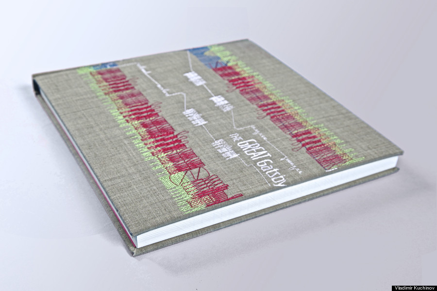
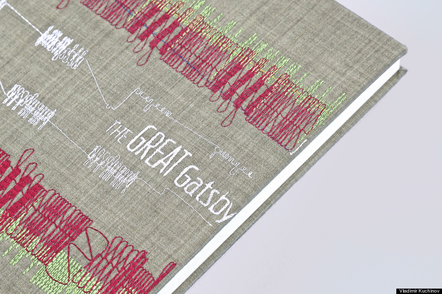
Finally, can you explain the embroidery on the cover of the project?
The easiest question of the day! I have done the book cover through the same algorithm I used for placing text. The only difference is that I have replaced words with colored curves. Actually, it is part of the Charleston melody, which was recreated for me by an embroidery school in Somerset, UK. It is a funny fact, but incidentally this embroidery school is named Jazziez.