
During a meeting in 2008, a U.S. senator told me about the many claims that global warming stopped in 1998, suggesting that we really don't need to be concerned about future warming and that climate scientists were misleading the public.
Google the phrase "global warming stopped in 1998" for yourself, and you'll see tens of thousands of results. A quick reading of these "results" finds many agreeing with the senator's sources, with many others debunking this claim. So what were the senator and I to do? The variability of nature often fools us. Everyday experiences with weather -- an unexpectedly warm winter, or a cooler-than-anticipated summer -- get many folks confused. But science has a way of connecting the dots of temperature over time, to find out what nature is really telling us.
When the senator quizzed me, the hottest year in thermometer records was either 1998 or 2005, depending on which compilation you chose. A huge El Niño had cranked up the 1998 temperature. But, if 1998 was the hottest or second-hottest year through 2007, didn't that in fact show that global warming had stopped, just as some people argued?
To find out what's really going on, the analysis is best done with extensions of statistical tests developed by a mathematician working for the Guinness brewery more than a century ago. (But that's a tale for another day.) Let me walk you through some dates in the past 50 years of Earth's climate history, keying them to a few personal milestones, and with my tongue somewhat in cheek. Do be aware that Latin for wandering about is "errare", the root of our word, error.
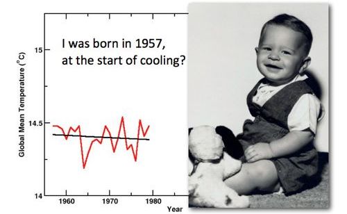
I was born in 1957. Here's what Earth's temperature was doing back when I had more hair, but less gray. The red line in all these graphics is the NASA Goddard Institute for Space Study's history of the planet's surface temperature, connecting the global average temperature for each year. The black line is a regression -- the best straight line through those dates and temperatures. And as you can clearly see from the downward slope of that black line, I was born at the start of a cooling period.
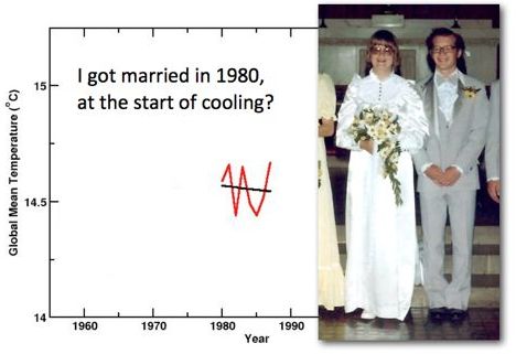
In 1980, I was lucky to marry a wonderful woman, to whom I'm still happily married. And you can clearly see that during the first years of our life together the temperature did drop a little. How lucky I was and still am to have her love to keep me warm!
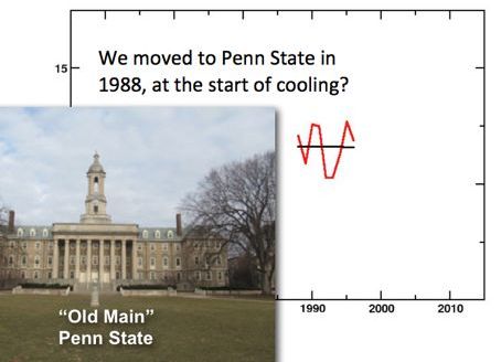
In 1988, I got this great job here at Penn State, and once again you can see there's a very slight downward trend in the years after we first moved to State College.
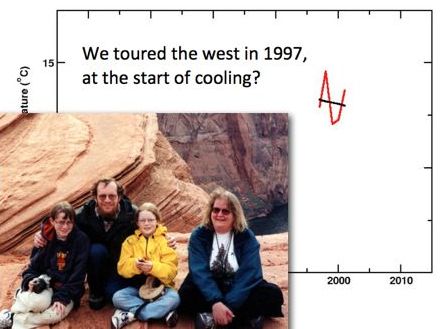
And when, nine years later in 1997, we decided to take our kids out West to show them some of the great National Parks, it was still getting colder.
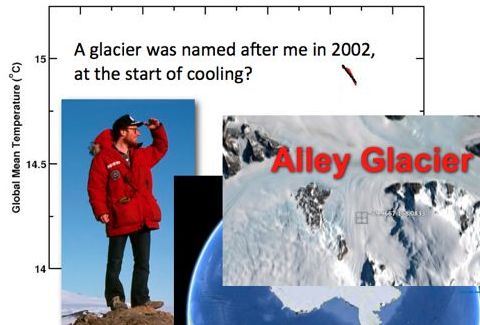
In 2002, they actually named a glacier in Antarctica (brrrrr!) after me and the cooling was really accelerating, as you can see from that short, sharp downward line.
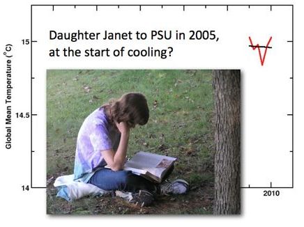
And in 2005, when our daughter Janet came to Penn State as a student, it was cooling very slightly.
So from 1957 through 2005, if you stop and look at these small fragments of my life, you see cooling trends.
But wait: suppose you actually connect all the dots, from 1957 through 2010, what do you see?
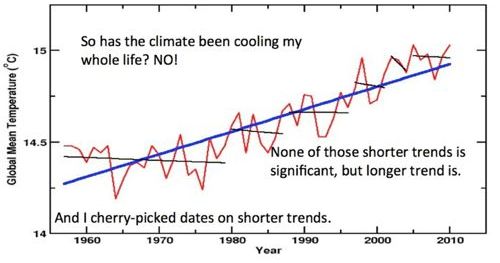
Like a photomosaic, the big picture is rather different from the little ones. (I did warn you I would have my tongue in cheek, and might be leading you into errors!)
You might imagine a person walking a dog. If you watch the dog, darting about, sniffing here and there, you might initially be fooled about which way they're going around the block. That's the red line: weather bounces around from year to year, and the extra El Niño warmth in 1998 was just the dog zipping after a squirrel. But if you watch the person -- the thick blue line -- you can see there's a clear direction to the walk through time.
The mathematician-turned-brewer figured out a century ago how to let the dog's motion tell you how long you must watch to learn which way the person is going. None of the thin black lines is long enough -- the mathematician would say that the short cooling trends are not significant -- but the thick blue line is long enough and shows significant warming. Yet despite a century of warnings, some people still seem to fool themselves, or others, by jumping to conclusions without watching long enough, whether in casinos, or on Wall Street, or even on the Opinion page of the Wall Street Journal.
Bottom line: Has it actually been getting warmer? Yes. Is there any serious doubt about this? No, there really isn't, especially because we also see warming if we work with the data from NOAA, or from the Berkeley group that reanalyzed the temperature "dots," or from satellites, or from many other sources.
We can get the story straight if we connect the dots, and let the data -- not ideology or delusion -- tell us what's really going on.