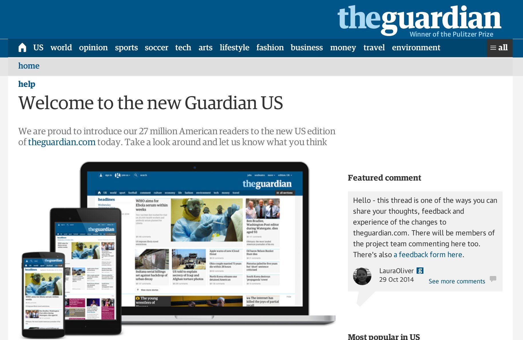
The Guardian launched its redesigned U.S. website, theguardian.com, on Wednesday morning after months of beta testing, research and reader feedback.
Based largely on the requests and needs of its readers, the new site comes after an eight-month period of interviewing users and studying more than 26,000 reader comments, the Guardian told The Huffington Post in an email Wednesday. The paper said it thoroughly examined how it's readers used its old homepage in order to figure out how to most efficiently redesign the look and functionality.
"We’ve listened to what you’ve had to say -- and we’ve developed the site with your thoughts and input front of mind," the Guardian announced in a post on Wednesday.
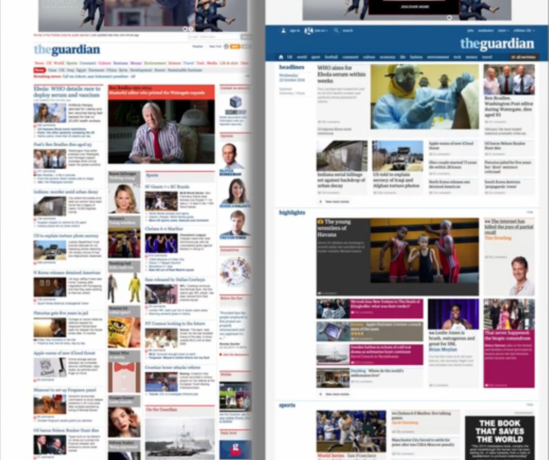
Check out the difference between the old and new homepage (at right):
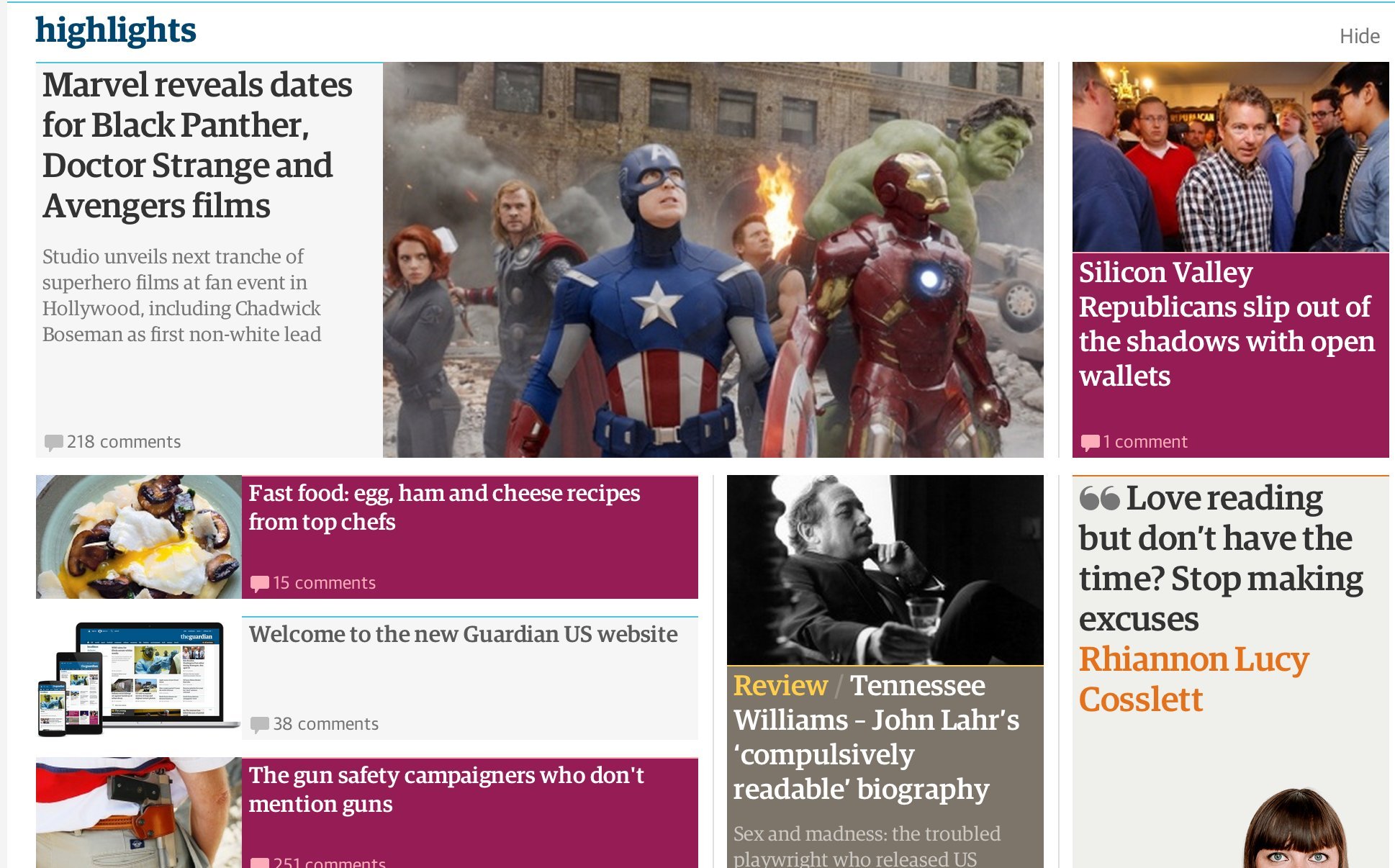
The biggest transformation is that the website now uses a "container" format, which the paper determined better reflects how readers actually read the news. The new format aims to bridge the gap between readers and journalists, making it easier to share stories, participate in conversations and forums, and engage in videos and interactives.
"Containers can be customized in a variety of different ways to highlight stories, and allow editors to think beyond simply building a page, to creating a collection of stories that bring each day’s news to life for readers," the Guardian wrote in a press release.
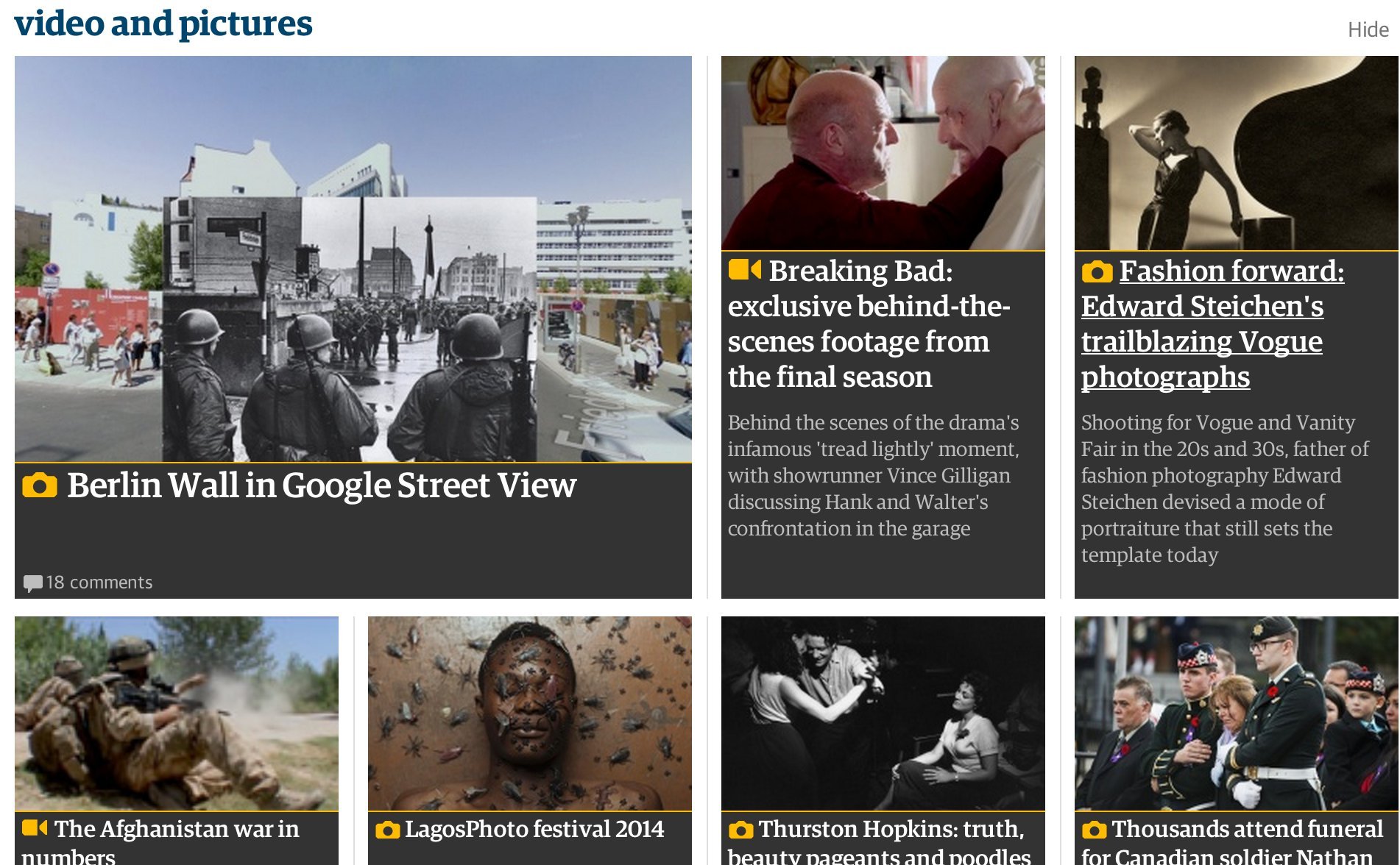
Other new features readers will notice include video and gallery pages, color-coded stories arranged by subject, improved live blogs and updates, and an entirely new typeface: