
You might be freezing right now, but at the top of the heap of 2013's climate trash was surely all the "15 year pause" in global warming stuff, and the way that the mass media played this up during the release of the new United Nations report this fall. So, before looking at this seriously, let's all laugh and celebrate that, just as surely as the ball dropped at midnight in Times Square the other night, that particular 15 year sleight of hand, intentionally counting from the hot 1998 El Niño year, came crashing down at the stroke of midnight as well: as of January 1st, the 15 year running mean surface temperature change now starts from the much cooler 1999, and gives a very different picture.
The problem with phony arguments -- and it was phony to argue that the temperature record since 1998 suggested global warming had paused, that there was some problem with the basis of climate science, or that we should hit our own societal "pause button" in response to the Earth's presumed one -- is that they tend to obscure the really interesting ones. So, to enter the interesting arguments, it is important first to underscore that there has, indeed, been a tiny slowing of the rate of increase in the average surface temperature, but it was just recently discovered to have been far smaller than anyone thought -- at least 75 percent smaller (and it evaporates entirely if we set the base period back to the 1950s). Back in 2010, however, Kevin Trenberth, a leading U.S. climate scientist, felt compelled to ask in a brief but influential Science article, "Where has the energy from global warming gone?" In a private email exposed during the fake Climategate scandal, moreover, he sounded almost self-tortured -- bluntly, and rather controversially, referring to the "missing energy" as a "travesty."
Let's take Trenberth's question at face value, for now. One aspect of his own recent answer to it, corroborated by others, might quickly end your feeling celebratory, however. In looking at the role of patterns of Pacific sea surface temperatures (i.e., ENSO, or the El Niño/La Niña cycle) in the recent climate record, one much discussed new Nature paper (Kosaka and Xie, 2013), for example, was quite explicit about what we should be expecting in the very near future as a consequence of exiting such a slowdown, with author Xie saying to Climate Central of the ENSO cycle, "Now it is swinging down, eventually it is going to swing up, and when it swings up we are going to see much, much stronger warming" adding that, "When it swings up we're going to be in big trouble."
This "when" is likely not far off: we are generally due for a move towards El Niño conditions again in the next year or two. The last two major El Niños were in 1982-83 and 1997-98. Trenberth's own work on decadal patterns of El Niño suggest that we could have several years longer this time, but the models, as of this past month, suggest that there's about a 45 percent chance, almost a flip of the coin, of an El Niño starting up this July-September. Keep in mind that the last El Niño -- like calling Sandy a "Superstorm," the 1998 one could rightly be considered a "SuperNiño" -- was some 600 percent of average in terms of impact on global temperatures, and when one also considers that the climate system has since exhibited a dizzying increase in the number of weather extremes without such conditions, one might feel more than a little concerned about prospects for the global climate coming our way soon.
Let's try not to pump up the fear factor, however, and let's keep looking dispassionately, but still more searchingly, at Trenberth's question -- Where has the energy gone? In two recent articles dealing with the pause at RealClimate, Stephan Rahmsdorf rightly emphasized a highly significant not-yet-released paper by Kevin Cowtan and Robert Way (Royal Meteorological Society, 2014), devoting one of the articles to it alone, and explaining how it shows the "pause" to be virtually eliminated after correcting data gaps, mostly in the Arctic temperature record. The only problem is that, put this way, Cowtan's paper unfortunately comes off as a somewhat dusty technical affair (it is a highly complex corrective process that has been undertaken, extensively tested and validated), a mere accounting error. This is a shame, because someone needs to show how the real import of the paper is not only that it more or less terminates the famous pause issue, but that it thereby adds depth to the clear and unmistakable message of one the most shocking climate graphics of recent years. I mean this one from NASA (my highlights in light red):
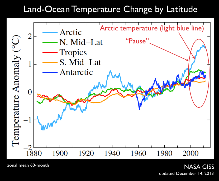
It takes a lot of warming in one small region of the planet to make up for stasis over all the rest, and the simple fact is that the infamous warming "pause" coincides precisely with a veritable explosion of increased surface warming in the Arctic. Why? There is always "Arctic amplification," generally assumed to be about twice global warming, but over the last decade it has distinctly accelerated beyond that (the new Cowtan data fix means the blue line in the graph should be even steeper), and this graph might make anyone interested in Earth's climate wonder whether Arctic amplification is in fact a more fundamentally dynamic mechanism than previously supposed.
Climategate was supposed to expose faked data by evil scientists, but only now has the real Climategate begun to emerge -- that is, that innocently incomplete data led one of the most famous U.S. climate researchers down a supercomputer-led rabbit hole in pursuit of "missing energy," from which it was shown authoritatively to be getting buried under 2,000 feet of Pacific ocean water, when in fact almost nothing was missing to begin with, and it was mostly just getting up into the Arctic atmosphere all along. This doesn't imply that Trenberth was completely wrong, either, and being wrong is part of being a good scientist. But it is vital to remember that a general aspect of Trenberth's thoughts on the pause -- that it mostly comes from the ENSO cycle itself, and that negative forcings (things that are cooling, in other words) such as Asian aerosol increases, the solar cycle, volcanic activity, etc., have played a comparatively small role -- could be accurate without his answer to his own question (namely, that the energy is going into the deeper ocean) being correct.
Consider one of the most interesting climate surprises of 2013, which came just last week, a kind of climatologist's surprise present -- the public announcement on Christmas of the discovery of a meltwater aquifer within the Greenland Ice Sheet large enough to raise global sea level a little bit. In a sense, this is like suddenly finding a lost entry in the unreconciled global energy balance sheets that Trenberth has been railing about in recent years: this one lake represents about .4mm worth of sea level rise, and the ocean has been rising now at about 3.2mm/yr, so it is about 12 percent of a year's worth of sea level, and might even represent one percent of Trenberth's imagined missing energy since the millennium (although this is surely an over-simplification and exaggeration, since there are vastly differing energetics behind thermal expansion of the ocean and melting of ice). In any case, this aquifer gift teaches us that one underlying assumption has been wrong about the global energy budget -- that is, that annual sea level rise creates an accurate measure of the global energy budget writ large in real time. And while we know that this hidden lake represents but a thin slice of Trenberth's presumed missing energy, we have no idea how many such aquifers there might be, and this one covers just one little part of the eastern side of the immense Greenland Ice Sheet, and seems unlikely to be all alone. How many of these might there be in Antarctica?
We should not really be asking, I might add, whether any missing energy might have gone into the ocean or into melting ice -- after all, much of it goes from one to the other, and during this "pause" period both Wieslaw Maslowski and Peter Wadhams have been out-predicting many climate models on the rate of summer Arctic sea ice losses in part through their assumptions of the melting of the ice from underneath by warmer waters, and the pulse of warm surface waters from a SuperNiño like 1998 easily makes its way through the Bering Strait, and perhaps we could say that the huge change in Arctic warming we see in the graph above, starting right after the 1998 El Niño, is partly that El Niño's energy pulse playing out as those waters made their way up into the Arctic ocean, rather than down into the ocean depths as Trenberth believed, in turn pushing the albedo feedback mechanism into higher gear, altering arctic atmospheric circulation, hydrology, etc.
This story of this unrecognized spiraling arctic crisis, recently laid even more bare by dry and academic sounding data gaps, "kriging", and other fusty things I won't bore you with, is really one of the stories of the decade. You see, the wintry chill that is coming right now to 100,000,000 Americans is perfectly in line with what is often called the "warm Arctic-cold continents" pattern these days. This is happening because of the blue line you see in the graph above. In short, what you are seeing out your window right now, the blast of Arctic air you are feeling, is coming from the real "missing energy" that one of the most famous U.S. climate scientists said was at the bottom of the sea. To be continued, but in the mean time -- Happy New Warming Year!