Scroll down for pictures of the color of 2011!
Text By SAMANTHA CRITCHELL, Associated Press
NEW YORK - It may be gray outside when the calendar flips to 2011, but a bright red-pink hue will be in fashion.
"Honeysuckle" is the color of 2011 chosen by Pantone Color Institute, the research arm of Pantone Inc., the company that largely sets color standards for the fashion and home industries.
The reddish pink shade lights a fire to your senses and revs you up, says Leatrice Eiseman, executive director of the Pantone Color Institute.
It's much livelier than 2010's color of the year: turquoise.
That was supposed to have a calming, escapist effect on the public's collective psyche after all of the bruising economic challenges, Eiseman says, but now we're ready for something stronger while still not moving quite at full-steam ahead.
"The color says we need to be hopeful and think of things that satisfy as many senses as we can," she says.
Eiseman studies trends adopted by designers, manufacturers and retailers, as well as indicators of public opinion, before making her prediction for the new year.
For some, honeysuckle will evoke a sweet taste, a happy childhood memory or the sound of hummingbirds, offering a hint of nostalgia within the otherwise energetic color, she says.
Eiseman does acknowledge, though, that others might be confused about the name because the honeysuckle flower can be shades of white or yellow, too.
Designer James Mischka, half of the Badgley Mischka duo, is in the I-thought-honeysuckle-was-yellow camp, but he's a fan of the red-pink color when it comes to fashion. "It's a really important color for us to get in for spring. It's a real strong color, but it's wearable for lots of skin types."
It also works for a variety of ages and styles, he says, noting that they used it for both their upscale collection and their more contemporary line. "It's a positive, strong, affirmative color, and I think that's what hopefully everyone's attitude is going into next year."
More good news?
It can be worn for casual and formal occasions and it's not limited to spring and summer, Mischka says. The way to wear it is either against white or all on its own, he says, noting it doesn't pair well with black.
Eiseman says that it is complementary to blues, greens and oranges, though, which will also work in the homes arena. "You're seeing it in tabletop -- it lends itself to striping and patterning in linens -- and it's gorgeous in glassware."
It used to be that home products followed fashion, but there's an effort on the homes side to work more in tandem, says Mary Rodgers, director of marketing and communication at Cuisinart. "For the home-appliance business, especially with our consumer, we've found success in products that put color in more fun items or things you don't leave on the counter."
For example, she says, an ice-cream maker will be offered in honeysuckle, but there are no plans for a coffee maker or food processor.
She compares it to the way people use colors in fashion: a purple scarf or red flats vs. a gray coat or black business suit. "Consumers like playing when they're working with accessories, but they're not willing to commit to them."
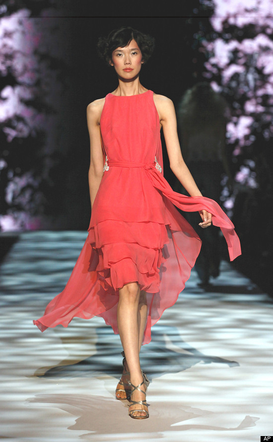
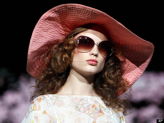
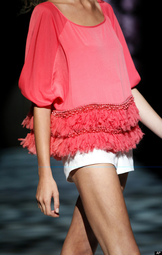
(All images from the Badgley Mischka spring 2011 collection show)