By Kelly Coleman for GalTime.com
If you're getting bored inside the house this winter, maybe it's time to spice things up a little -- in case some of your New Year's resolutions included decorating your home in this year's hottest styles, we interviewed some interior decorators to equip us with colors and trends worth exploring.
Fresh Palette
According to Mary Lawlor, the color-marketing manager for Kelly-Moore Paints, "What we expect to see in 2014 is a refreshed lighter palette of colors." She speculates that the trend towards fresh, light colors is a response to previous years' tendency towards darker colors.
"The pendulum is now shifting," she says. Due to the blending of different cultures within families, "we are now seeing colors put together that haven't been put together before." Lawlor cites blending gold and turquoise with a yellow-influence neutral tone as an example of this.
The Star of the Show: Radiant Orchid
Pantone, a world-renowned company specializing in color selection and communication, as the color of the year, voted radiant orchid as 2014's "color of the year." It is fresh, bold and versatile. Aimee Beatty, an in-house stylist with Pier 1 Imports, suggests pairing it with smoky grays, chocolate, vibrant yellows and greens, or with neutral creams and linen.
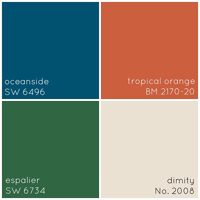
Last year, emerald earned Pantone's "color of the year" vote, and this color is definitely not on its way out. Lynn Dayton, founder and owner of Dayton Home feels it "looks good in just about any form."
Aimee Beatty also advises the use of blues and greens to create a calming atmosphere.
Linen is Luxe
Linen is another popular color this year. Dayton describes linen as, "calm and serene. This rich neutral has an earthy vibe that's soft and soothing."
Peacock Blue
Peacock blue, credited by Dayton as "moody and masculine," is perfect for making small spaces, such as powder rooms, pop. The eye-catching hue can also be an intriguing accent color.

Sunny Side
Oranges and yellows are obvious choices for a quick way to brighten up any room. While they are more popular for spring and summer, they can add some sunshine in the colder months, too! Dayton suggests using blood orange "in a crisp white kitchen or sunroom, and take it outdoors to add a splash of color to your patio furniture." Combing yellow with "playful patterns" creates a new, fresh look for the home, according to Beatty.
The most important thing to remember, says Dayton: "Although some colors certainly get their 15 minutes of fame, no color is ever out... you should surround yourself with the colors that make you feel good."
All images used with permission by Dayton Home
More from GalTime.com: