Your logo is the key to your brand identity. If it’s well known, it’s one of the first things people will think of when they envision your company. Even if it isn’t well known, it will still make a powerful impression, for better or for worse, when consumers encounter it for the first time.
Logo redesigns often come under intense scrutiny. Everyone’s going to have an opinion, and inevitably some consumers aren’t going to like the new direction. Logo redesigns that come with big price tags get even greater scrutiny, and often attract criticism about cost vs. benefit.
But even if you don’t like a company’s logo redesign, it’s impossible to deny just how important logo design is to a business. It’s precisely because logos are so important that they attract so much attention when they’re altered, and why so many companies invest tens of thousands of dollars redesigning them.
One question companies often have though is how to know when a logo redesign is necessary. There’s no hard-and-fast rule that says a logo must be redesigned every five years. Some logos may be able to endure for 10 or even 20 years at a time, while others need a closer look after only a few. Here are a few ways you can tell your company’s logo is deserving or a redesign.
1. Your company is shifting direction
A change in company direction is one major reason for a logo redesign. As a company evolves, its logo can quickly cease to represent what the company actually does or stands for.
A shift in direction is a good opportunity to evaluate whether or not the logo still stands for the same things your company does. Maybe your brand has pivoted direction and the logo no longer represents your business. Maybe you’ve merged with another company and need to accommodate both companies within a single brand entity. When these types of changes occur, it’s necessary to reevaluate your company’s branding, with special emphasis on logo design.
When two iconic publishing houses, Penguin and Random House, merged, they became known as Penguin Random House. The new logo is designed to live seamlessly alongside the logos of each brand’s distinctive imprints. It replaced an interim logo that combined the logos of each publishing house.


2. Your logo looks dated
Brand heritage is important to most brands, but that doesn’t mean your logo should remain unchanged forever. Design norms change over time, and in order to stay relevant, your brand logo needs to adapt to those changing norms.
That doesn’t mean logos need to be updated to reflect every single design trend, but they do need to be refreshed every so often to keep them from looking outdated.
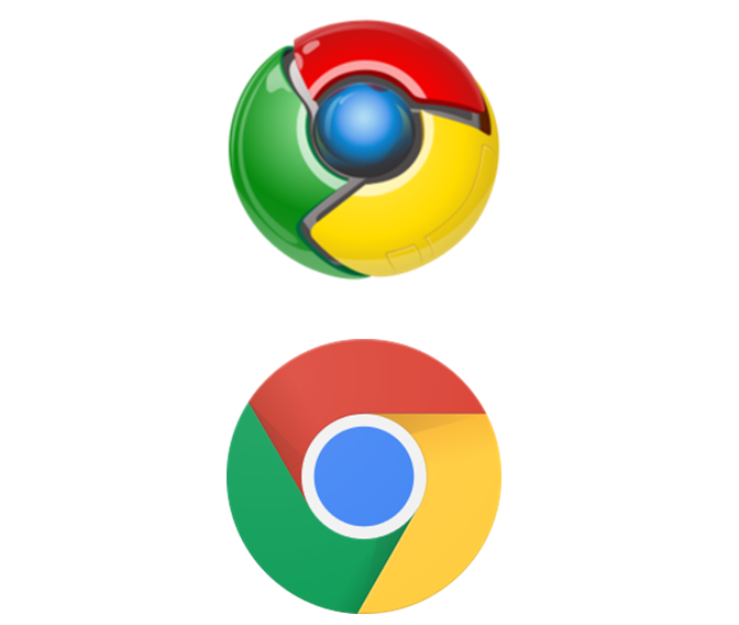
Google is known for updating their logo regularly, while still staying true to their original brand identity. When they launched Google Chrome it was with a logo designed with their brand colors, but the logo is 3D and after a few years quickly became very dated. The logo was redesigned with a flat design that matches modern sensibilities and represents the browser as one that’s on the cutting edge.

3. Your logo is too complex
Older logos were designed in different times when the contexts in which they would be seen were different. Before the internet and television, logos were only ever seen in print ads, on packaging, and on store signage. In other words, their use was much more limited. Their use contexts were usually limited to large formats, so they could afford to incorporate a bit of complexity.
These days, however, logos appear on ever tinier screens, and when viewed on these small screens, complexity can be problematic.
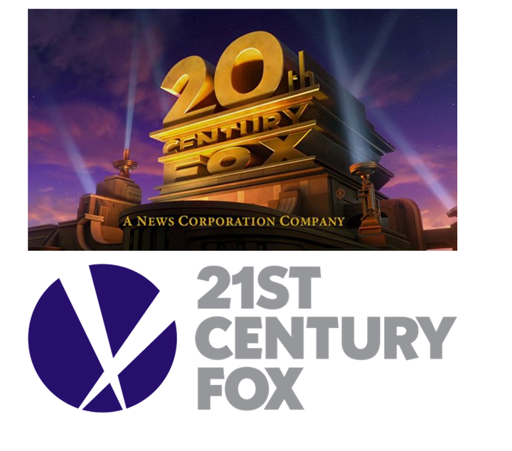
The original 21st Century Fox logo is incredibly rich and complex. There’s a lot for the eye to take in. We can probably all remember seeing that logo at the movie theater on massive screens, but its complexity means that it doesn’t translate very well to smaller screens where details will be less discernible. The logo was redesigned when News Corps split its entertainment and news divisions. But even though a shift in company direction necessitated the new logo, it’s also a breathtaking simplification of the original version.
When the new logo was announced, Rupert Murdoch wrote: “Like our name, the logo reflects the rich creative heritage of Twentieth Century Fox and signals the promise of the 21st century and our restless drive toward the future.”

4. Your company has outgrown your logo
When a company launches, it doesn’t always have a lot of resources at its disposal, and it’s not infrequent that a logo will be thrown together quickly just to get things up and running. But as the company grows, it might evolve beyond the original logo design. Growth brings change, and a logo which was designed to represent a single product or service that was available at launch may eventually fail to properly convey all that a brand ultimately comes to stand for. For a lot of brands, the idea of a refreshed logo has become a critical part of their marketing strategy—and for good reason.
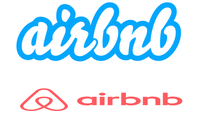
When Airbnb launched their new logo, the founders wrote: “What started as a way for a few friends to pay the rent has now transformed into something bigger and more meaningful than we ever imagined. And what we realized is that the Airbnb community has outgrown the original Airbnb brand.”
In an effort to make the brand more universally recognizable and welcoming, Airbnb launched the “Bélo”, which it calls a universal symbol of belonging. The symbol is much simpler than the originally bubbly script logo and it can go anywhere -- in windows, online, and in print.

Logo redesigns can feel like risky business. It’s easy to become attached to the way things have always been done, and to fear changing something as important to your brand as a logo is. But in order to stay relevant, it’s important to reassess your logo’s effectiveness at various stages in your company’s development. If you’re doing a redesign, be sure to work with a firm that has a clear process in place that ensures they understand your business and your culture and will work with you to design something that truly represents everything you want your brand to stand for. Don’t be afraid to do your research and look around for inspiration when it comes to concepts for your new design. Take the time to explore digital resources that highlight logo designs, like Design Rush or any of your favorite design-oriented media outlets.
To learn more about logo redesigns, visit Blue Fountain Media online.