By Yanic Simard, Houzz
White on white, white mixed with gray and, hmm, maybe a little more white? It’s certainly an in-demand look, but some people want a bit of bold color in their palettes. To help you mix color with more color to get the look you crave (without going totally overboard), here are some of tips for what hues to mix, how to combine them and how to bring the whole look together.
Original photo on Houzz
Semineutrals
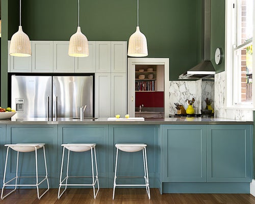
In recent years, the trend of embracing semineutrals has returned. These are colors that can’t be considered true neutrals, but are still easy to combine and work with. Blues and greens, being such natural hues, tend to be the most cooperative of colors, and this is especially true when you choose midtone shades with a hint of gray in them.
When combined, such hues feel lively, but when neither is very aggressive on its own, the resulting pairing isn’t over-the-top.
Original photo on Houzz
Tone on Tone
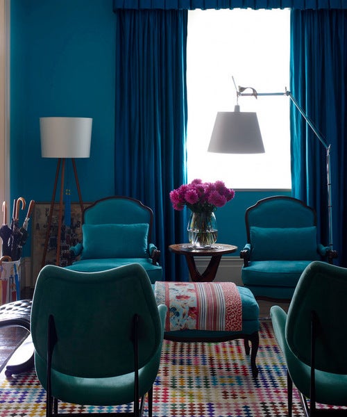
An even more vibrant blue is still an easy color to mix. It works beautifully in a tone-on-tone scheme to give the sense of a lot of color even when most of it is essentially the same hue.
Try combining pure, chilly blues with green-blues or blue-indigos to get subtle variation while keeping the hues tied together. Include a few hot accents for contrast — flowers are a great way to add a red or violet counterpoint.
Warm colors can also make for engaging tone-on-tone looks, although with hot hues, it’s usually safer to stick to lighter shades for walls and large pieces to avoid color overload.
Original photo on Houzz
More Is More
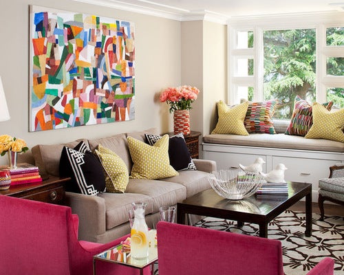
In total contrast to the tone-on-tone look, another approach is to actually use a bit of every color imaginable so that no one hue feels too overpowering.
Try choosing a very colorful piece of art to use as inspiration for your palette. Then pick up fabric accents that echo a similar palette, such as the toss cushions on the window bench seen here.
This room feels exceptionally colorful, even though most of the other pieces are neutral, save for the pair of vibrant pink chairs.
Original photo on Houzz
Wallpaper
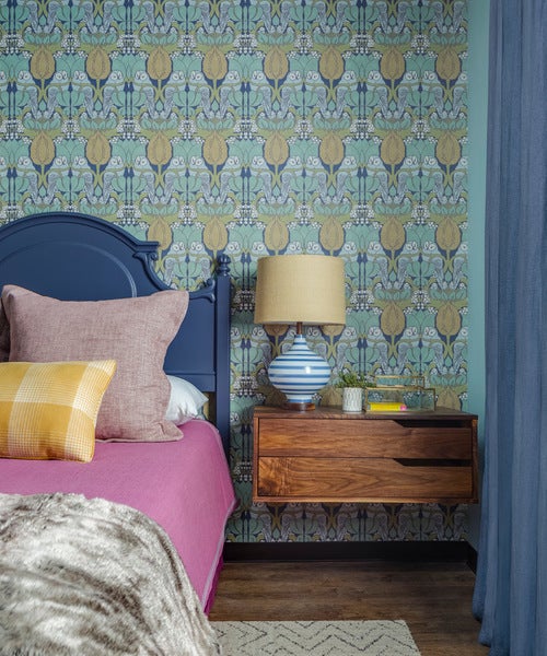
Another way to get a rich palette is to choose a bold wallpaper print that already has a terrific color combo assembled for you.
In this case, the dark blue shades in the paper are picked up for the headboard and drapery, while the yellows are echoed in the pillow.
A bed sheet is a great opportunity to try a risky color, like this perfect contrasting pink. Since high-use linens can expect to wear out and need replacing in the future anyway, it’s not an extremely long-term commitment.
Original photo on Houzz
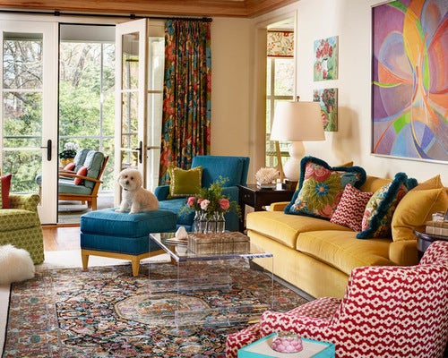
Patterns With Solids
Notice how this room and the previous two use a mix of small-scale patterns with chunky solids. Specifically, each piece either carries many diverse hues or just one (or just one mixed with a little white).
Keeping each piece to this rule of extremes isn’t necessary, but it does make it easier if you’re not confident about mixing. The very colorful pieces combine well because they don’t have a singular hue that stands out (which might clash with another), and the solids are drawn from the art so that they have something to relate back to.
Tip: When pulling colors from art to use as wall hues or solid fabrics, it’s generally safest to pick slightly grayer or paler versions to keep them from looking overly vibrant. However, some of these looks ignore that rule, and if you’re feeling bold, you certainly can too.
Original photo on Houzz
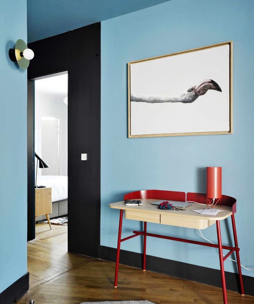
Breaking It Up
When you mix color with color, often the neutral elements end up becoming emphasized. Breaking up this blue wall with artwork in mostly white gives a bit of visual breathing room and really makes the art sing.
You can achieve a similar visual break by adding a framed photo with deep white matting, or even many in a grid. That the walls are a bright hue makes the room feel alive, but you can use this trick to reintroduce as much white as you need to tame the look to your liking.
Original photo on Houzz
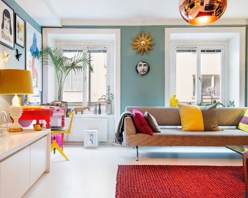
White Trim
Thick white trim (and similar elements like doors and even white floors) can eat up a lot of wall space.
When you paint walls in a case like this, the actual amount of square footage painted is often surprisingly low. The result feels very colorful, but in an easily livable way.
Notice how this room also uses the previous tricks of layering art with lots of white and using a semineutral green on the walls. Even with the addition of hot red accents, the room feels balanced and approachable.
Original photo on Houzz
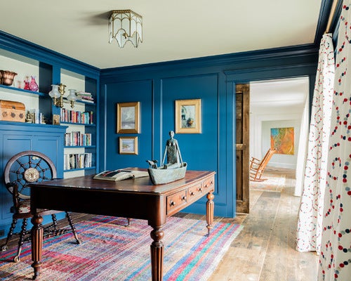
Wood
Another great way to diffuse a colorful look that may be starting to feel overloaded is to add a little wood.
An elegant wood desk or dining table, countertops, side tables, chairs, exposed floors, or coffee tables can break up a vivid color combo and add natural warmth to balance out powerful man-made hues.
