Reading Time: 7 minutes
The original Macintosh user experience was a revolution back in 1984. It set the stage for Microsoft to become wildly successful with a new fangled input device call the mouse and a new on-screen experience called Windows. All of these ideas were introduced to the commercial market by Apple and Steve Jobs but Microsoft and Bill Gates transformed these ideas into a mighty commercial empire that is only now, nearly 30 years later, losing steam.
In 2007 Apple and Steve Jobs created another user experience revolution by unleashing a commercially viable touch-based input device and a new on-screen experience called iOS. Quickly history began to repeat itself as Google, while Microsoft dozed, became a wildly successful mobile phone operating system provider with an Apple-inspired user experience called Android.
But this time around I'm sure Apple and Steve saw this one coming. I bet they prepared a master plan, to continue after Steve's untimely death in 2011, in the manner of Hari Seldon from Isaac Asimov's classic science fiction Foundation Series. Apple is in the middle of a "Seldon Crisis." Her visionary leader is gone, her competitors are copying everything Apple is doing with more resources than even a multi-billion dollar company can muster, and the way forward looks uncertain. Just as the Foundation proved more than a match for the Galactic Empire in the Foundation Series, I would not count Apple out of the game yet. And iOS7 is the proof.

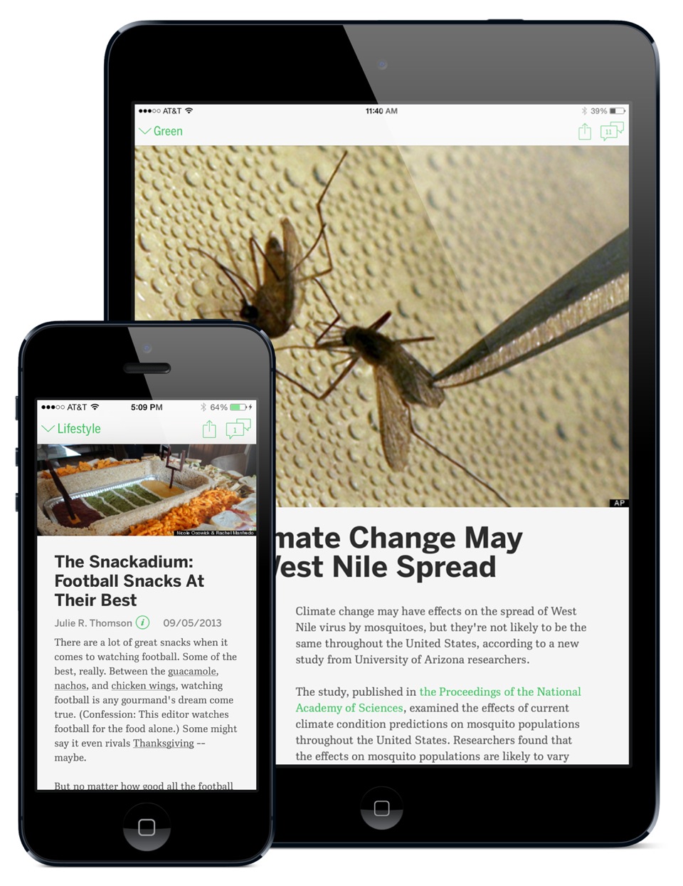
You have to play with iOS7 for a couple of days to digest it. On the surface, as seen in the screen shots from our next iPhone/iPad release of the HuffPost News App, iOS7 looks like a facelift. Most of the functionality that is available in iOS7 is just a carry over from iOS6. There are a few new functions, minor improvements, and some changes to how popular features are accessed. For example, to search in iOS6 you swipe all the way to the left-most page on the home screen. To search in iOS7 you swipe down from the middle of any page on the home screen. It's a tiny improvement but gives you quicker access to the search feature. It doesn't solve the big problem with search on the iPhone and iPad: The search functionality is so well hidden that I hardly ever use it. Even a design-driven company doesn't get it right every time.
If you want to really understand the power of iOS7 get two phones, one with the iOS6 version of the HuffPost News App and one with the iOS7 version. A side-by-side comparison illuminates the 3rd and 4th dimensions that iOS7 uses so well.
You might remember from your High School Math class that there are four dimensions in space: width, height, depth, and time. The user experiences of Mac OS X, Windows 8, Android, and iOS6 do really well with the first two dimensions, width and height, and treat the second two dimensions, depth and time, as minor accessories. When you launch the HuffPost News App from the iOS6 and iOS7 home screens you see an animated zoom effect that uses all four dimensions: Over a couple of seconds the home screen seems to "fall away" while the app seems to "zoom up" to fill the screen. It's a nice effect that says to the user: You just launched an app. Both iOS versions do it well and it has become part of the visual vocabulary for devices with touch screens.
Now touch an article on the HuffPost front page. On iOS6 a blank article page seems to slide up from the bottom of the screen and then you wait a bit for the article to load (depending on your network connectivity). It's a smooth, even, and serial visual effect. One event happens after another in iOS6 in a clearly unnatural fashion. On iOS7 the HuffPost article page still loads from the bottom, but it's much snappier, and the page accelerates to the top, and bounces before it comes to a rest. It feels like there is a paper page under the glass in four-dimensional space that is snapping into position. In real life things don't just smoothly move through space and stop abruptly. In real life objects push each other around, bump and bounce, resist and release, and move through time at different speeds. iOS7 gives an app like HuffPost News the opportunity to look and feel more "real".
Now start reading the article you opened on both your iOS6 and iOS7 devices. Touch the screen to scroll the text up the page. On the iOS6 version the comment and share buttons slide away and the page scrolls at your command at a uniform speed. On the iOS7 version the comment and share buttons are always available and the text of the page slides over the photo at the top. If you flick the iOS7 screen the article text responds to your flick like a real object subject to the laws of nature: it accelerates and then slows down as it gains and loses momentum. There is a lot more going on with our iOS7 design: It's streamlined, playful, and powerful. As you use it you'll discover new features. Our designers, editors, and developers worked hard to figure out the true nature of iOS7 and how to integrate HuffPost into it. The dimensions of depth and time are not thrown in as animated eye candy. We use animation to help the reader understand where she is, where she is going, and what she can do once she gets there.
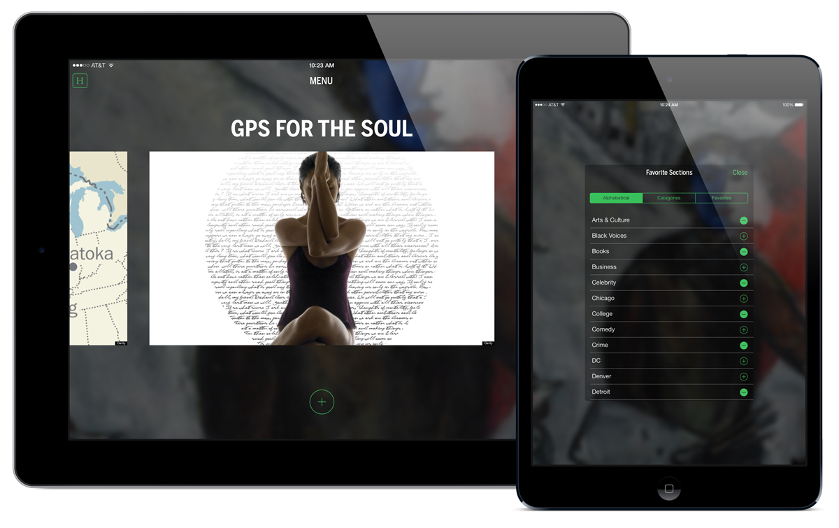
My favorite part of our new iOS7 HuffPost News App is the menu screen. In iOS6, like all good mobile apps, we used the "hamburger button" to access settings, search, and sections. It was a monster list with almost 30 items and many more sub items that slid out from the right side of the screen. It was more like the Windows Start menu than an Apple-inspired design.
In iOS7 the menu screen is accessed by tapping our "H" icon on the left hand side. The top and bottom of the screen fly away and the user gets a carousel of our sections and a new feature we call "categories." Since The Huffington Post has dozens of sections navigating through them can be a chore. Categories are collections of sections combined into five big buckets: News, TV & Entertainment, Lifestyle, Tech & Innovation, and HuffPost Live. We have a similar set of sections in our mobile website and we find them a convenient and meaningful way to group all our content together. You can customize the carousel by tapping the big "+" in a circle on the bottom of the Menu screen so you can get just the right combination of categories and individual sections that you enjoy. If you get tired of a section on the carousel you can swipe up to remove it.
After setting everything up you can tap the settings icon, turn on "offline reading" and automatically download all the articles you want to read while stuck in the subway or flying without wifi. This is not new functionality for the HuffPost News App but it is far easier to find and use in our iOS7 version.
During the development of the original Macintosh user experience one of the engineers needed a shortcut for ejecting a diskette. He decided that dragging the disk icon to the trashcan icon on the desktop was a great way for the user to tell the computer, "Hey, I don't need this diskette anymore, please spit it out." Except that it wasn't a good idea. Many users, the rational ones, figured that dragging a diskette to a trashcan must mean "delete all the files on this diskette." For many years this shortcut was built into the Mac operating system and was as embarrassing to Mac designers as Control-Alt-Delete must have been embarrassing to Windows designers.
iOS7 generally eliminates the arbitrary and confusing elements of the iOS user experience (like the "hamburger button" and deeply nested hierarchical menus) that have no business cluttering up a touch screen device. If you have ever downloaded an iOS6 app and wished it came with a help manual then you'll find well written iOS7 apps a breath of fresh air. And even though we already rewrote and redesigned the HuffPost News App earlier this year we did it all over again to make sure you'll never miss an important news article, video, or blog post on iPhone and iPad.