

One of the more compelling graphs in the inequality debate is the growth of real family incomes for low, middle, and high income families, going all the way back to the 1940s. The reason for its popularity is that it's one of the few pictures (though not the only one) that very clearly delineates a period of growing together and a period of growing apart.
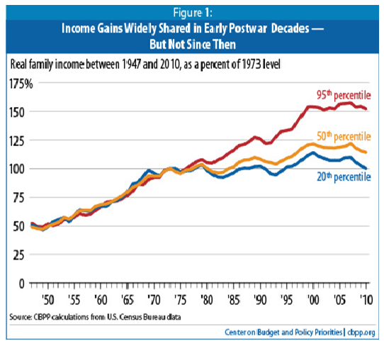
For example, comparing two roughly 30 year periods, 1947-79, when inequality was relatively unchanged, incomes just about doubled for each group shown in the figure. But between 1979 and 2010, income growth at the middle and bottom was pretty much flat, with the important exception of the mid-1990s, discussed below. High incomes rose more consistently over the period, though that trend too looks flat in the 2000s. That is, however, an artifact of these data, which exclude realized capital gains, an important income source in reference to inequality's growth over this period. In fact, other data which include capital gains show that the share of national income accruing to the top 1 percent grew to historic highs in 2007, before falling with the financial bust in 2008.
Now, there is of course a lot more than unequal growth delineating the two periods. The latter period saw many more women entering the workforce, demographic changes, including more single parent families, and importantly, at least until the mid-1990s, a significant slowing of productivity growth. But there's no question that inequality was a major factor in play (see note #1).
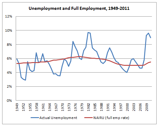
Another big distinction between these two roughly 30 year periods was the tightness of the labor market. Over the first period, 1947-1979, the average unemployment rate was 5.1 percent; over the second period, 1979-2010, it was 6.3 percent (6.1 percent through 2007). That doesn't sound like that big a difference in terms of labor market tightness, but it is. Let me explain.
One useful way to assess labor market tightness is to compare the unemployment rate to a construct called the non-accelerating inflationary rate of unemployment, or the NAIRU. The idea behind the NAIRU is that a) there's a tradeoff between low unemployment and inflation, and b) there's a rate of unemployment that's consistent with stable inflation. The implication is that if unemployment falls below the NAIRU, inflation will keep accelerating.
In fact, it's a slippery concept, this NAIRU idea, and the historical evidence for its existence is mixed at best. Back in the mid-90s, economists though it was 6 percent, and when the jobless rate fell below that, they badgered the Fed to raise interest rates so as to forestall the inflationary spiral they were sure was forthcoming. But it turned out that the spiral was a phantom menace -- price growth actually decelerated in these years and the jobless rate fell below 4 percent for a few months in 2000. Most importantly, from my perspective, very low jobless rates in the latter 1990s shows up quite clearly in Figure 1 as helping to generate uniquely favorable income trends for middle and low-income families.
But I still think the concept is useful, and that the estimated NAIRU provides a rough benchmark against which to compare the actual unemployment rate. For example, analysts like those at the Congressional Budget Office, who estimate the NAIRU, make adjustments for demographics that are useful in figuring out the full-employment unemployment rate. As our labor force ages, we'd expect the NAIRU to fall, because older workers tend to have lower unemployment rates.
The figure below plots the CBO's NAIRU against the actual unemployment rate since the late 1940s. Obviously, we're way above full employment right now, thanks to the Great Recession. But what's notable from the perspective of the income trends above is how much more common full employment was in the period when incomes were growing together versus when they were growing apart. There's an important, substantive linkage here between growth and inequality: at full employment, middle and low-income workers have much more of the bargaining power they require to claim their fair share of the growth they're helping to generate.
Sources: BLS, CBO
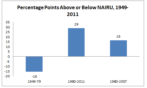
One way to compare how tight the labor market was over these two periods is to ask how many cumulative points of unemployment were spent above and below full employment in each period (to be clear about polarities, "above full employment" means the actual unemployment rate is "too high," i.e., above the NAIRU, and vice versa -- generally speaking: below is good, above is bad).
The next figure shows that over the first period, 1949-1979 unemployment was often below the NAIRU, for 16 cumulative percentage points over the full period (CBO's NAIRU series starts in '49). Conversely, unemployment was above the NAIRU for 29 points, 1980-2011. However, 13 of these points are due to the GR -- through 2007, we spent 16 points above the NAIRU.
Sources: BLS, CBO
But do these differences really play a role in generating the differences in income growth shown in the first figure? A little regression analysis suggests that they do. Again, this is correlation, not causation, but there's a lot more detailed evidence, not to mention common sense, that confirms these relationships (see, for example, this book by Dean Baker and me; see also note #2).
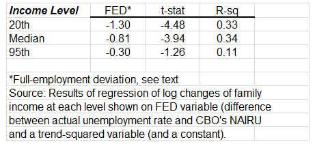
The table below shows the result of regressing (log) changes in real incomes -- the ones shown in the first figure above -- against the annual difference between actual unemployment and the NAIRU. In other words, if the NAIRU in a given year is 5 percent and the actual unemployment rate is 6 percent, this variable equals 1 percentage point in that year, and the regression asks how that measure correlates with real income growth.
The full employment hypothesis developed above would predict that the coefficient on the full-employment deviation variable (FED...like the central bank... hee-hee!) would be "large" and negative for low-incomes and small and not particularly significant for high incomes.
The table shows that the results largely fall out as predicted. The coefficient on FED tell you the percent change in real income at each level that you'd expect to see for each point you're above the NAIRU. So, for low-incomes (20th percentile), that elasticity is -1.3 percent and statistically significant. For middle incomes, it's about -0.8 percent and again, significant. For high incomes, it's -0.3 and insignificant, meaning that deviation from full employment doesn't much hurt high income families. R-squared, a measure between 0 and 1 of how well the regression explains changes in real incomes, is around 0.33 for middle and low-income families and only about one-third that amount for high-income families.
Source: my analysis of Census, BLS, CBO data.
Armed with these simple relationships, we can examine how income growth might have been different had unemployment in period two been more like that of period one -- i.e., had we hewn closer to the path of full employment.
The figure below shows actual median incomes -- the same series as in Figure 1, though now in 2010 $'s instead of indexed to 100 -- along with two different simulations. One simulates full employment, meaning the FED variable was set to 0, 1980 forward. It's not a realistic scenario, of course, but gives you the flavor of the cost of slack labor markets. The second scenario is more realistic -- it's takes the actual FED value over these years and divides them in half, basically asking how middle incomes might have fared had the job market been half as slack as it actually was.
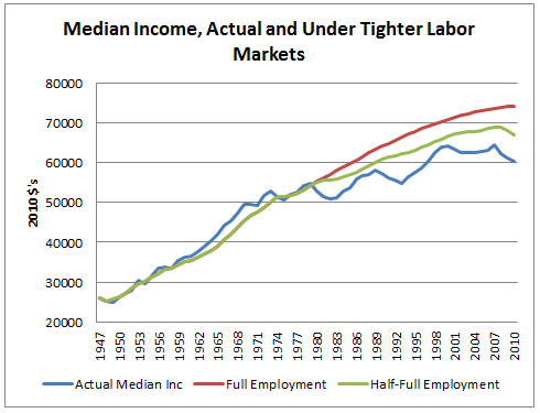
Source: Census data and results in previous table.
In the first simulation, by 2007, right before the GR, middle-class incomes under "pure full employment" were $9,200 above the actual; under "half-full employment," they were $4,400 higher. Where would this extra income come from? In fact, we're sacrificing output when we run slack labor markets, so some would come from missing growth. But another source would be more equitable distribution of growth, such as prevailed throughout the first period shown in Figure 1.
In other words, no matter how you cut it, slack is awfully costly to middle and low-income families.
OK -- I hopefully have convinced you that full employment matters, it's a good thing, and it's particularly important to middle and low-income families. Now you'd probably like to know how we recreate a job market that generates a bar more like the first one in Figure 3 above.
That's to come. Right now, time to go cheer on the kid, whose team made the local basketball playoffs!
Note #1: I unearthed this excellent Census study -- one I recalled finding quite compelling back in the day -- which examines the impact of demographic changes on the growth of inequality. It finds they were more important in the 1970s than in the 1980s, while inequality was a factor in both decades, especially the 1980s (e.g., note that in table 7, the fully standardized income shares are about the same as the actual shares, suggesting that demographics were not the driving factor in share changes over the decade ).
Note #2: Interestingly, the whole NAIRU schtick is based on low unemployment leading workers to push for higher wages, which then feed into higher prices. Once workers realize that their higher incomes are getting eaten up by higher inflation, they push for even higher wages, and that sets off the alleged wage/price spiral.
This post originally appeared at Jared Bernstein's On The Economy blog.