
The headline of a recent New York Times piece by The Upshot’s managing editor David Leonhardt is eye-opening and not at all subtle: “Inequality Has Actually Not Risen Since the Financial Crisis.” Unfortunately, the article that follows does not back up the sweeping conclusion of the headline.
In fact, the piece, based on a new study of income inequality by George Washington University economist Stephen Rose, is misleading, and its headline is flat-out wrong. The story has two huge problems: It fails to mention wealth inequality at all, and the income inequality data on which it is based does not support the story’s breathless “everything you know about inequality in America is wrong” opening lines.
The first problem is the big one: There’s a huge distinction between income inequality and wealth inequality. Leonhardt knows this, and throughout the piece takes care to note that he is referring to income inequality, not wealth inequality. But he never explains why he’s using that modifier, which may confuse some less-knowledgeable readers, if they even notice. At times, he seems to use this omission in the service of the broad headline.
Take this chart:
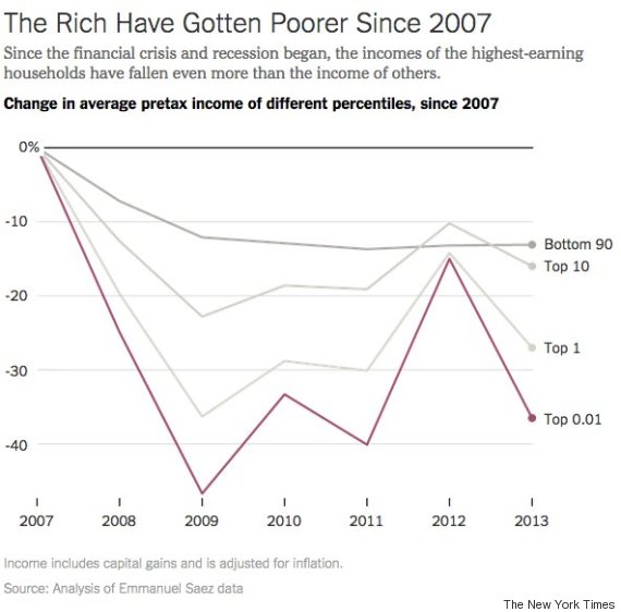
The chart’s title says that the “rich have gotten poorer since 2007.” But rich and poor are vague concepts. Here and throughout the piece, you have to pay close attention to the fact that Leonhardt, like Rose’s study, only looks at income. Wealth, a central part of what most people tend to mean when they use words like “rich” and “poor,” is excluded entirely.
So what about wealth since the financial crisis, which neither Rose nor Leonhardt look at? Does wealth since the financial crisis prove the point that “inequality has not actually risen since the financial crisis?" No, absolutely it does not.
Look at this chart, from Emmanuel Saez of the University of California, Berkley, and Gabriel Zucman of the London School of Economics. It shows the percentage of total household wealth held by the wealthiest households. The higher the number, the more concentrated and unequal the wealth distribution in the U.S.
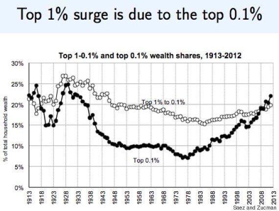
The rich have not only gotten wealthier since the financial crisis, but super-rich Americans -- those in the top 0.1 percent -- have gotten disproportionately more wealthy than even the merely rich.
The reason why wealth inequality in the U.S. has yawned wider since the financial crisis is pretty straightforward: The markets where the rich hold their wealth have been booming. Stocks, bonds, real estate, classic cars. Everything, The New York Times’ Neil Irwin noted, is up, up, and up some more.
What’s more, the wealthy have been the primary beneficiaries of this boom. According to the Federal Reserve, About 49 percent of Americans own any stock at all, either directly or through a fund. But among the top income earners, that number is a whooping 92 percent. As a result, millions of Americans in lower-income and lower-wealth brackets have completely missed out on the stock market recovery.
The post-financial crisis recovery has, to a huge extent, been a financial asset price recovery. Look solely at post-crisis income changes and you’ll miss one of the biggest stories of the recovery. You simply cannot sincerely and accurately talk in broad strokes about inequality in America without talking about wealth inequality. Yet that’s exactly what Leonhardt’s story, and Rose's study do.
Again, what Leonhardt’s article does address is income inequality. But the inequality data it cites -- incomes at the very top have dropped more since the financial crisis, on a percentage basis, than incomes for everyone else -- is largely meaningless.
Yes, the biggest post-crisis drops in income have hit the people who made the biggest incomes before. Then again, that’s fairly intuitive. The year Rose’s study uses as a baseline -- 2007 -- was the height of the pre-crash bubble, which was characterized by massively outsized pay for top earners. Of course top incomes have fallen hard since then. It would be weird if they had not. (University of Chicago economist Amir Sufi also pointed out that the very rich are the only group who see bigger income declines than they very poor –– those who can most and least afford it, respectively.)
Even the master of the counterintuitive economic take, Vox’s Matt Yglesias, thought Leonhardt read too much into a paper that uses the 2007 peak as its income baseline.
Measuring income changes from 2007 does not help you understand the long-term trend in income inequality, as Trulia’s Jed Kolko notes. And the long-term trend of income inequality really is exactly what you probably think it is: increasing.
Here’s income inequality in the decades before the crash.
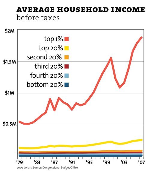
In that context, a few years of decline don’t alter the larger picture: Income inequality is still massive. And, as Leonhardt notes, the recovery’s gains have been gobbled up to a hugely distorted degree by those at the top. As Mother Jones’ Kevin Drum notes, this means that the counterfactual abnormality flagged in Leonhardt’s story will be brief: “The rich will regain all their losses within another year or two, and probably surpass them.”
The accurate picture of inequality in America since the financial crisis is this: The really rich are way wealthier than they were before. But, compared with the all-time highs of 2007, they are making slightly less income than before. Which is more important? Ask any a really rich person, and they’ll probably tell you they’re fine with slightly, and temporarily, falling income as long as they keep getting a lot wealthier.
And on a multi-decade time frame, both wealth inequality and income inequality remain as they were before the financial crisis: near all-time highs.
So if you thought that wealth inequality and income inequality have been at historically high and largely unacceptable levels before and after the financial crisis, you’re still right.
UPDATE: Feb. 19: In an email exchange, Rose noted that the purpose of his original research was to point out that a study by Saez that focused on the post-crisis period was incomplete. Rose said that he was trying "to show that Saez's research was cherry-picked and if you changed the years by a bit, you would get very different results." This is why he looked at the period from 2007 to 2012.
"I'm certainly aware that inequality has risen tremendously since 1980 and my point was not to say that inequality was starting to decline," Rose wrote.
He also pointed out, correctly, that while the top 0.1 percent have enjoyed gains in wealth and in the share of overall wealth since 2007, the top 1 percent -- the merely rich -- suffered a small outright decline in wealth between 2007 and 2012 (though they still have taken a bigger share of the overall wealth, as seen in the chart above).
Rose also argued that data on wealth are much "sketchier" than income data, and he noted that many other studies on inequality say nothing about wealth inequality.