There are many problems in the world more pressing than a few errant pixels in iOS 7, the latest operating system for iPhones and iPads. But when Apple fanatics downloaded the new, Jony Ive-built OS, they expected perfection.
Three months after its public release, design aficionados say Apple fell short.
An anonymous Tumblr called UX Critique is highlighting design problems with iOS 7, as BGR pointed out last week.
Mind you, tiny mistakes like these are expected in any software overhaul, especially one as thorough as iOS 7 -- Ive gave the OS a complete new look. However design-conscious consumers buy iOS to avoid these sorts of flaws. And Apple doesn't want to give them any more reason to leave for Google's Android operating system.
Here are some of the flaws UX Critique found:
1. It's impossible to tell if WiFi is on or if Bluetooth is off at first glance in Control Center.
For a company that values intuitiveness as much as Apple, that's a problem.
2. If you're in a dark room, dates are illegible in Facetime.
Turning on "Reduce Motion" gets rid of the problem, but doing so eliminates other design features you may wish to keep. (Read more about it here.)
3. Apple needs to add a few more pixels between the edges of the box and "Disable Background App Refresh."
Yes, it's small. But boy is it annoying. (Scroll to the bottom of the image below to see what we mean.)
4. "Copy," "Slideshow" and the rest of the bottom row are, in fact, not disabled.
Don't let their faded-out look fool you.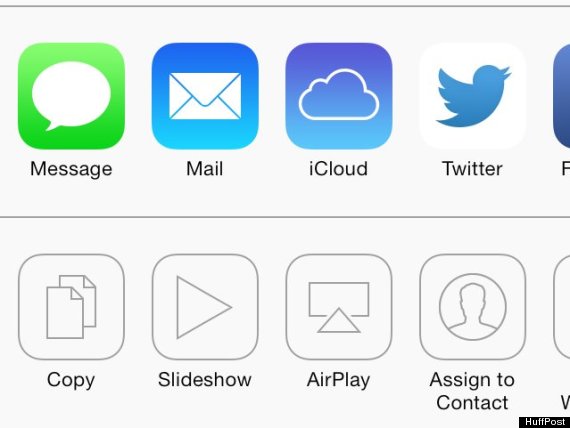
Related
Before You Go
