Attribution: Twitter
Branding and color have a particularly symbiotic relationship when it comes to the marketing and communications industry. Their relationship extends far beyond communications, and well into consumer habits.
Actually, it goes even further. Color psychology is important to understand and utilize in your marketing efforts, especially because neuroscience says humans may be hardwired for certain shades.
As a Psychology major at UChicago, I find the science behind successful brands to be incredibly compelling. I dug deeper into this field to learn more...
Research shows that colors, branding, and tying them together create an opportunity for consumers to recognize your business or brand quickly. After all, the goal of your branding attempts and marketing efforts is to create a company reputation easily remembered with a quick glance at a logo.
Colors are chosen to represent a brand very carefully. There’s a lot of work, time, and money put into the research of successful branding attempts. Companies use branding research to target particular markets and give a certain impression to their consumers.
Why color?
This is a question that’s not so easily answered as it is asked. Color relates to persuasion, because it evokes an emotional response. Persuasion is a marketer’s friend.
Color theory represents a unique opportunity to research the consumer's decision making process, as well as what marketing professionals can do to sway those decisions in their favor. In essence, it’s a sort of manipulation you want to be able to get away with. Research shows there are a lot of ways color theory affects consumer habits, and how marketing professionals can get away with it.
Utilizing color is an effective way to play on someone’s personal experiences. This means it’s not necessarily a universal thing, and can’t be universally translated into emotional responses. However, this does allow for a broader, more open pattern to be found behind the messaging in color perception.
In fact, 90% of snap judgements made about products, brands, or businesses can be based on color alone, according to research conducted by the University of Winnipeg. There are a variety of things that factor into the perception of color from a consumer’s point of view. Their age, culture, socioeconomic status, location, job, experience, family status, and the landscape of their industry all factor into the way they view color, or what color evokes in them.
Companies use color to elicit emotional responses like increased appetite or an enhanced mood. Some take it a step further, using color theory to soothe customers, reduce the perception of a lengthy wait, and other various situations where an emotional response may occur.
Choosing where to use color, aside from logos, is also important. There are a variety of locations to choose from, including merchandise, web design, and calls-to-action.
Fortune 500 companies know a little something about effective branding, especially when it comes to the utilization of color theory.
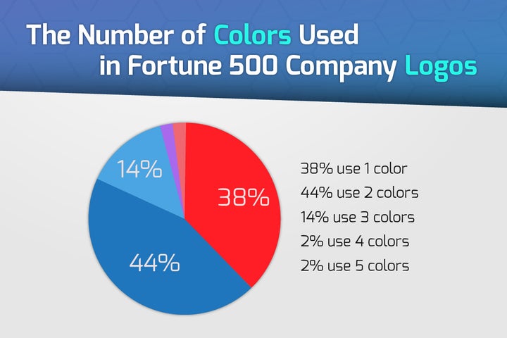
In an analysis of Fortune 500 company logos, there’s an evident underlying message in the colors they choose as well as how many colors they choose. Most people prefer color patterns with similar hues, which explains why over 80% of Fortune 500 companies have two or fewer colors incorporated into their logo.

Attribution: EPC Group
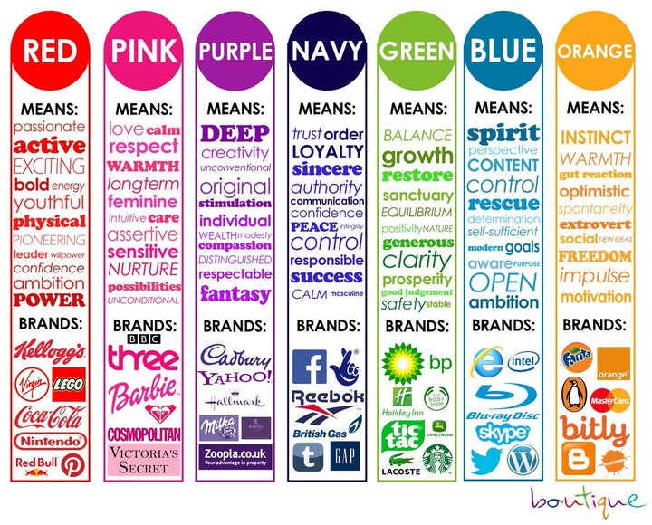
Plenty of notable, popular logos belong to Fortune 500 companies, because they know the value of a strong brand identity. Which, often times, they base off color theory. Ironic, isn’t it, how red is an appetite enhancer and it is present in the golden arches of McDonald’s logo? Red isn’t the most popular color in the logos of Fortune 500 companies though - over half (51%) of Fortune 500 company logos include the color blue in some form or another.
There are three steps to figuring out what colors to use in your branding attempts. You have to start by understanding your brand personality in order to choose the right colors to convey it with. If you’re a green, eco-friendly company, you won’t want to create a logo with red, a color associated with boldness, fire, and excitability. The next point of business is to take your brand personality, and match it with certain hues using color theory. As a third and final step to utilizing color theory in your company branding, learn which colors convey what meaning to readers.
Finally, architect your brand story using those colors.
Your logo, as well as the rest of your marketing materials, is the first impression on a customer. Because of this, you need to hone the message you’re trying to tell your customers about your brand through your logo. Your brand message matters, and it has an effect on the opinions of your customers - past, present, and future.
