The label may be limiting how we see the design of the capital subway stations. (The first of two parts.)

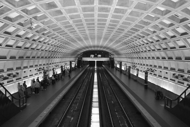
Washington Metro, designed by Harry Weese, 1966-1976.
This Spring, after the Washington Metropolitan Area Transit Authority (WMATA) started painting the interior of one of its Metro stops, some riders welcomed the change, but architects went into an uproar: “THIS IS OUTRAGEOUS!” protested critic Kriston Capps on Twitter. The vaulted, coffered concrete Metro stations, designed by Harry Weese in the mid-60s, opened in 1976 and in 2014 won the American Institute of Architects (AIA) Twenty-five Year Award, which honors a building that has “stood the test of time … and continues to set standards of excellence for its architectural design and significance.” While objections to painting the stations range from the practical to the esoteric, they center on one idea, as planner Matt Johnson first put it: “WMATA is breaking the cardinal rule of Brutalism,” referring to a strain of architecture that was common in the 60s and 70s and now is making a comeback. Painting the Metro, claim the objectors, is not only “disrespectful” to the style—it is an “affront” and even a “crime against Brutalism.”
Yet, with all the debate in recent months, I can find no public record of anyone asking the obvious question: Is the Metro really “Brutalist”?
To answer this, we’d need to define Brutalism clearly, and this is surprisingly elusive. “Perhaps no other twentieth-century architectural -ism has been such a moving target,” writes Joan Ockman in an essay in Mark Pasnik, Michael Kubo, and Chris Grimley’s 2015 book, Heroic: Concrete Architecture and the New Boston. Today, write the three authors, the word remains “a loosely and often arbitrarily applied moniker… [T]he worst aspect of Brutalism has been the misapplication of its name.” In his new volume on the topic, Barnabas Calder maintains, “Brutalism is hard to define, but easy to recognize. Exposed concrete now is the key identifier for most of Brutalism’s fans.” During the Metro controversy this Spring, Washington City Paper columnist Amanda Kolson Hurley concurred: “[E]xposed concrete is integral to the Brutalist style in which the Metro system was designed… So covering up the surface of the concrete warps a fundamental principle of this design philosophy.”
Hurley and others contend that the word Brutalism derives from béton brut (“raw concrete”), a technique most associated with the Swiss architect Le Corbusier but pioneered by his mentor, Auguste Perret. In actuality, the origins of the term are not so clear. Some say Swedish architect Hans Asplund coined nybrutalism (“new brutalism”) in 1949, as a tongue-in-cheek description of a contemporary house made of brick, not concrete. The Britons Alison and Peter Smithson either borrowed the term or, as they sometimes claimed, invented it on the toilet, possibly in reference to his student nickname, “Brutus.” Regardless of the source, the best-known early example of the nascent idea is their Hunstanton School (1954), built with brick and steel. So concrete was not the original earmark of Brutalism.
According to the critic Reyner Banham, whose 1955 essay “The New Brutalism” portrayed the emerging trend as an ethical agenda, material “honesty” was its defining trait: “Hunstanton appears to be made of glass, brick, steel and concrete, and is in fact made of glass, brick, steel and concrete.” Nearly 50 years later, Peter Smithson reiterated this in a 2001 interview: “Brutalism is not concerned with the material as such but rather the quality of the material… [T]here is a way of handling gold in Brutalist manner and it does not mean rough and cheap, it means: what is its raw quality?” Today, Brutalist gold might strike some as oxymoronic.

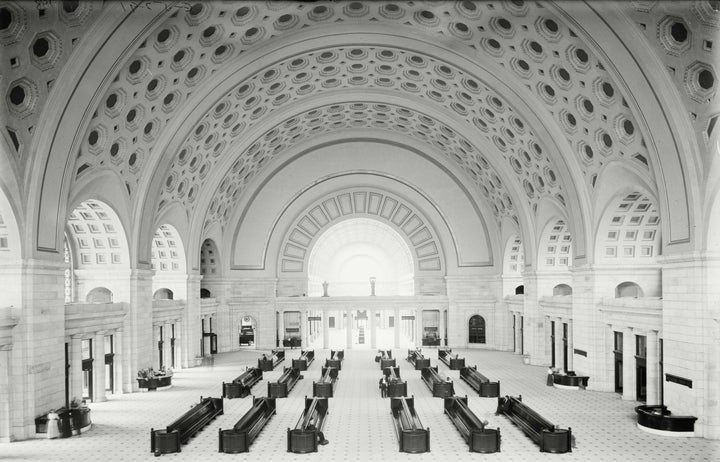
Union Station, Washington, DC. Designed by Daniel Burnham, 1908.
Imported to the United States, the term did become associated most notably with exposed concrete buildings such as Paul Rudolph’s Yale Art and Architecture Building (1963) and Kallmann, McKinnell and Knowles’ Boston City Hall (1968). Both were heavily influenced by Le Corbusier’s Unité d'Habitation in Marseilles (1952), where the concrete mostly is exposed but also is painted various colors in prominent places. At Le Corbusier’s monastery at La Tourette (1956-1960), considered “iconic” of Brutalism, concrete is painted rich colors in many of the most remarkable spaces. Unpainted concrete clearly wasn’t a “cardinal rule.”
Within American architecture alone, the word “Brutalist” has been applied to buildings with a wide range of exterior materials: e.g., Marcel Breuer’s Whitney Museum (granite cladding), Frank Lloyd Wright’s Guggenheim Museum (painted gunite), and Louis Kahn’s Exeter Library (brick). Bizarrely, Matt Johnson’s own media site, Greater Greater Washington, lists as one of the seven “best Brutalist buildings in DC” Arthur Erickson’s Canadian Embassy, which was built decades later (1989) with limestone and fluted classical columns.
So, whether in Europe or America, the use of a specific material in a specific condition has not always been a prerequisite of Brutalism. Yet, as Pasnik and Grimley, two of the authors of Heroic, confirm in an email, the term “is often exclusively (if incorrectly) associated with concrete alone”: “Brutalism we believe is a label that is often inaccurately applied to any concrete building from the late 1950s to the early 1970s.” For example, Deane Madsen, founder of Brutalist DC, has been quoted describing the Metro this way: “Brutalism in its purist form is about celebrating the materiality of concrete; painting over it hides that materiality.” It’s not clear whether this is intended to be purest or purist; one implies apotheosis, the other dogma, and neither seems a perfect description of the Metro in relation to Brutalism.
Even if you consider exposed concrete the essence of Brutalism, do all concrete buildings from that period, including the DC Metro, inevitably fall in that category? BrutalistDC praises “bona fide Brutalism” but doesn’t explain what that is (at least not that I can find). The site celebrates examples such as Weese’s Metro, Breuer’s American Press Institute, Eero Saarinen’s Dulles Airport, and I.M. Pei’s Third Church of Christ, Scientist, structures that have seemingly little in common with one another, other than concrete and the period in which they were built. It might be more accurate to refer to them as simply mid-century concrete buildings.
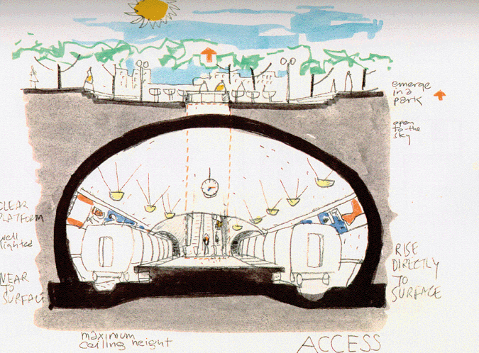
While the brut root of Brutalism expressed the “raw” state of materials, whether concrete or otherwise, this may not have been Harry Weese’s motivation. Robert Bruegmann, author of The Architecture of Harry Weese (2010), tells me that “during the tortuous process of getting all necessary approvals” and containing the costs, Weese studied many possibilities, including a more inconspicuous girder structure and even leaving the bedrock uncovered after tunneling. Choosing concrete had virtually nothing to do with the supposed ethics of materials, says Bruegmann. “Far from trying to highlight its raw and industrial character, Weese's coffers were a direct reference to the great concrete vaulted and domed spaces of ancient Rome, to the baths, basilicas, and the Pantheon.” While Hurley contends that the Pantheon’s “two-thousand-year-old concrete dome is brut (raw),” in fact it originally was stuccoed and gilded to evoke an ethereal, heavenly atmosphere. Brutalist gold, indeed.
Weese chose concrete, bronze, and granite for the Metro stations because he considered them “noble materials with an ancient pedigree,” according to Bruegmann. “I'm not even sure Harry would have objected if the Fine Arts Commission had insisted on covering the vaulting with travertine, as the Romans did in many public buildings.”

Harry Weese, concept sketch for the Washington Metro, July, 1966.
Homages to classical architecture extend beyond just the material palette. Upon giving it the Twenty-five Year Award in 2014, the AIA highlighted that the Metro’s “rectangular tessellations also make warmer references to the coffers seen in Daniel Burnham’s Union Station and the U.S. Capitol dome, Neo-Classical buildings that point to Greek and Roman architecture as precedents to contemporary American democracy.” Bruegmann’s book recounts that the Commission on Fine Arts specifically urged Weese to create “a dignified design in the ‘spirit of the classical style.’” The architect visited many train stations around the world and was inspired by Moscow’s ornate single-vault stations and Brunel’s vaulted train sheds in the UK, particularly Paddington Station, and he undoubtedly considered McKim Mead and White’s Roman-bath-inspired Penn Station, which had been razed only a few years before Weese began work.
Weese’s brilliance was to combine such a disparate wealth of precedents in such an utterly clear design that cannot easily be summarized with a single stylistic label.
