J.C. Penney wants you to forget that it hired a former Apple executive and tried to be "hip."
The retailer is reverting to its old logo in an aim to regain its loyal following and signal its return to the company's traditional values, according to the advertising news website Ad Age.
(Story continues after the logos)
Old Logo Pre-2011:

Redesigned Logo Under CEO Ron Johnson In 2012:
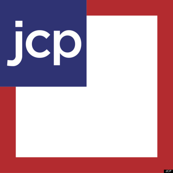
New Logo In 2013:
![]()
The change is likely part of CEO Mike Ullman's plan to wipe away any vestige of his predecessor Ron Johnson's short, but failed attempt to transform the company.
Johnson, who helped launched Apple's outrageously successful retail stores, led J.C. Penney for just 17 months, but the period was marked by employee layoffs, stock drops, marketing failure and a loss of $552 million in fourth quarter sales. The company ousted him last April.
Johnson rebranded the company to simply "JCP" in 2012, and changed the logo to a clean, square-cut shape as part of a attempt to redesign the store as hip, chic and modern. Customers didn't buy it, and the company's logo awareness decreased by nearly 28 percent from 2010 to 2012, according to Business Insider.
Ullman has already brought back many of the in-house brands Johnson removed, got rid of coffee bars on store floors, and reinstated a stricter dress code and the return of cashiers. He also fired nearly all of the high-level workers brought in by Johnson.
"As we transition to a more iconic and recognizable design, the change will give our loyal customers a sure sign that we're still the store they know and love," JCPenney spokeswoman Kate Coultas told Ad Age.
Related
Before You Go
