Looking through the J.Crew website this season may give you ideas for a holiday party menu. There's a cashmere sweater in harvest grape, moccasins in dark nutmeg and chinos in melted caramel and fresh sage.
"People really respond to food," said Tom Mora, head of women's design at the company. "I've never heard a person not feel happy about eating. It's that emotion or smile on your face. These colors all have distinct smells or tastes to them."
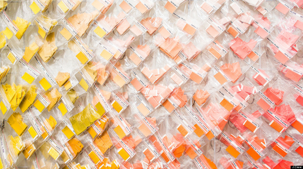
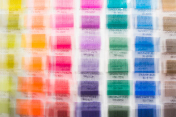
Food is just one of many things that inspire the names of the more than 100 colors J.Crew invents every season. Seasonal smells, flowers and destinations can all work to shift a red to dark poppy, or a neutral beige to sandy shore. The continual supply of bold new colors, painstakingly curated and named, is one reason the catalog resembles a lifestyle magazine and the brand has earned cult status.
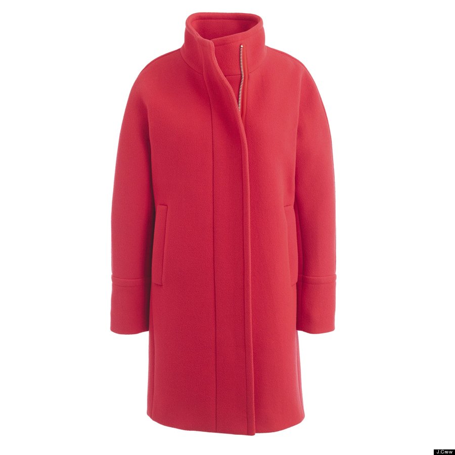
But before the colors are named, the colors themselves have to be selected. Mora and other color creators, including color librarian Cherie Zavitz (who has "the coolest job EVER," she said), start with a "mood board" in the company's color library in downtown Manhattan. They post items that set the collection's mood: vintage clothing, leather wallets, scraps of paper or silk. This season's neon electric flame, seen here in the stadium-cloth cocoon coat, started off as a "really intense shoelace," Mora said.
Once the seasonal palette is set, each color is dyed onto a fabric swatch and given a name that reflects the feel of the collection.
"Whether we're going on a trip to Spain or the 1920s in Berlin or the California coast, you start thinking of what that does in your head," said Mora. "That's where you start getting the words you can kind of associate with the colors as well."
Summer collections may have a tropical or warm feel: neon flamingo, reef blue and even pebble can evoke a sunny day at the beach. Fall takes on a more weathered, outdoorsy tone with rich colors that are burnished or icy or crisp or rusty. Color names can go in a lot of directions -- and they have, considering J.Crew has coined thousands of them -- but there are a couple of things the company tries to avoid. One is being creative to the point of obscurity.
"We don't want to start naming names in terms of a town or get too specific," Mora said. "That confuses people. They need to get it immediately from the sound of the name. Sometimes when you have a name that doesn't include the color, like dusty cobblestone, it kind of does feel like a cobblestone. They still know what that is."
He added that sometimes colors just sound like they would smell bad: "Sometimes the two words together, like burnt something or ripe something, are like, ew!"
Simplicity can work just as well as the most imaginative names. Bright colors pair well with J.Crew's signature neutrals. Jenna Lyons, the company's creative director, lists adding a pop of color as one of her 10 style rules.
"Color isn't easy for anyone," she told The Guardian. "It's not easy for me! It's a challenge. It feels good to embrace a challenge."
Standby colors like black, white and khaki aren't going anywhere. Those swatches are labeled and pinned on the wall in the color library -- along with the thousands of past colors that might make a comeback, if the designers and customers love them enough.
"There are always the favorites," Mora said. "You know it's a great color when the customer comes in asking for it by name."
Two old favorites that have resurfaced this season are golden sun and brilliant flame.