
Color is a way to differentiate and identify your company and products in a crowded marketplace. From the black-and-orange combination of the Amazon logo to the green of the Starbucks emblem or Tiffany's distinctive blue, the shade you choose is a vital element in brand recognition. (If you don't believe that, there's a fascinating Fast Company article that shows what happens when key colors of the world's most famous brands are switched out for unfamiliar ones.)
Given how color so radically increases brand identification (which, in turn, can boost sales and engagement), it's crucial that color remain consistent across all expressions of the brand, whether online or in print. Quality use of color is likewise vital: Imagine spending a sizable portion of your budget only to find the color is poorly rendered and unrecognizable as yours.
How Do You Keep Color Consistent?
- Every monitor is different.
- Every color copier is different.
- Every mobile screen is different.
- Every type of paper takes ink differently, depending on its weight and surface, such as coated or uncoated paper.
- Engraving ink is different from offset ink.
- Short-run digital inks are different; some are toner-based, while some are liquid ink.
The designer who is creating your brand has to deal with all of these factors to create acceptable consistency in a less-than-perfect world.
It Takes the Human Eye; You Can't Go By Numbers Alone
First, you must take the time to establish clear guidelines for the use of color in all of your online and print materials. Regularity in color goes a long way to promoting brand consistency, which is key to making the brand memorable and enduring.
- Is it offset or engraving? (They both use different formulations of ink. The colors are a bit different.)
- What type of paper are you thinking of? All papers have different surfaces and shades of white, which will affect the color.
If you rely on multiple vendors, the quest for consistency necessarily becomes more complex; but under no circumstances should they print anything before a review, including a sample drawdown where they test their ink mixing. Color-management software (available from a variety of vendors) can keep color somewhat consistent throughout the printing process, and even help determine how to print the same colors across different types of paper stocks and materials.
When it comes to coated and uncoated paper (and digital papers), the designer should establish different formulas for matching color across different substrates.
Color for Digital Campaigns (Websites and Apps)
RGB (Red, Green, Blue)
Anything that emits light (such as a computer screen, a projector, etc.) uses additive color, while anything that reflects light uses subtractive color. The basis of additive color is RGB (red, green, blue). Anything created onscreen for the online or digital realm--whether a Website, app, or PowerPoint--must be rendered in RGB for effective viewing. Screens (and the light they produce) render color differently than ink on paper.
The differences between digital and print colors are especially important to keep in mind as screens continually improve in resolution; an element that looks great on a MacBook's Retina screen may not effectively translate into print via the CMYK printing process, which may look dull in comparison. Variance in screen quality, size and even operating systems adds yet another layer of complexity, which is why many creative professionals end up stressed when trying to match brand colors in a design-intensive app across smartphones, tablets, and PCs.
Web-Safe Colors Are Hex Colors
Not all RGB colors render the same online. Therefore, in Web design, RGB colors are given Hexadecimal values (Hex or Web-safe colors) of either three or six digits and a hashtag, which modern browsers use to translate code into hues; black, for example, is represented as #0000. However, this is a limited palette and some color equivalents are not available. In order to maintain the consistency of your logo, you should establish a Hex color designation that matches your brand system as much as possible.
The color system is not perfect. This may be hard for some clients to understand, but there are technical limitations that curtail what any designer can do.
Printing Is Not a Science; It Is an Art.
Here are color designations of four-color printing:
Pantone (PMS)
Pantone is a corporation that created a proprietary Pantone Matching System (PMS) color space. This is a color matching system that designates the formulas for mixing inks to match swatches or color chips; it allows for uniformity when discussing and producing color. Pantone colors are printed as spot colors, made of pigment, which means the color is printed as a pure laydown of ink by the printer; this is most efficient in controlling color.
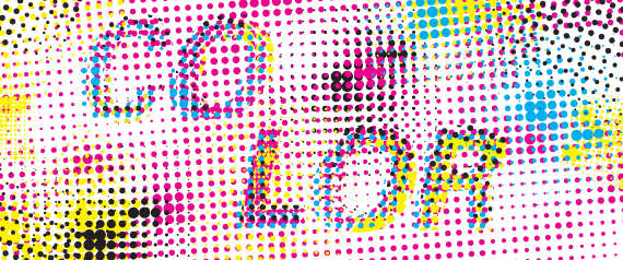
CMYK (Cyan, Magenta, Yellow, and Black) or Process Colors
Subtractive color works on the basis of reflected light; the way a particular pigment reflects different wavelengths of light determines its apparent color to the human eye.
As with additive color, there are three primary subtractive colors: Cyan, Magenta, and Yellow (CMY). In subtractive color, white is the absence of color, while black is the combination of all colors.
It's an imperfect system. Available pigments don't fully absorb light (preventing reflected color wavelengths), so we have to add a fourth pigment to compensate for this limitation. This is essentially black. Without this additional pigment, the closest to black we'd be able to render in print would be a muddy brown.
CMYK is a color process for print; cyan, magenta, yellow, and black are the inks used as the basis for printing a wide variety of colors. These four transparent colors, rendered as tint dots, overlap one another to create the images you see in magazines and newspapers. Most printing is done this way; color copiers use CMYK, as well. By using a "mixed" color, CMYK creates a less exact color match than using a PMS spot color.
While CMYK seems a pretty straightforward concept, things can quickly get complicated for branding campaigns that extend across print and online. Exactly matching CMYK color to PMS can prove impossible; Pantone produces a book that shows the bridge between actual PMS color and the equivalent made out of process colors. Some colors (such as orange, for example) can lose vibrancy. Every brand across the board faces this challenge. That being said, there are acceptable and necessary accommodations to handle color variations.
Brand Integration and Style
Brand integration means your logos, typefaces, text, and design end up displayed in multiple formats, from paper to smartphone screens. That makes an understanding of RGB, Pantone, and CMYK one of the most important parts of the creative process; if there's obvious inconsistency in color between those platforms, it could tarnish your whole campaign.
As mentioned above, developing "Brand Guidelines" at the outset of the project that establish a framework for the use of brand color in CMYK, RGB, and Pantone is vital; the designer should create separate formulas for uncoated and coated paper for color matching. While it's a lot of work to build color consistency into a brand, the results are well worth it, especially if a company wants to extend its presence into new mediums and markets.
Visual Perception is relative to context
A little over fifty years ago, Josef Albers used his famous book Interaction of Color to demonstrate, via optical illusions and visual exercises, how human beings perceived the world around them. He demonstrated how the same color is viewed differently based on the context of where it is seen. He was convinced that most human beings looked without really seeing, and he wanted to open their eyes. Keep Albers in mind when recognizing how print and the Web are different visual environments. The right colors, applied in a most judicious fashion, can help a viewer see, feel, identify and remember your brand.
Janet Odgis is the President and Creative Director of Odgis + Co, an award-winning certified woman-owned design firm based in New York City. For 30 years she has worked with some of the world's most prestigious corporations reinventing ways to define and express their brand. We Make Business Beautiful.