If you ever get to wondering why roughly half of America thinks we're still in a recession five years into the recovery, and after one of the longest stock-market rallies in history, just look at this chart:
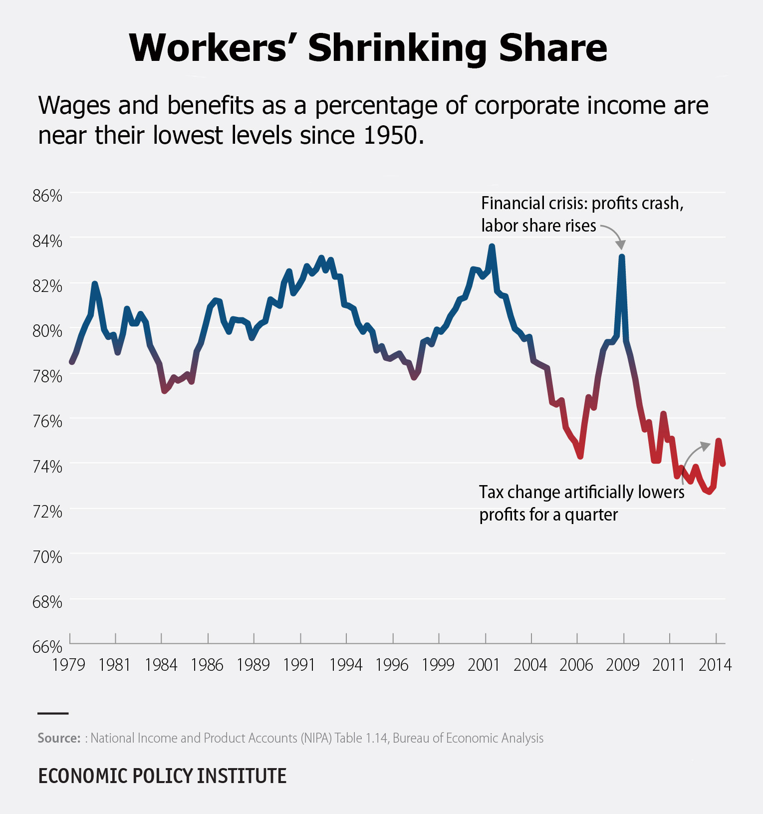
This is a chart of how much of the corporate-income pie that workers get for themselves in wages and benefits. It was made by the Economic Policy Institute, a think tank focused on labor issues. That share hit a peak of nearly 84 percent right around the turn of the millennium. It is currently at about 74 percent, near its lowest point since 1950.
The chart says pretty much everything about how ridiculously uneven this "recovery" has been. It exposes how most of the benefit of the recovery has gone to employers, not employees. Corporate profits have hit record highs, and so have stock prices. Wages have stagnated, meanwhile, and low-wage jobs have accounted for most of the job growth in the recovery.
This isn't just happening in the U.S. -- it's a problem around the world. It's partly due to technological advances, partly due to jobs being shipped to where labor is the absolute cheapest, and partly due to policies designed to shovel more income to the top 1 percent, to name a few. The end result is that more wealth keeps flowing to the owners of capital, rather than to labor, just as French economist Thomas Piketty warned us.
These trends have made income inequality grow wider and widespread economic hopelessness grow deeper. That sets us up for more economic trouble ahead.
Thousands of low-wage workers are protesting today for better pay, benefits and working conditions. They're risking jail to do it. This chart is a reminder that their cause is no joke.