

Data is a vital part of any business, and new software tools make analyzing that data easier (and cheaper) than ever. Despite the relative ease of crunching the numbers, however, it's often difficult for businesses to explain the full importance of the data to stakeholders, customers, and potential investors.
Simplifying Complexity
When trying to convey complex abstract concepts visuals become even more vital. Data related to such topics measures growth, correlations, comparisons, and reveals insights that are hard to understand in spreadsheets or standard PowerPoint graphs. Delving into such strategic topics through text alone can quickly add up to many dense pages that few people will even begin to read. On the other hand by conveying data rich information in a few elegant slides or a single infographic, you can easily convey its overarching point--and win over the audience in the process.
Comparisons and Correlation
At their best, presentations and visualizations can make data come alive in an engaging, comprehensive way. Take one of the most famous examples by French civil engineer Charles Joseph Minard, who created a concise, beautifully rendered graph that demonstrated Napoleon's troop strength, the distance they marched across Russia, the direction of travel, and the dipping temperature:
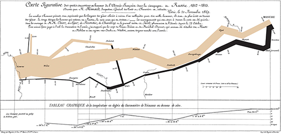
Edward Tufte, noted Yale professor and master of data visualization (and whose work The Visual Display of Quantitative Information is well worth the read for anyone interested in the field), once described Minard's graph as "the best statistical graphic ever drawn."
Minard managed to accomplish all that with a bit of ink and paper; imagine what a designer today can do with a full suite of digital tools and a bit of creativity. As with so many things, creating a memorable visual display comes down to skill, and knowing which elements to include (and which to leave off). Every ounce of creative muscle should be applied to creating something that instantly imparts information to the viewer; you don't want frustrated people trying to puzzle out the meaning of the work.
Telling the story
But how to choose which information and visual elements will best illustrate the point? In an ideal scenario, the visualization will make the audience instantly understand the relationships and causality of the data in play. For example, Minard's graph makes it clear from the outset that Russia's wide-open geography, and dipping temperatures, led to a steady decrease in the number of French troops as Napoleon marched to Moscow and back; all the elements come together in a pleasing whole.
- What's your point?
- How can you prove it?
- Which findings are you trying to compare?
- What information best supports that concept?
- How should it be presented?
- How should it look? (Pie/graph/overlaying information, etc.)
- What's the takeaway?
- Why does that matter?
Get to the point
There should also be an attempt to remove as much clutter or "noise" as possible. Lots of data is extraneous; when creating something streamlined, it's important to focus on what matters. If you do it right, though, you'll have a visualization that instantly conveys even the most complex data effectively. As it is said, A picture is worth a thousand words.
Janet Odgis is the President and Creative Director of Odgis + Co, an award-winning certified woman-owned design firm based in New York City. For 30 years she has worked with some of the world's most prestigious corporations reinventing ways to define and express their brand. We Make Business Beautiful.