As part of Under the Covers, our occasional series on book cover design (formerly known as Rejected Covers), we talked via email to Natalie Slocum, cover designer of Bloomsbury book Little Known Facts ($25.00)
In your own words, what is this book about?
Little Known Facts is about an aging, still popular movie-star turned director in his mid 50s to 60s. It's about his adult children and ex-wife and more widely all the people in his orbit and how his fame effects all of them.
What was the mood or moment from the story that you're depicting with this cover?
This cover was intended to convey a general mood and leave the viewer wondering a bit. The type sets it up as a particular kind of magazine cover, that gives a feeling of celebrity... larger than life.
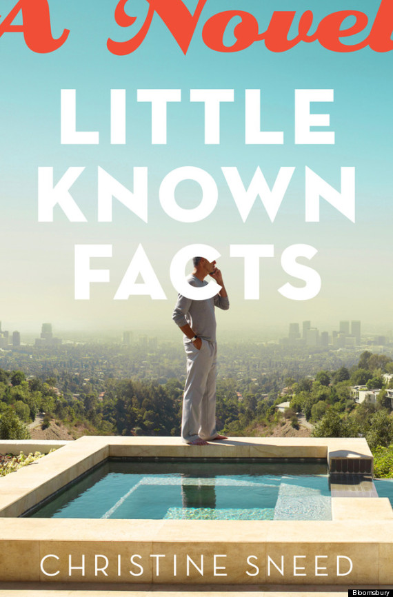
Hopefully you're seeing a man who's at the top looking out over all he has power over, and he's relaxed, barefoot even. He's on the phone, he's in charge, calling the shots, and he seems completely at ease. He's also incredibly alone and isolated, phoning instead of talking directly to someone, which is how he holds people at a distance in the book. And now that huge, larger-than-life type and illusion is holding him back, trapping him on the edge of a metaphorical (and literal in the picture) chasm because it's all supposed to look so easy and under control to everyone in the audience/society, and yet he's very isolated. And it gets to him and his family.
For this particular book my main influence was the illusion of the glossy, larger-than-life celebrity/fashion magazine. It's all so fake. These have got to be real people who feel and mess up, just like we do, and yet they are so airbrushed in front of their sets, and even worse is we want that from them. We want to believe in that illusion. It seems really poisonous, as it is in the book.
What inspires your design?
First: storytelling. It's such an entertaining puzzle to be asked to let a viewer have, in one glimpse, an idea of a whole story. I don't think I'll ever get tired of it.
Secondly: typography. I feel a physical change in my brain, maybe even my body, when I see beautiful type. I can't always achieve that effect in my own work, but hopefully I'm getting better. Usually if I'm stuck and can't really find the right concept, or something (image, construct, layout) that helps convey the feeling or story, I just start trying to lay out the type. Suddenly things flow, and it pulls me through about 98% of the time.
What is your professional background? For which other books have you designed covers?
I started designing books at Vintage for John Gall. He actually hired me as a sort of studio manager/assistant, but I bugged him until he gave me art research and clearance to do for the department. I took design classes at SVA Continuing Ed. at night, and kept wheedling John into giving me any book cover I could get my hands on. And then eventually I started getting more. I went to grad school at SVA for my MFA in Graphic Design thinking I'd try something else, and then came right back to books.
Some of my recent favorite designs: The Silence and the Roar by Nihad Sirees (really cool book), The Dangers of Proximal Alphabets by Kathleen Alcott, The Uninvited by Liz Jensen, The Hypothetical Girl by Elizabeth Cohen, An Emergency in Slow Motion by William Todd Schultz, The Hustle by Doug Merlino, Tiny Sunbirds Far Away by Christie Watson, and Calling Mr. King and Solo Pass, both by Ronald De Feo. But the list goes on....
What was the biggest challenge in designing this cover?
Ha ha. Trying to get Conde Nast to let us use the cover that everyone fell in love with, and failing. There was an incredible picture of a silver-haired actor we all know sitting in a convertible with a starlet, in front of a back drop of Cannes with a set light and director's horn next to it. It was perfect. And because it was a picture for this type of magazine, it communicated all the above-mentioned emotions. The type conveniently covered the actor's and model's faces, but to no avail.
In many ways, this cover works better.
What concepts did you reject? Do you have a favorite? Are you happy with the final result?
We went around and around on this (three, maybe four cover concepts?) and we rejected a number that weren't personal enough, looked too much like it was another LA story, or the mood just wasn't right. Ironically, this cover image was among the first of my searches. Ultimately, I am happy with this one.
What makes a successful book cover?
It either:
1. causes you to ask a question you want answered
2. speaks to your aesthetic
3. reminds you of something you've been exposed to before and enjoyed on some level, (or didn't enjoy, but enjoyed being tortured by).
4. any combination of the above.
What are some of your favorite book covers?
I love too many. I can tell you that the following designers constantly amaze me for the following reasons:
Smart, clever, conceptual, funny as hell: Helen Yentus, Jason Booher, Peter Mendelsund, Jamie Keenan, John Gall, Paul Sahre
Rich, Lovely, I want to eat these books: Jonathan Gray, Christopher Silas Neal, Roberto de Vicque de Cumptich, PattiMatteo Bologna, Megan Wilson, Patti Ratchford, Coralie Bickford-Smith, Jessica Hische, Chin-Yee Lai, Amy King
What's sharp and gorgeous? Diamonds: Gabriele Wilson, Barbara De Wilde, Carol Carson, Rodrigo Corral, Stephen Doyle
Those are just some names, and they cross my categories on occasion. There are so many more out there, and more coming all the time. Especially with cover design changing as it is.
Do you judge books by their covers?
Of course. But sometimes I judge a book excellent and the cover, well... not.