
Map of San Antonio from 1873.
San Antonio, the nation’s seventh largest city, recently passed a historic first, a $2.7 billion budget based on something called an “equity lens,” a concept first popularized in Seattle. How Seattle and San Antonio, two very different cities, go on to interpret “equity” is a theme that will likely resonate for years to come.
As a major American city, San Antonio is without an obvious counterpart in the Census Bureau’s top 10 list of cities. Predominantly bi-cultural rather than multicultural, its closest analogs may turn out to be smaller Texas cities, such as El Paso and Corpus Christi, that share Hispanic majority populations and similar settlement histories. Nevertheless, San Antonio’s progress is vitally important as an indicator of where both Texas and the United States are headed in demographic trends (increasingly younger and more Hispanic), according to numerous experts, including sociologist Rogelio Sáenz, Ph.D., co-author of Latinos in the United States: Diversity and Change, and dean of the University of Texas at San Antonio (UTSA)’s College of Public Policy. (Sáenz spoke about changing demographics at the third annual Latino Leadership Conference held in San Antonio last week.)
As someone who’s lived at length in Seattle and San Antonio, I’ve been intrigued to consider ways in which “equity” may get interpreted differently in both places, given the two cities’ different population characteristics and focuses. As a word, equity is tied to how it’s demonstrated — the sense of treating segments fairly and proportionately. In Seattle, which has taken the lead, equity seems to be more about addressing structural inequality and racial inequality. There’s a great tool kit on the city’s website about just how to do that, and Seattle recently pushed through an increase to $15 of its minimum wage. Some backstory there involves Nick Hanauer, the progressive, self-described “plutocrat” and tech billionaire/venture capitalist, who’s made it very clear in a series of TED Talks how vitally important he feels it is for a city with such great wealth disparity to address it directly — lest the future include mobs of disgruntled “have-nots” with torches and pitchforks, gathering outside Seattle’s gated communities of “haves.”
In San Antonio, the equity emphasis appears at least initially to have less to do with addressing social inequality and residential or economic segregation — although various sources have established that as some of the worst in the nation — and more to do with improving infrastructure, such as fixing streets and improving parks.
But whether or not there’s a clear-cut model for San Antonio to follow on this, and whether its residents insist on broadening the reach of the equity lens, there’s no doubt that overlapping layers of poverty concentrated in some of the city’s highest-hardship areas risk greater human consequences than the condition of their physical infrastructure.
This past summer, I had the fortuitous opportunity to intern with the City of San Antonio’s Human Services department, which administers the $2 million-plus federal Community Services Block Grant for the city. Trying to understand where poverty was distributed across the city, I started an ambitious, independent project to map population characteristics by ZIP Code, using U.S. Census Bureau and American Community Survey data.
As I mapped the data to Tableau Public, which later awarded this project their “Viz of the Day” honor, it became easier to see the patterns. Areas of concentrated disadvantage emerged in ZIP Codes to the immediate west and east of the city center, extending into the south but with nothing like it to the north. A persistent image began to develop of a specific “zone of well-being,” a veritable “crescent of comfort” to the north, which was consistent across multiple metrics — and below it, areas of much greater hardship and concern.

L-R, percent of population below poverty level, educational attainment (population with high school diploma or GED) and median household income. Source: U.S. Census Bureau 2010, American Community Survey 2015 Estimates.
The same general pattern continued with other comparisons.
An enormous spread exists in median home values from the lowest-performing ($57,600 in 78202) to the highest-performing ($572,400 in 78257 ) ZIP Codes. Home values are tied to property taxes, which are tied to school funding — and San Antonio has a checkered history where unequal educational opportunity is concerned. (See Jonathan Kozol’s Savage Inequalities for more about the landmark case, San Antonio Independent School District vs. Rodriguez, and “Schools Feed Uneven Growth,” from the San Antonio Express-News.)
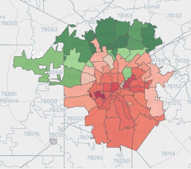
Per capita income by ZIP Code. Source: U.S. Census Bureau 2010, American Community Survey 2015 Estimates.
Not surprisingly, per capita income follows the same general distribution.
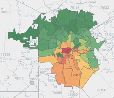
Educational levels high and low by ZIP Code. Source: U.S. Census Bureau 2010, American Community Survey 2015 Estimates.
And educational levels are particularly divergent. Bachelor’s degrees and graduate or professional degrees are strongly concentrated in the northern crescent.
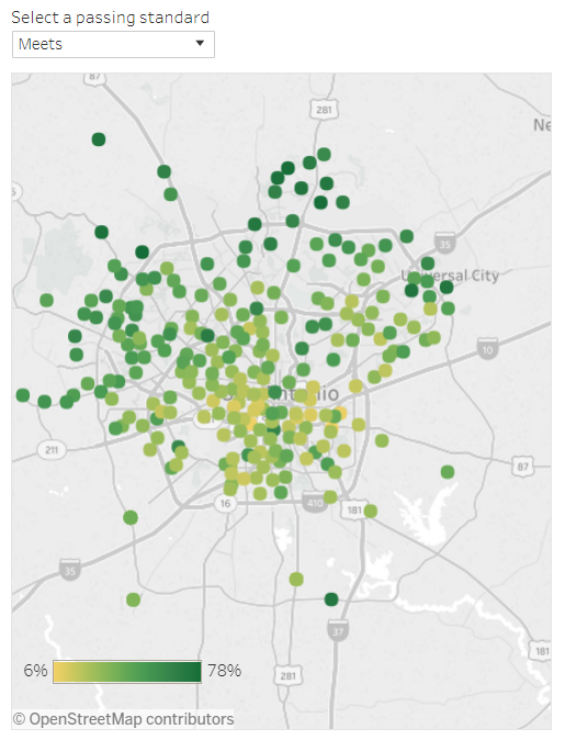
The distribution of where students meet the third grade reading standard. Source: P16 Plus, an educational nonprofit and collective impact organization, using Texas Education Agency data.
But see how consistent this is conceptually? Educational performance, even at a third grade level, matches the same distribution.
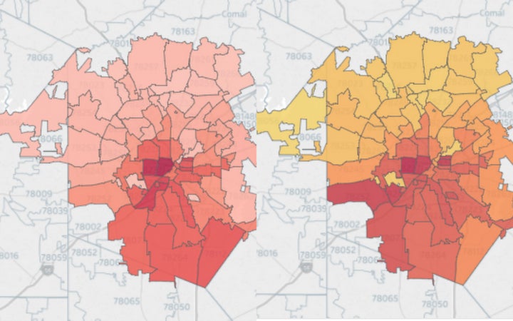
L-R. Percent of population with less than a ninth grade education; and percent of population with between a ninth and a twelfth grade education, but who left without attaining a diploma or a GED.
Grimmer still, it’s possible to map lack of educational attainment at a more granular level. Heat maps display a consistent “geography of poverty” — where those with less than a ninth grade education, as many as one in four, depending on the ZIP Code — or those with between a ninth and twelfth grade education, but who left without graduating or attaining a GED — reside. (The educational maps are linked here.)
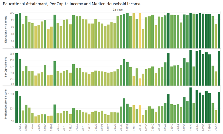
Comparison of educational attainment, per capita income and median household income in San Antonio by ZIP Code.
Of course, educational attainment is connected to per capita income, which factors into household income and ultimately residential segregation, as earning power expands or limits choices of where to live.
And there’s a double whammy: Not only is San Antonio lower at every level of educational attainment when compared to the U.S. as whole, but earning power is also down at every level — and worst at the high school graduate level, where the difference is more than 10 percent.
Why disparity matters
These layered levels of hardship that sociologists call “concentrated disadvantage” have been linked to “numerous social and psychological outcomes, neighborhood disorder, collective efficacy and health,” according to an article in Sociological Perspectives.
San Antonio’s public health department, the Metropolitan Health District, seems out in front on this idea. “. . . The single most striking theme in health outcomes is inequity,” they write in their 2016 appraisal of Bexar County, the region which includes San Antonio as its most populous element. There’s even a segment presciently entitled, “Looking at health with an equity lens:”
“Two key themes emerge from a close look at environment and living conditions. First, fundamental social determinants of health like poverty and educational attainment remain stubbornly unchanged. Some, like income inequality and segregation, are getting worse, and Bexar County’s income inequality now resembles that of China and the Dominican Republic.”
While acknowledging that medical care accounts for no more than a “10 to 20 percent contribution to overall health,” they look instead to the “stark differences in the conditions in which people are born, grow up and old, work and play.” These social determinants, they write, “vary by race/ethnicity, and even more strikingly by neighborhood.” “. . . Disparities are often evident when comparing racial/ethnic subgroups,” but “when comparing neighborhoods, though, the disparity is especially dramatic.” So great, in fact, that “. . .the difference in life expectancy between prosperous and poor neighborhoods is a staggering 20 years.”
How important, then, is it that San Antonio is committed to gearing its budget to an equity lens? Incredibly so. But the next frontier should decidedly address implications that go well beyond physical infrastructure — to educational attainment, earning capacity, even residents’ health and well-being, to name just a few key factors.
Next up: Calculating a “Hardship Index” for San Antonio’s neighborhoods.
