

Respect the GIF.
Gavin Schmidt’s GIFs, especially. The climatologist and director of NASA’s Goddard Institute for Space Studies (GISS) has a knack for distilling large amounts of data into easily digestible animations, often illustrating historical shifts in our climate.
Earlier this month, Schmidt came up with a new one, showing monthly temperature distributions and how they’ve changed since the late 19th century:
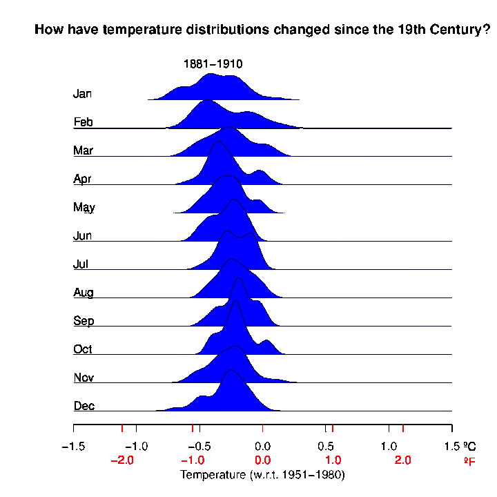
Simply put, the animation illustrates how often a month reached certain temperatures over time. Taller peaks for each month’s individual graph indicate that month hitting that temperature more often, while lower ones mean those temperatures were less frequent. (The more technical term for this is a “histogram” or “frequency plot.”)
And as is evident by the slug-like plots inching to the right over time, the Earth’s temperature is heating up.
At the end of the animation, Schmidt included red and black boxes to indicate individual temperatures for 2016 and 2017, respectively, all of which are clearly on the far right of the graph, around 2 degrees Fahrenheit warmer than historical averages.
And here’s a version of the graphic that illustrates the same warming trend in the context of broader seasonal temperature shifts.
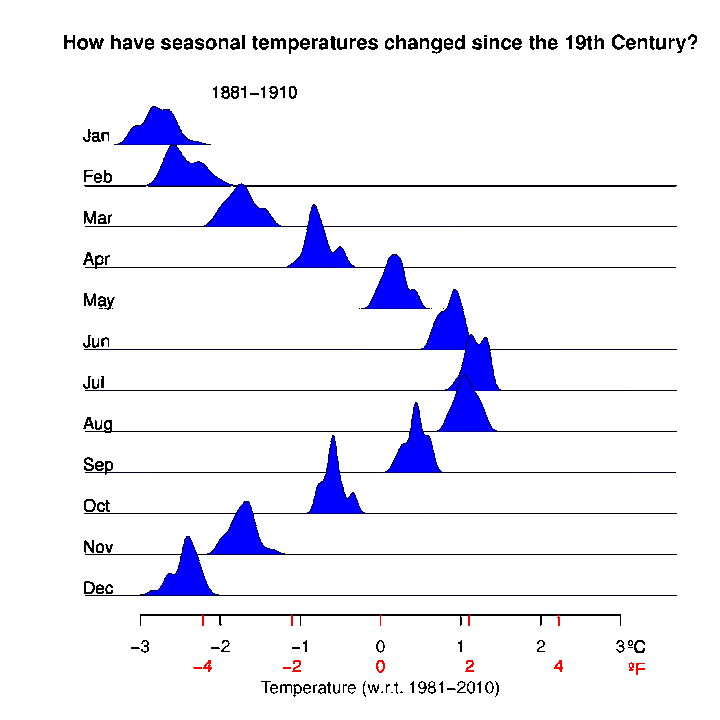
Beyond simply becoming warmer, Schmidt told HuffPost there’s another interesting trend the GIF reveals: sharper monthly temperature swings.
In earlier periods toward the beginning of the century, you’ll notice the monthly “slugs” are more tightly compressed, indicating most of those months landed within a narrower temperature range. In recent decades however, the “slugs” are shorter and longer, signifying less consistent temperatures.
“If it’s very tall and narrow, it means that the months were all very similar over that period,” Schmidt said, “while if they aren’t, then there were relatively more extremes.”
Per Schmidt, some of the stretching can be attributed to El Niño, an atmospheric and oceanic event in which warm water in the Pacific Ocean shifts east from the South Pacific toward the coast of South America. In recent decades, however, he said it’s due to larger climactic warming trends.