
Sea level rise in New York City / Climate Central
World leaders have begun to get serious about fighting climate change, but we still face the incredible risk of a rising sea in this century and far into the future. According to Climate Central, a research organization, a 4-degree Celsius (7.2 degrees Fahrenheit) global temperature increase, which is our current path, could result in sea level rise that would submerge land where 470 - 760 million people now live. If the world's governments actually meet the declared goal of the UN climate summit in Paris and reduce and draw down carbon emissions, keeping the world to a 2 Celsius (3.6 degrees Fahrenheit) temperature increase, 130 million would need to evacuate over coming decades. To understand how serious this could be, here's some perspective: 4 million Syrians have fled their homeland since their civil war began in 2011, with 380,000 making their way to Europe this year. Imagine millions more on the move each year, all over the world, and the political, social, and environmental effects of this migration.
In a new report, Climate Central finds that Asia, with large populations on coasts, will be hardest hit. "China, the world's leading carbon emitter, leads the world, too, in coastal risk, with 145 million people living on land ultimately threatened by rising seas if emission levels are not reduced. China has the most to gain from limiting warming to 2°C, which would cut the total to 64 million. Twelve other nations each have more than 10 million people living on land at risk, led by India, Bangladesh, Vietnam, Indonesia, and Japan." And the U.S. could experience huge impacts, too, with land for 25 million underwater. Major parts of coastal cities like New York City, Boston, Miami, Los Angeles, and San Francisco; river cities like Chicago and Washington, D.C.; and smaller coastal and river communities could be submerged.
The Surging Seas Risk Zone Map, their latest interactive map, shows in startling detail what that flooding could look like, foot by foot, with a 2 degree Celsius increase. The map, which was relaunched last November to extend the coverage from the U.S. to the whole world, is designed to help policymakers and planners better plan coastal resilience efforts.
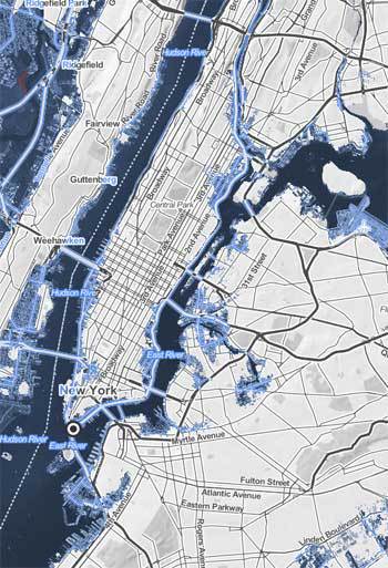
Plugging in New York City brought up a map showing the relative impact of inundation, ranging from 1 to 10 feet. As one moves up the scale in sea level rise, parts of lower Manhattan are submerged, and LaGuardia airport in Queens is totally underwater (see map above). A rising East River would flood highly populated parts of Brooklyn as well, and New Jersey would become a patchwork of islands.
In Los Angeles, almost all of the coastal communities, including ecological preserves, are completely submerged.

Sea level rise in Los Angeles / Climate Central
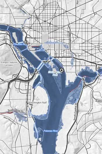
Looking at Washington, D.C., one could see the Anacostia and Potomac Rivers expanding beyond their banks, putting much of the Tidal Basin, East Potomac Park, the Navy Yard, and parts of the National Mall underwater. Reagan National Airport could also need to close some runways.
Sea Level Rise in Washington, D.C. / Climate Central
And an even scarier map shows side-by-side comparisons for any mapped point, with both a 2 degree Celsius and 4 degree rise.
Sea level rise will be incremental and long-term. They write: "carbon emissions this century can lock in these projected threats, but the associated sea level rise is expected to play out over a longer period, likely centuries." To date, the seas have risen approximately 8 inches.
The data in the map is based on research published in the Proceedings of the National Academy of Sciences of the U.S. According to Climate Central, these are just median projections -- meaning real sea level rise could equally be higher or lower.
A fascinating, complementary map is the Atlas of a Changing Planet, a "story map" from Esri.