
President Barack Obama has reached the first crossover point of his presidency, where his job approval numbers with the public are lower than his disapproval numbers. This is not exactly good news for Obama fans, especially heading into a midterm election.
For five months, Obama was holding his head above water, metaphorically, and charting extremely stable polling numbers where his approval was slightly above his disapproval. This trend has now ended, and a new trend is emerging -- downwards for the president. What's even more ominous is the fact that this trend seemed to accelerate dramatically at the end of July, meaning August may be even worse for Obama.
After taking a quick look at July's numbers, we're going to attempt to put this into some sort of historical perspective by taking a look back at where other presidents first reached this crossover point in their presidencies, without drawing any sweeping conclusions (other than: "don't attempt to draw sweeping conclusions"). If at any time, while reading the rest of this, you get too depressed to read further, I would suggest skipping down to the last historical section and at least giving that a chance.
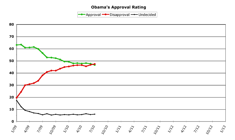
With that warning having been given, let's take a look at this month's chart for Obama:
[Click on graph to see larger-scale version.]
July, 2010
I'm going to keep this mercifully short, because the last section today is going to take up some room.
July was not a good month for Barack Obama's approval numbers. After showing remarkable stability for the previous five months, in July Obama lost more ground than he's lost since February, when he entered into his stable period. Obama charted "worst" numbers in every category this month, figured both daily and monthly.
July had some political successes for Obama, but the public once again didn't give him any credit for passing Wall Street reform, or any of the other achievements Obama chalked up. Obama, during this time, was drawn into a fracas in Arizona over immigration which has political repercussions both in the short term and the long (short term: good for Republicans -- long term: good for Democrats). The volcano of oil in the Gulf was shut off, and the spill seems to be a lot less worse than it could have been (which isn't saying much, since it's officially "the worst ever"), but none of this helped Obama much.
By the numbers, Obama dropped a full percentage point last month in approval, to wind up with 46.6 percent. His disapproval rose a bit less than this, to 47.4 percent, an increase of 0.7 percent for the month. This puts him officially 0.8 percentage points "underwater." As I mentioned, for approval, this was Obama's worst month since February. Over the past two months, Obama's approval has fallen a total of 1.5 percent, while his disapproval rose 1.9 percent. Not exactly a happy trend for Obama fans.
Overall Trends
But there's even more bad news ahead, likely.
Obama charted new "worst ever" marks across the board this month. In terms of monthly numbers, both approval and disapproval were his worst ever. But in terms of daily numbers, it's even more chilling. Obama's approval hit a high of 47.6 percent in the middle of the month, but he ended the month on a serious low, at 45.3 percent -- almost a full percentage point lower than his last "worst daily" number. And -- again, ominously -- on the last day of the month, Obama also posted a daily high disapproval rate of 49.8 percent, which is a whopping 1.8 percent higher than his previous "worst daily" number, which he hit last month.
Looking at Obama's daily chart (at RealClearPolitics.com), you can easily see that Obama hit a point on about July eighteenth, and his numbers have been in a pretty steep slide ever since.
But I've saved the really grim bit for last (sorry). Because this month is August. And Augusts, to put it mildly, haven't been very kind to Obama. He's got some sort of Augustine Jinx happening, or something. Two years ago, August was "Reverend Wright" month for Obama on the campaign trail. Last year, August was "death panel" month at the town hall meetings from Hell. As always during August, Congress is about to flee Washington for better climes, meaning nothing will get done for the rest of the month (after this week).
What this means is nothing but politics, hot air, and midterm campaigning all month long. And, as I said, so far August seems to be the cruelest month for Obama. I'm sorry to be the bearer of bad news here, but that is indeed where I see things at this point.
Crossover Point Historical Comparison
To put Obama's bleak milestone last month into some perspective, I wondered what other modern presidents' records were like. When (I asked myself) did the others face this first crossover point in their presidencies?
The results were a bit surprising. From Eisenhower forward, here is what I came up with (in order of impressiveness):
Eisenhower -- (never)
Kennedy -- (never)
Nixon -- 53 months into his presidency, in June 1973
G.W.Bush -- 40 mo., May '04
Johnson -- 37 mo., Dec. '66 (or 45 mo., Aug. '67)
G.H.W.Bush -- 36 mo., Jan. '92
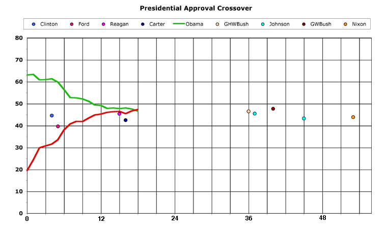
Obama -- 18 mo., Jul. '10
Carter -- 16 mo., May '78
Reagan -- 15 mo., Apr. '82
Ford -- 5 mo., Jan. '75
Clinton -- 4 mo., May '93
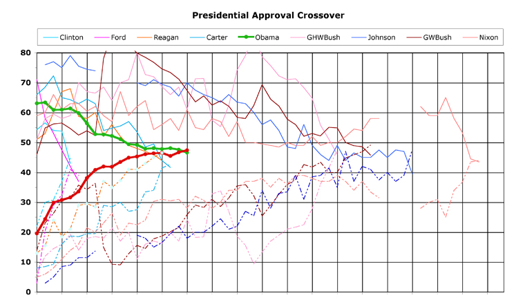
But since you know how we love charts around here, I tried making this more graphically interesting. Here's what I came up with (comparison of all presidents' approval/disapproval charts, up to the point where their lines first crossed over):
[Click on graphs to see larger-scale versions.]
This, I fully realize, is kind of hard to understand, due to the "busy" nature of the data. So I went back and tried again. This time, I kept Obama's lines and added just the point where previous presidents have hit the crossover. This makes it a lot easier to understand. The bottom axis is in months, not counting the first month they were in office (February, 2009 would be Obama's "month 1" on this chart, in other words), and I added some numbers to the scale to make it easier to read.
[Click on graphs to see larger-scale versions.]
This strips away all but the essentials, making it easier to compare Obama's record to his predecessors' records. But, if you're interested in further details on any of these presidential approval ratings, please visit ObamaPollWatch.com for each president's actual charts (both standalone and compared to Obama).
The first thing that really jumps out at you here is that the presidents fall into four (or possibly five) distinct groups. The first of these groups is the "quick to disappoint" group, hitting crossover less than six months into office. The second group I would call the "slow to disappoint" group, where their approval ratings took about a year and a half to slide slowly to crossover. The third group all (significantly) had an external event to boost their ratings, and they didn't hit crossover until at least three years into their presidencies. One of these is almost in a class by himself, as his crossover point didn't come until after his second term started. And the fourth group never hit crossover at all, and wasn't even included on the chart. The lowest approval rating John F. Kennedy ever hit was 56 percent, and his highest disapproval 30 percent, shortly before he was assassinated. But the real champion in this competition is Dwight D. Eisenhower who survived two full terms without ever falling below 50 percent approval, and whose disapproval rate never even approached 40 percent. Meaning everyone, pretty much, did "like Ike."
Moving from left to right on the chart, the first two (almost immediate) crossover points are Bill Clinton and Gerald Ford. Clinton, elected in a three-way race with less than 50 percent of the popular vote, never even hit 60 percent approval in his post-inauguration "honeymoon," and quickly slid to a worse position in the polls than Obama finds himself in today. Clinton's first term, as measured by public opinion, was so eclectic that at this point in his presidency, he was about to slip underwater for the second time.
Ford, of course, inherited the presidency in the middle of a term, when Nixon resigned. And then Ford pardoned Nixon. Sending his approval rating plummeting. Ford, just like Clinton, did recover in the polls, but by this point in his presidency he was (as Clinton would be next month) underwater for the second time.
The next grouping on the chart has two members in it other than Barack Obama. Ronald Reagan faced similar economic gloom in his first two years of his presidency as Obama has, and his poll numbers reflect this. Reagan's party lost a huge amount of congressional seats in his first midterm, and then Reagan went on to win a second term after the economy bounced back. Jimmy Carter did not fare so well. Carter went into cycles of being underwater in the polls and struggling above water, until he finished his presidency well below the waterline, and lost to Reagan in 1980, ending up a one-term president.
Obama's chart can be compared to either Reagan's or Carter's, at this point, since they are all three very similar. Obama is in a better place at this point in his presidency than either Reagan or Carter, but not by a whole lot in either case. But I'll save conclusions for the end, here.
The next grouping all had a somewhat-artificial boost in their poll numbers at some point during their first term. Both Bushes marched us off to war in the Middle East, and reaped a "bounce" as a result. Johnson, of course, stepped into office after Kennedy was assassinated, giving him an enormous boost with the public.
George H.W. Bush lost his boost the fastest. During the first Gulf War, Bush charted approval ratings higher than any modern president ("modern" meaning back to F.D.R., when public opinion polling was born), but he then quickly lost this wave of support.
Lyndon Johnson rode the wave of public support he instantly received upon becoming president to win the 1964 election. This wave lasted through his inauguration, which happened (on his chart) at the exact point Obama finds himself at now. But, as Vietnam got progressively worse, L.B.J. started losing public support. For those of you with eagle eyes, you may have noticed that Johnson gets two points on the above chart, at 37 months and again at 45 months. This is to be fair to him, because in Gallup's polling, he had one bad month in the polls which may have been a statistical mistake (an "outlier," as pollsters say), as his numbers recovered the month after and stayed fairly steady for the next six months or so. As I said, to be fair, I've plotted both points -- the possible mistake, and the real point his polls turned for the worse.
George W. Bush, like his father before him, charted new highs on presidential approval after 9/11, and after the invasion of Afghanistan. This was reinforced further by another bump in approval when he invaded Iraq. But eventually, what went up came down, and while Bush's numbers rebounded just in time to secure his re-election, they soon took a fatal dive and he wound up charting the worst approval ratings since Nixon by the end of his presidency.
Speaking of Richard Nixon, he is represented by that furthest-right point on the graph. That's right, Tricky Dick was seen positively by America until five months into his second term -- a whopping 53-month streak, only surpassed by Eisenhower and Kennedy's perfect records. Nixon, like George W. Bush, entered a fatal decline that only ended when Nixon became the first president to resign the office. About the only difference is that Nixon's numbers only crossed once, and once they tanked, they never recovered.
In conclusion, does any of all of this mean anything? Well, probably not. Because the data tell us two obvious things: that presidential approval rating crossover points seem to cluster in four distinct groups; and that you simply cannot use any of this to predict whether a president will ultimately be successful in office, or even if he will win a second term.
In the first grouping, we have Ford, the "accidental president" of our age, who was defeated and is generally thought of (in the kindest possible terms) as nothing more than a "caretaker" president. But we also have Bill Clinton, who recovered from his early stumbles only to make fresher stumbles, later; but who is also generally seen as a successful president who handily won re-election. Clinton then went on to enjoy very high approval ratings throughout his second term, even during his impeachment.
In the second grouping, we have Obama together with Reagan and Carter. Although party affiliation is switched, we again have a presidency seen as less-than-successful which ended with one term; and we have a president seen as successful, who won his second term in a record landslide. Obama's future, of course, remains unseen at this point.
Further out, we have a mixture of one-term presidents and two-term presidents, and also a mixture of success and failure. And not even on the chart, we have an assassinated president (can't really call Kennedy "just a one-term president" because who knows if he would have been re-elected?) and a two-term president, one from each party.
In other words, other than the odd grouping effect, it's not very easy to use any of this as any sort of political crystal ball to see what Obama's chart will look like when he leaves office -- or even when that will be. Maybe he'll be the second Carter, and maybe he'll be the second Reagan (or possibly he'll be the second "neither one of these"...). The historical record really can't be seen as definitive, at this point.
[Obama Poll Watch Data:]
Column Archives
[Jun 10], [May 10], [Apr 10], [Mar 10], [Feb 10], [Jan 10], [Dec 09], [Nov 09], [Oct 09], [Sep 09], [Aug 09], [Jul 09], [Jun 09], [May 09], [Apr 09], [Mar 09]
Obama's All-Time Statistics
Monthly
Highest Monthly Approval -- 2/09 -- 63.4%
Lowest Monthly Approval -- 7/10 -- 46.6%
Highest Monthly Disapproval -- 7/10 -- 47.4%
Lowest Monthly Disapproval -- 1/09 -- 19.6%
Daily
Highest Daily Approval -- 2/15/09 -- 65.5%
Lowest Daily Approval -- 7/31/10 -- 45.3%
Highest Daily Disapproval -- 7/31/10 -- 49.8%
Lowest Daily Disapproval -- 1/29/09 -- 19.3%
Obama's Raw Monthly Data
[All-time high in bold, all-time low underlined.]
Month -- (Approval / Disapproval / Undecided)
07/10 -- 46.6 / 47.4 / 6.0
06/10 -- 47.6 / 46.7 / 5.7
05/10 -- 48.1 / 45.5 / 6.4
04/10 -- 47.8 / 46.5 / 5.7
03/10 -- 48.1 / 46.4 / 5.5
02/10 -- 47.9 / 46.1 / 6.0
01/10 -- 49.2 / 45.3 / 5.5
12/09 -- 49.4 / 44.9 / 5.7
11/09 -- 51.1 / 43.5 / 5.4
10/09 -- 52.2 / 41.9 / 5.9
09/09 -- 52.7 / 42.0 / 5.3
08/09 -- 52.8 / 40.8 / 6.4
07/09 -- 56.4 / 38.1 / 5.5
06/09 -- 59.8 / 33.6 / 6.6
05/09 -- 61.4 / 31.6 / 7.0
04/09 -- 61.0 / 30.8 / 8.2
03/09 -- 60.9 / 29.9 / 9.2
02/09 -- 63.4 / 24.4 / 12.2
01/09 -- 63.1 / 19.6 / 17.3
ObamaPollWatch site:
Chris Weigant blogs at:
Follow Chris on Twitter: @ChrisWeigant