
Good News, Bad News
This month Obama poll watchers got some good news, and some bad news. This was capped off, at the end of the month, by the Washington punditocracy making an incredibly stupid comparison between polling for Barack Obama and Jimmy Carter -- which we will address at the end of the column (complete with a "guess the president" graph quiz, for your amusement).
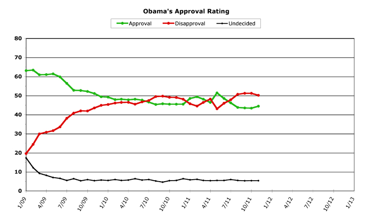
But we've got a lot to cover, so let's just jump right in with Obama's chart for November, 2011.
[Click on graph to see larger-scale version.]
November, 2011
November saw the Republican presidential nomination rollercoaster ride continue, with Herman Cain flaming out and Newt Gingrich rising from his own ashes. The Occupy Wall Street protests clashed with the reality of the cops, and has since mostly fizzled out. However, what I like to call the "99 Percent" movement has not -- because the core ideas of the occupiers have been gaining traction in both the media and political environments, and the idea that maybe doing something about income equality is now running about par with deficit-cutting obsession (which had been the prevailing theme ever since the Tea Partiers made their mark). Right before Thanksgiving, however, the congressional "supercommittee" threw in the towel and announced it couldn't possibly come to any agreement which either one single Democrat or one single Republican would cross the aisle to support. To nobody's surprise, I might add.
President Obama entered November on an upswing, but the failure of the supercommittee was a reminder to the public just how broken Washington truly is, which dragged him back down towards the end of the month.
Obama improved his standings in the polls in November, both by increasing his average monthly approval number to 44.4 percent and by bringing his average monthly disapproval down to 50.2 percent. In both cases, this represented a 1.0 point change over his October numbers (which were almost perfectly flat). While Obama's still got a long ways to go, this is the first positive bump in the polls he's seen since the death of Osama Bin Laden. That's the good news. The bad news is that he ended the month on a downward swing. Which leads us right to...
Overall Trends
The overall trend for Obama was the bad news, because the supercommittee failure dragged him down at the end of the month. But, overall, mostly the news was good for Obama in November. Simultaneously rising and falling by one percent may not sound like a lot, but it was Obama's third-best ever rise in approval, and his fourth-best month in falling disapproval (to put these numbers in some sort of context).
The other good news for Obama was that this was the first month in quite a few where he didn't post any "all-time" negative numbers. Last month, by comparison, Obama posted an all-time high for average monthly disapproval, and all-time lows for both average monthly approval and average daily approval. This month, Obama posted a daily approval high of 45.8 percent -- which he hasn't seen since July. His highest daily disapproval in November was almost two points below his all-time daily record. The problem, as noted, was that the last day of the month Obama posted the lowest daily approval of the whole month (at 43.2 percent), and the highest daily disapproval (51.4 percent).
So while overall the month was indeed a positive one for Obama, there is still bad news contained within his numbers. Struggling to get above 45 percent approval is not (to be blunt) where a president wants to be, heading into a re-election battle. And if Obama's numbers don't improve soon in December, the rise he just posted in November could completely disappear.
Obama does have some good news to enter the month with, however, so turning his numbers back to positive may indeed be possible. The unexpected good news on unemployment will help him, and all month long the media will be occasionally reporting on the troops "coming home for the holidays" as our final pullout from Iraq winds down. Both of these may give Obama a boost in December. Who knows, maybe Santa will leave some better approval ratings under the White House Christmas tree?
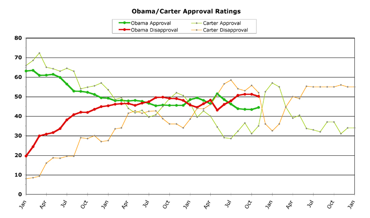
Obama versus Carter (and three others)
For a week, I've been hearing from inside-the-Beltway pundits (including some who really should know better) that "Obama's numbers are worse right now than Carter's were at the same point in his presidency."
Since I only post monthly averages, my numbers haven't quite caught up to this talking point, but you can see what they're talking about on my comparison chart:
[Click on graph to see larger-scale version.]
However, this is still a monumentally stupid comparison to make. I'm sorry, but it just is.
During November, thirty-two years ago, Iran exploded. During their revolution they took Americans hostage. This was, as you can imagine, a rather large event in the American consciousness. It had an outsized effect on Carter's polling, as a direct result (pollsters call this the "rally 'round the president" effect).
Carter's bump in the polls didn't last very long, however, as you can see in that chart. He got four very good months out of it, and then his polling fell back to almost exactly where it had been before the crisis began. To put it another way, in the six months previous to the bump, Carter averaged only a 32.1 percent approval rating (with a low of 28.5 percent in July of 1979). After the bump, Carter averaged 35.9 percent for the next six months.
Obama isn't even close to that territory.
Which is what makes the comparison so silly, on the face of it. It's like comparing a president's approval rating to George W. Bush's right after 9/11 happened, to put it another way -- it really is an invalid comparison to even make.
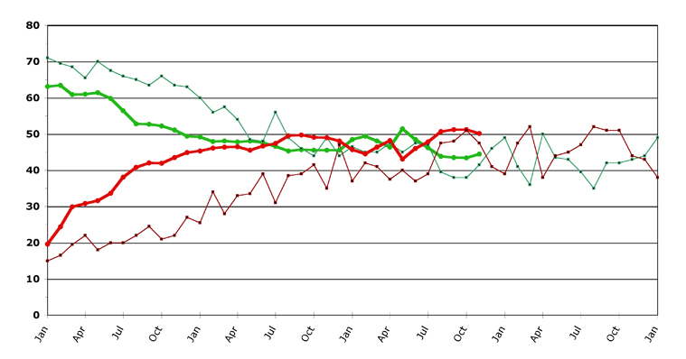
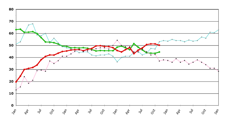
But because the talking point gained such wide circulation, I thought I'd pull out three other past presidents and compare their overall charts to Obama's at this point, to show where more intelligent comparisons could be made. All of these presidents were prior to Obama, but after Truman (polling data gets sketchy, pre-Eisenhower). See if you can guess whose numbers these are (answers at the end):
[Click on graph to see larger-scale version.]
The first one I chose has probably the closest numbers to Obama, if you prefer just a one-month "snapshot." As you can see, both the approval and disapproval are within three percentage points of where Obama now is. As you can also see, this president had a rocky rest of this term, swinging wildly up and down.
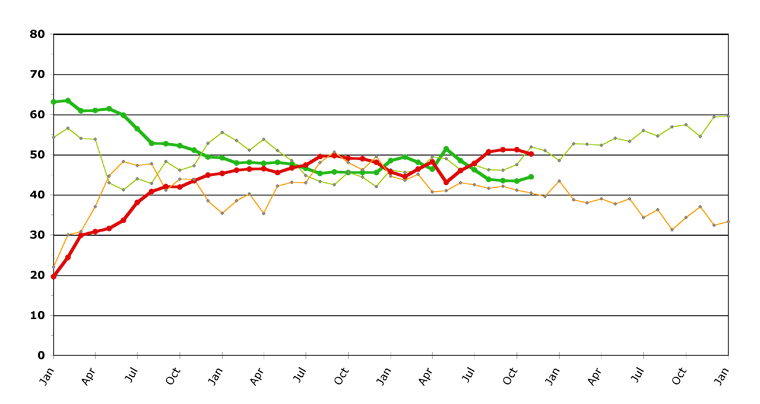
[Click on graph to see larger-scale version.]
Up until the last few months, this second president was tracking very close to Obama's trajectory, especially in approval rating. Since about Year Two, this president was in pretty much the same range as Obama. This president started climbing right about now, and his numbers headed upward for the remainder of his term.
[Click on graph to see larger-scale version.]
The third president also closely tracks Obama, although closer on disapproval than on approval. The past three or four months, the lines start to diverge, but before that disapproval tracked extremely closely with Obama's line. This president also seemed to be turning things around right about now, and his numbers headed upward for the rest of his term.
Answers: The first graph (under the Carter graph, above) was Lyndon Baines Johnson's "second term." Some might argue that this is an apples/oranges comparison, but since his "first term" was less than a year long (after Kennedy's assassination), and since he was indeed running for re-election, I considered it valid. Eventually, L.B.J. famously pulled out of the primary race because he thought he likely couldn't win re-election.
The second graph is none other than Bill Clinton's first term. The third graph is Ronald Reagan's first term. The question for Obama is whether he can engineer a similar rise in polling that both Clinton and Reagan rode back into the Oval Office.
[Obama Poll Watch Data:]
Sources And Methodology
ObamaPollWatch.com is an admittedly amateur effort, but we do try to stay professional when it comes to revealing our sources and methodology. All our source data comes from RealClearPolitics.com; specifically from their daily presidential approval ratings "poll of polls" graphic page. We take their daily numbers, log them, and then average each month's data into a single number -- which is then shown on our monthly charts here (a "poll of polls of polls," if you will...). You can read a much-more detailed explanation of our source data and methodology on our "About Obama Poll Watch" page, if you're interested.
Questions or comments? Use the Email Chris page to drop me a private note.
Column Archives
[Oct 11], [Sep 11], [Aug 11], [Jul 11], [Jun 11], [May 11], [Apr 11], [Mar 11], [Feb 11], [Jan 11], [Dec 10], [Nov 10], [Oct 10], [Sep 10], [Aug 10], [Jul 10], [Jun 10], [May 10], [Apr 10], [Mar 10], [Feb 10], [Jan 10], [Dec 09], [Nov 09], [Oct 09], [Sep 09], [Aug 09], [Jul 09], [Jun 09], [May 09], [Apr 09], [Mar 09]
Obama's All-Time Statistics
Monthly
Highest Monthly Approval -- 2/09 -- 63.4%
Lowest Monthly Approval -- 10/11 -- 43.4%
Highest Monthly Disapproval -- 9/11, 10/11 -- 51.2%
Lowest Monthly Disapproval -- 1/09 -- 19.6%
Daily
Highest Daily Approval -- 2/15/09 -- 65.5%
Lowest Daily Approval -- 10/9/11 -- 42.0%
Highest Daily Disapproval -- 8/30/11 -- 53.2%
Lowest Daily Disapproval -- 1/29/09 -- 19.3%
Obama's Raw Monthly Data
[All-time high in bold, all-time low underlined.]
Month -- (Approval / Disapproval / Undecided)
11/11 -- 44.4 / 50.2 / 5.4
10/11 -- 43.4 / 51.2 / 5.4
09/11 -- 43.5 / 51.2 / 5.3
08/11 -- 43.8 / 50.7 / 5.5
07/11 -- 46.2 / 47.8 / 6.0
06/11 -- 48.5 / 46.0 / 5.5
05/11 -- 51.4 / 43.1 / 5.5
04/11 -- 46.4 / 48.2 / 5.4
03/11 -- 48.1 / 46.4 / 5.5
02/11 -- 49.4 / 44.5 / 6.1
01/11 -- 48.5 / 45.7 / 5.8
12/10 -- 45.5 / 48.1 / 6.4
11/10 -- 45.5 / 49.0 / 5.5
10/10 -- 45.5 / 49.1 / 5.4
09/10 -- 45.7 / 49.7 / 4.6
08/10 -- 45.3 / 49.5 / 5.2
07/10 -- 46.6 / 47.4 / 6.0
06/10 -- 47.6 / 46.7 / 5.7
05/10 -- 48.1 / 45.5 / 6.4
04/10 -- 47.8 / 46.5 / 5.7
03/10 -- 48.1 / 46.4 / 5.5
02/10 -- 47.9 / 46.1 / 6.0
01/10 -- 49.2 / 45.3 / 5.5
12/09 -- 49.4 / 44.9 / 5.7
11/09 -- 51.1 / 43.5 / 5.4
10/09 -- 52.2 / 41.9 / 5.9
09/09 -- 52.7 / 42.0 / 5.3
08/09 -- 52.8 / 40.8 / 6.4
07/09 -- 56.4 / 38.1 / 5.5
06/09 -- 59.8 / 33.6 / 6.6
05/09 -- 61.4 / 31.6 / 7.0
04/09 -- 61.0 / 30.8 / 8.2
03/09 -- 60.9 / 29.9 / 9.2
02/09 -- 63.4 / 24.4 / 12.2
01/09 -- 63.1 / 19.6 / 17.3
Chris Weigant blogs at:
Follow Chris on Twitter: @ChrisWeigant
Become a fan of Chris on Huffington Post
Full archives of OPW columns: ObamaPollWatch.com