Comma (,)

Virgules (/), double hyphens (=), and pilcrows, or paragraph marks (¶), in a facsimile of a book printed in 1489. Source: The statutes of Henry VII, 1889.
The comma is one of the oldest marks of punctuation. It was created over 2,300 years ago by a Greek scholar named Aristophanes, head of the fabled Library of Alexandra, in a punctuational big bang that also gave us the colon and the period.
Ancient scrolls were written without punctuation of any kind (even word spaces were centuries away), and readers habitually mumbled along with the text as they read, forming syllables into words and picking out the rhythm of the text. This was all too much for Aristophanes, who created a series of marks for readers to annotate their unbroken texts. Each mark took the form of a simple punctus, or "point," a dot placed on a line of text to signify a short, medium, or long pause. The shortest pause, called the comma, was represented by a dot at the middle of the line (•); the longer colon and periodos were at the bottom (.) and top (˙) respectively. The idea was that the reader, not the writer, would punctuate their scroll with these little dots to help them read it aloud.
Over the centuries Aristophanes' dots moved up and down the line: the period dropped to the bottom (.) and has stayed there ever since, while the colon gained an accomplice (:). The modern comma, however, despite its visual kinship with Aristophanes' original, is not the same mark at all. In the twelfth century, as the Renaissance gathered steam, an Italian writer named Buoncompagno da Signa took a crack at inventing his own system of punctuation. He proposed only two marks: the suspensivus, or slash (/), represented a pause and the planus, or dash (--), marked the end of a sentence. By the fifteenth century Buoncompagno's slash was being used interchangeably with Aristophanes' ancient comma: gradually, the newer mark dropped to the bottom of the line and acquired a slight curve, and when it took on the name of the older mark the comma we recognize today was born.
Quotation marks ("")
Caption: Diples in a sixth-century copy of the Four Gospels. The parchment is so thin that the handwriting on the other side of the leaf is clearly visible. Source: British Library, MS Harley 1775, f. 22.
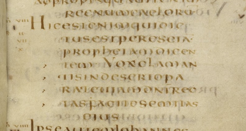
The Library of Alexandria was the source of much of the punctuation we still use today. In the second century BC, Aristarchus, one of Aristophanes' successors, took it upon himself to create a series of marks to help editors correct the error-strewn scrolls that crossed their desks. The simplest was the arrowhead shape of the diple (>), or "double," a symbol used to highlight interesting lines of text in the same way that a modern writer might underline a notable passage.
The meaning of the diple changed over the centuries. Early Christian writers, who quoted from and criticized one another's tracts endlessly, used it to mean "here is a quote from another writer." The diple became a kind of quotation mark, a tool for keeping one's own interpretation of scripture insulated from the heretical falsehoods of others. By the time printing arrived in the middle of the fifteenth century, the diple was firmly entrenched as the way to call out the words of others.
And then, just like that, the diple was gone. Johann Gutenberg and his successors made their movable type by sculpting steel punches into the shapes of tiny letters, numbers, and marks of punctuation before driving these punches into copper and finally casting them in lead. It was a time-consuming business, and printers were eager to keep the numbers of characters they had to carve, strike, and cast down to a minimum. The diple was one of the first casualties of this efficiency drive, left out of printed books right from the start. From the sixteenth century on, printers began to use a pair of commas (,,) instead of diples--no-one has ever quite worked out why--and later rotated them (") to produce matching pairs of opening and closing marks. Overnight, the diple was dethroned by the quotation mark.
Question mark (?)
A 12th-century punctus interrogativus. Source: © The British Library Board, BL Cotton Domitian i, fols. 2-55: 55v.
There is a theory that says that the question mark is not a mark of punctuation at all--instead, it is an abbreviation for the Latin word quaestio, signifying a question, interrogation, or a line of inquiry. Abbreviated to qo, the theory goes, the "q" was stacked atop the "o" and the pair gradually morphed into the question mark. And certainly, if you write out this double-decker pair of letters and squint at it for long enough, it is entirely possible to see how it could have been transformed into "?" by the careless pens of successive scribes.
The only problem is that there is no evidence that this ever happened. The late Malcolm Beckwith Parkes (in his lifetime Parkes was the undisputed champion of medieval punctuation) speculated instead that the evolution of the punctus interrogativus, or question mark, was not about words but rather tone of voice. Medieval Latin was lousy with little marks indicating abbreviations, contractions, and tone, and it seems that sentences containing a question were often closed with a kind of "lightning bolt"--the closest modern mark is the tilde (~)--that denoted a rising, questioning tone of voice (as shown in line 4 above). This combination of period and accent (.~), Parkes said, became standard practice when punctuating questions and from there evolved into the modern question mark. All this remains speculative, however: the question of the question mark is not entirely settled.
Octothorpe (#)
Left, Isaac Newton's handwritten "lb"; right, printed "lb" symbols with bars. Courtesy of the Chemical Heritage Foundation Collections.
The clue to the origin of the mark known as the octothorpe, hash mark, or pound sign comes from an old use in weights and measures. Today, it most often stands in for the word "number"--"#5" is read "number five"--but when the "#" is placed after a number it switches to its older meaning of "pounds in weight." And this is an old usage indeed.
In ancient Rome, merchants used the Latin term libra pondo to mean "one pound in weight." Libra, as the name of the constellation suggests, means "scales" or "balances," while pondo comes from the verb pendere, "to weigh." This may come across as a little tautological, and so it was: both libra and pondo were routinely used by themselves to mean the same thing that they did together--one pound in weight.
By the fourteenth century the abbreviation "lb" for libra had made its way into English as a unit of weight. As a hangover from medieval times, writers often added a bar called a "tittle" or "tilde," tying the letters together and signalling that it was an abbreviated version of a longer word. (The modern "~", or tilde, is named for its medieval predecessor.) Though "lb" survives to this day, its barred counterpart grew increasingly stylized, written down in haste by harried merchants, mathematicians, and scientists (Isaac Newton possessed an especially florid version) so that "℔" has since become the familiar "#", or pound sign.
Ampersand (&)
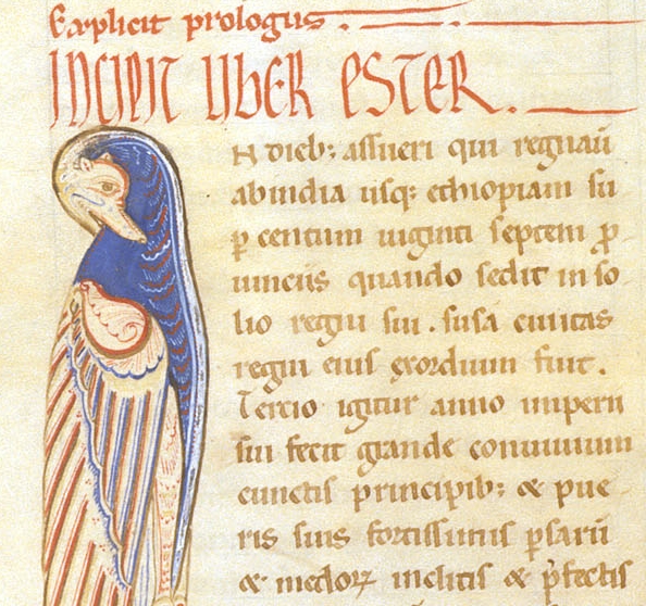
Twelfth-century ampersands (on the ninth and eleventh lines), alongside a bird-shaped capital "I". Source: British Library, MS Harley 4773, f. 71.
Like the octothorpe, the ampersand is not a mark of punctuation so much as a word transmuted into a distinctive symbolic form. And like the octothorpe, we have the Romans to blame.
Vandalism is not a new problem. The streets of Pompeii, an ancient Roman town cradled in the lee of the comforting bulk of Mount Vesuvius, were covered in graffiti: "Satura was here," read one scrawled message; "Cruel Lalagus, why do you not love me?" said another. Most are unprintable. One particular message, however, contains the oldest known ampersand: its furtive scribbler had written the word ET, or "and," so that its two letters nestled together with vertical stroke of the "T" abutting the middle stroke of the "E". It was a ligature, in other words, where two or more letters are combined to make a single symbol, and it looked quite different to today's abstract curlicue.
Ligatures are common in printed books; any book worth its salt will display "fi", "fl", and "ff" using ligatures designed to smooth out the collision between adjacent letters. The original Pompeiian ampersand, however, frozen in time by Vesuvius's eruption in 79 AD, was a handwritten contrivance, likely the result of a nervous graffiti artist hurrying to complete their message before they were noticed. Since then, their simple ET has evolved by degrees into the "&" we recognize today, progressing steadily from a concrete word into an abstract symbol as scribes modified and embellished it along the way. Certain fonts still contain clues to the ampersand's origins, however: check out the italic ampersand in Constantia, Garamond, or Goudy Old Style to see a very recognizable et that harks back to the ash-filled skies of old Pompeii.
Keith Houston's book Shady Characters: The Secret Life of Punctuation, Symbols, and Other Typographical Marks (W. W. Norton & Company) is now out in paperback.
___________________
Also on The Huffington Post:
